The Information Design & Critical Theory course examines various theoretical models of sensemaking, mapping, and visual communication intrinsic to information design that help students understand the broad scope of the practice, its goal, and value, as well as their ethical responsibilities, as practitioners who soon will join the workforce. Students unpack concepts through mapping assignments and build an understanding through discussions, visual thinking exercises, individual and collaborative activities, and a final synthesis map project.
The pillars of the course
Sensemaking is at the core of what information designers do. This activity involves deep immersion in the content to construct knowledge through analysis and synthesis. Students explore this process through the use of visual thinking and mapping techniques.
Mapping helps students synthesize their understanding of multiple sources and identify core concepts and connections. In addition, students learn how to think in layer by organizing large amounts of content, clearly distinguishing hierarchies, and using visual variables with purpose. The resulting artifacts are schematic representations of their internal understanding of core concepts and theories and how they relate. These skeletons represent (on a single visual plane) their mental models of different aspects of the practice.
Visual communication involves the transformation of mental models, skeletons, or outlines into pieces that people can understand and act on. The organization and encoding of content in a way that supports people’s needs and perceptual principles is the basis for effective results. Students explore and learn how to identify key types of information, determine hierarchies, and define the reading flow to clearly convey a story.
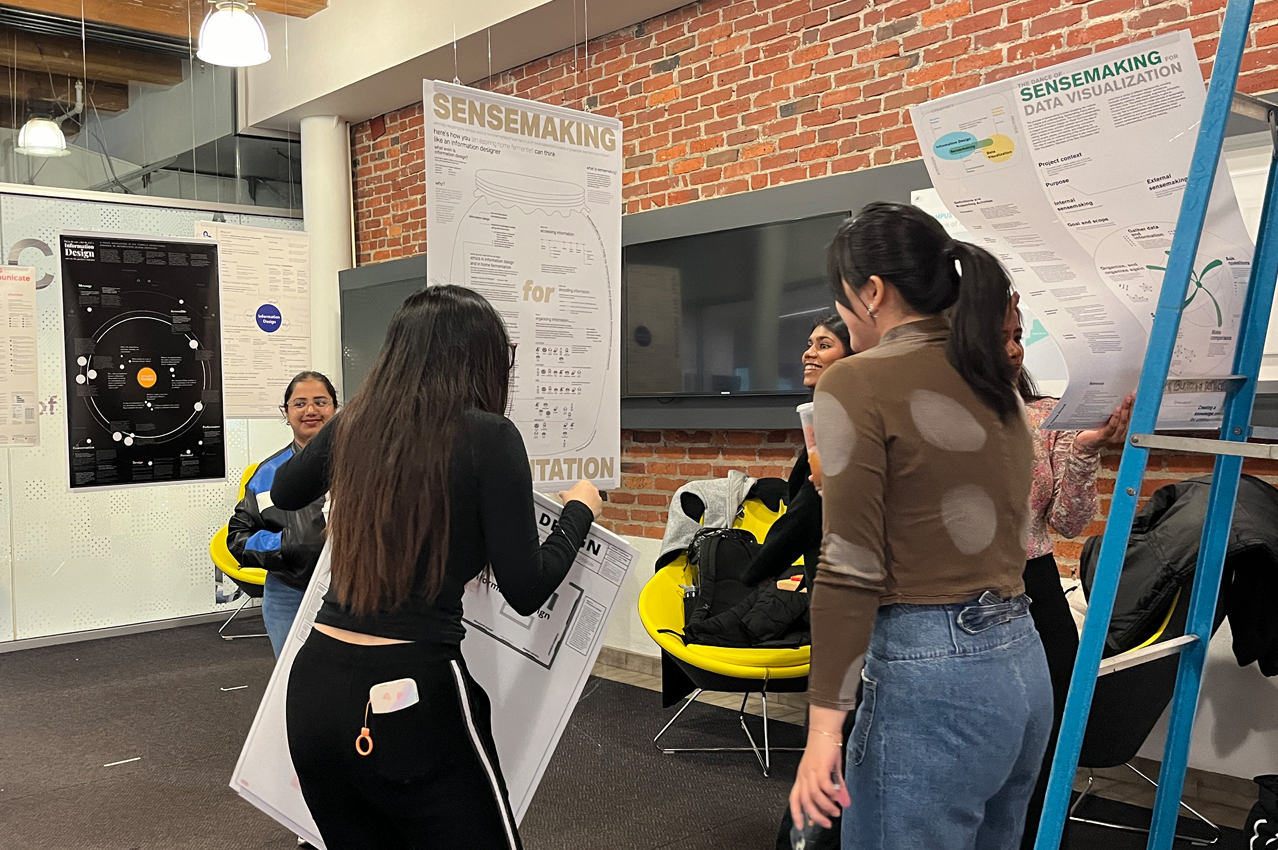
The culmination of the course
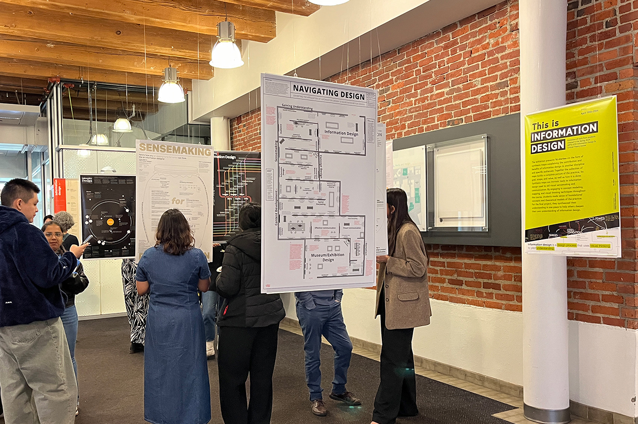
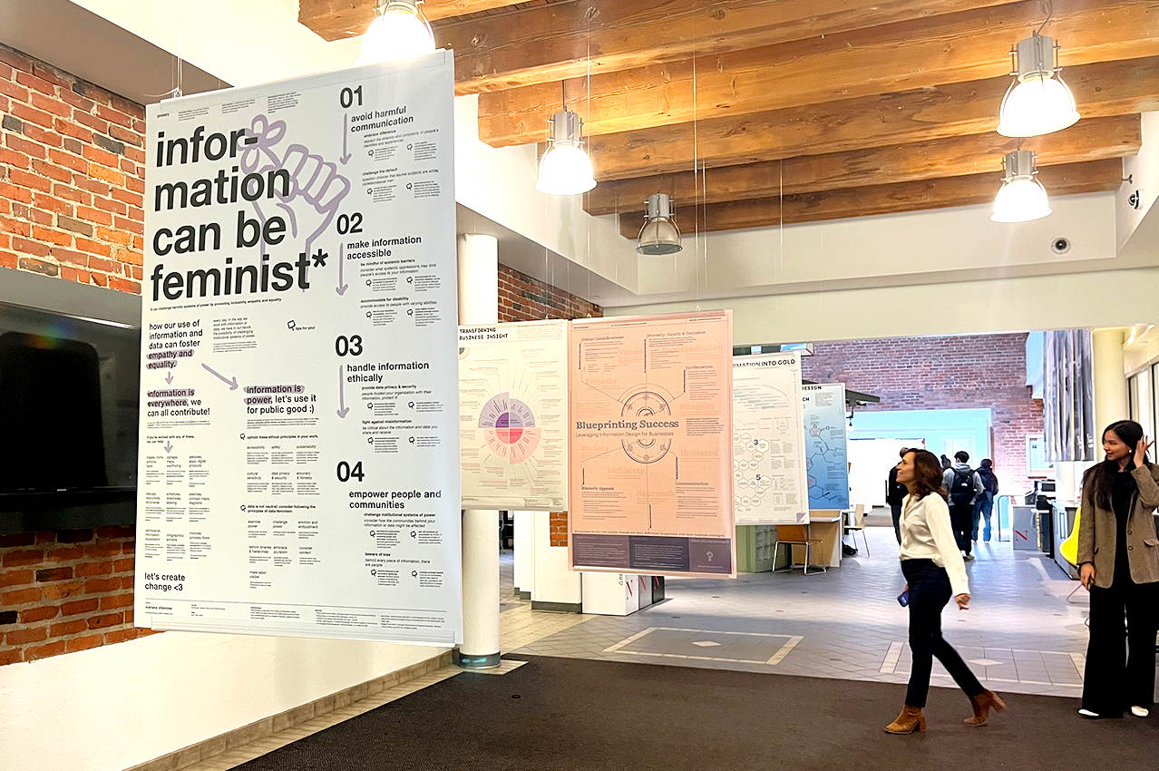
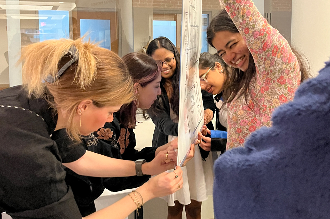
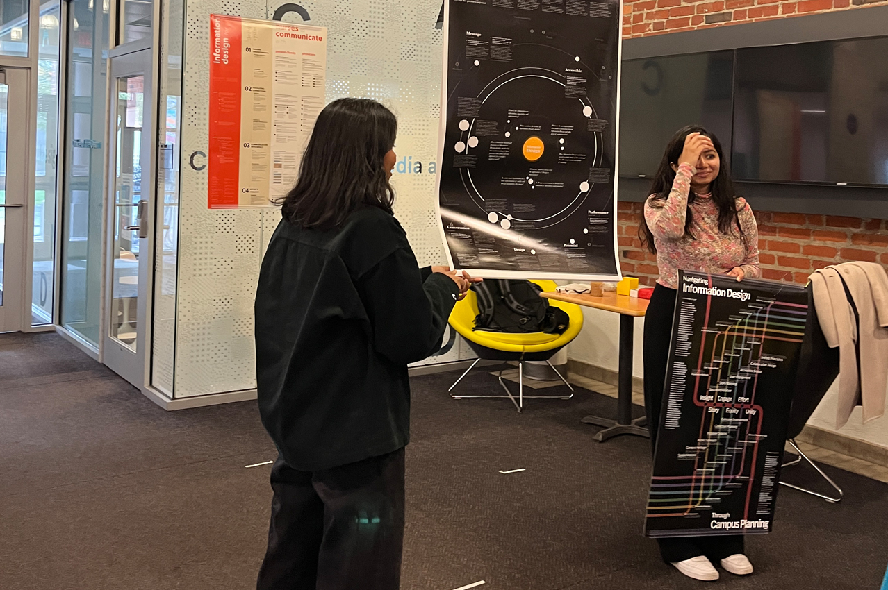
Each student created a collection of 11 concept maps that reflected their way of making sense of new information to construct knowledge, and the evolution of their understanding of the information design field, and a synthesis map in the form of one large-scale poster that communicated that understanding to others.

The goal of these synthesis maps is to help someone who never heard of the information design field understand its goal, scope, and value, as well as how it is done. To tell this story, students synthesized all readings and concepts discussed in the course to determine the most appropriate narrative and point of view for their concept. Then, they contextualized the story in today’s world by illustrating its benefits and contributions to another domain of their choice. For instance, students explained the role of information Design for social science, museum design, digital humanities, cancer research, healthcare, business, entrepreneurship, computer science, fermentation, feminism, attention economy, and campus planning, among other fields. To make the contribution clear to their specific audience, students added examples and tailored the content, style, and overall visual language to their needs, gaps in knowledge, and characteristics.
Through surveys, interviews with content experts and users, and secondary research, students gained familiarity with their audience’s understanding of information design as well as identified concrete ways in which information design could help. The resulting exhibition presents 16 stories explaining the contribution and benefits of information design to another discipline and specific audience. Together the collection of maps builds a complete picture of the practice, and demonstrates the transdisciplinary nature of information design: help address the need for clarity and understanding in almost any domain from academia to industry.
This exhibition showcases work from MS + MFA IDDV students created during Spring 2024.
Dates: April 19th – May 5th @ Ryder Atrium, in Ryder Hall, Northeastern University.
If you are in Boston, check out the exhibition!
Leave a Reply