Let’s analyse some images.

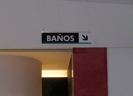
01. New bus station. Mar del Plata (Argentina). This is one of the biggest summer tourists’ cities of the country. I was there (in the new bus station!) for the first time a couple of weeks ago, and the first thing I noticed was its Wayfinding System (I will discuss it in a different post) and in special the visual sign shown in this picture: ”˜Baños’ (Toilets). On the one hand, it can be a design decision to employ typographic signs only, instead of graphic signs to indicate the location of most important elements of a station, such as platforms, toilets, exits, etc. However, I found it useless to have it only in Spanish, as to this bus station are arriving both national and international tourists, and not only in summer time. This new bus station is still underconstruction, hopefully this is only a temporary sign”¦

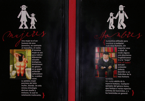
02. Coffee shop. FrayMocho library. Mar del Plata (Argentina). Automatically, when I saw these doors, they reminded me the previous ”˜Baños’ sign. What a difference! I thought”¦These toilet signs seemed to me to be exactly an opposite example than that of picture 01. Even though written text is in Spanish (mujeres [women], hombres [men], and their definitions), it is supported by both icons and pictures of ”˜women + girls’ and ”˜men + boys’. Maybe having three languages to communicate a message (toilets location) can be too much, but it has an intention behind of how to communicate and organise the elements.

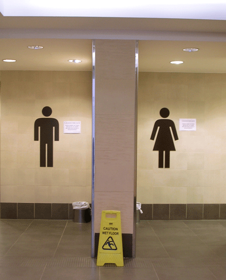
03. Central mall. Cambridge (UK). This is a clear image which it is also depicting toilets location, and has a similar meaning than that of the second picture. However, it is extremely more synthetic and simple than picture 02. It has only the minimum graphic elements to communicate, with an appropriate chromatic coding and size. Maybe, it can be said that these signs are focused on young audiences as, probably; the older ones can find them useless or confusing because of their lack of text. Nevertheless, this is another example of a strong design decision and its importance for a design process.
A same concept/word can be visualised with many different visual languages (graphic, typographic, mixed). Some results are more effective than others, communicating without doubts a message to the correct audience. Others, even though are employing an appropriate synthetic visual language are not being simple and clear enough. This means that not for employing only an appropriate language a message is going to be effectively communicated. As Richard Wurman has explained, the how is also a key factor of the design process.
Leave a Reply