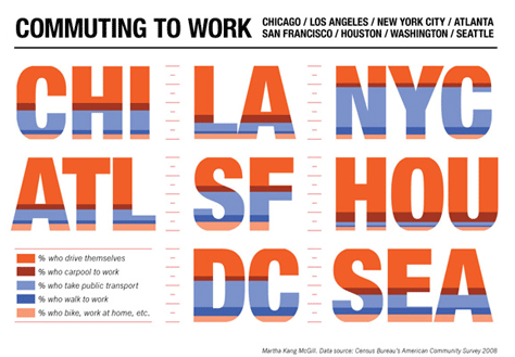
One of my colleagues sent me this link about how Americans go to work. A synthetic infographic showing the different commute patterns used by workers in eight different major US cities according to the 2008 US Census Bureau American Community Survey. The infographic includes information of people who drive, walk, cycle, or take mass transit.

Technically, this is an example of a diagrammatic map. This infographic is both a diagram and a map: it represents geographic location without any geographic element, and information employing a synthetic visual language.
Perhaps, it can also be added more details to this image, but this is definitely a great starting point!
Leave a Reply