Although my research is mostly centered on information design projects’ content and not on their aesthetic characteristics, I think it is important to highlight that the visual characteristics and language of these projects also require deep analysis and work to reach effective results. As part of my practice review, I have encountered with several cases where signage, wayfinding or information design aesthetic principles were not properly applied or followed, such as incomprehensible maps, or being lost in a bus station, an airport or a museum. For this reason, this post will briefly highlight a more ”˜visual’ or ”˜aesthetic’ side of information design projects, in other words, elements concerning with the executing stages of the design process.
Design process
Tasks and actions of the design process can be grouped in two main stages, according to their purposes and objectives: thinking and executing. Thinking stages refer to the tasks and actions of the design process, which translate (extract meaning) information into understandable data for designers by analysing and understanding the problem to be solved. While executing stages refer to the tasks and actions of the design process which convert information into visual language for communication by taking decisions and actions based on the analysis conducted in the decoding stages. Once thinking stages have been passed through, and content has been analysed, organised and classified, and key data to be visualised has been identified, executing stages consist of visually encoding that data. Even though there was an appropriate analysis of content during thinking stages, when aesthetic principles are not properly followed, the visual translation process can be misled, creating confusing messages, and ineffective outcomes.
For this reason, it is worth to review some basic design principles, which are particularly relevant for information design projects.
Aesthetic and communication principles
– Visual coding: The use of different visual variables to distinguish information, such as colour, size, orientation, shape, texture, value, or a combination of two or more of these. The term Visual Variable was introduced by Jacques Bertin, with his book Semiology of Graphics. These encoding variables are essential to code any kind of information, but the most important is to choose and apply the most appropriate variable according to the purpose, objective, audience of the project.
– Purposed colour: Colour is one of the most used visual variable to code information, for this, I will explain its relevance with a specific example.
Recently, for the first time, I went to the Science Museum in London, and my first reaction was to take a map to know where each exhibition and project were set and the general organisation of the building and floors. However, once I started walking around, I found myself a bit lost in a couple of minutes; as an example, I couldn’t find the exhibition I was looking for nor the coffee shop that was supposed to be on the first floor, according to the map. Moreover, even though the map is purposely coded with: a floor-map of each floor, an icon system, numbers matching exhibition-floor, and a colour-coded system; these codes are not applied to the physical building. In simple words, it seems that there is not a relation between the map and the whole building, creating a feeling of disorientation in the map-readers.
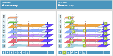
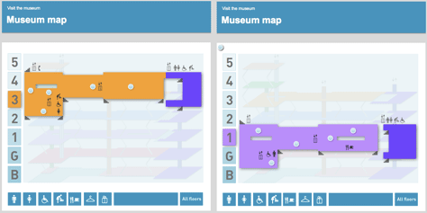
To avoid this, in information design projects, it is essential to apply the same rationale in all pieces of the project. If colour constituted one of the main signage elements, it would have to be applied throughout the different pieces of the project, to facilitate the navigation within the place. Or if colour were not the main visual variable, and instead it were an icon-system, it would have to appear in the different rooms and corridors of the building, so users would be orientated, even though the absence of a colour variable.
– Signage & Wayfinding: To explain this category I will refer to a lecture of Erik Spiekermann, which was exclusively addressed to airport signage, highlighting that these concepts may be applied to similar problems and different contexts. Particularly, Spiekermann’s lecture pinpointed recurrent and common wayfinding-sign mistakes in airports: where to place the arrows within the signs, which indicates ”˜gates’, ”˜airport facilities’, ”˜toilets’, etc. On the right of the text? Or on the left of the text? But what if the gate/facilities are on the opposite direction than that of the arrow?
Spiekermann explained some key tips to make wayfinding signs more understandable:
1- The arrows should be placed always at the same side that they are pointing out, to allow information to flow
2- The arrows should be always pointed out UP, when depicting straight direction
3- The arrows should never be pointed out DOWN, because it is not clear if that means straight direction or going to a different/lower level
These tips seem to be pretty obvious, however some not-following-these-tips examples can be found around the world, in quite new airport terminals or bus stations.
The first case study corresponds to the new Bus Station of my hometown, Mar del Plata, in Argentina. In my first visit, the first thing I noticed was the arrows directionality of the signs and the lack of information design in the whole station.
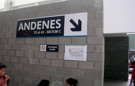
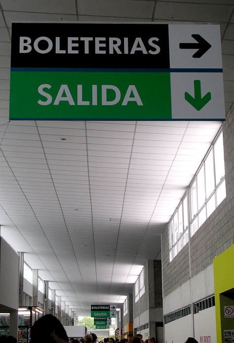
As in January 2010, the station was still underconstruction, my hope was that these were provisional signs and that more appropriate ones would be replacing them soon (unfortunately, it was not the case, I have been there again last August, and the same wayfinding signs were there).
Similarly, every time I go to the new terminal T1 of Barcelona airport (opened last October 2009), I notice that there is something wrong about the wayfinding & signage system. As can be seen in the images below, the wayfinding signs have been designed exactly in the opposite manner that the advice given by Spiekermann. The directionalities of the arrows are all pin pointing to misleading directions.
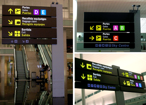
There are many more aesthetic principles that take part of information design projects, such as Visual arrangement, Typography & legibility, Grid system, etc. However, as I have explained in a previous post, to obtain effective design results, it is not enough to apply these (or other) design principles as a recipe. In any area of design, principles should be purposely applied, instead.
– Gregory, S.A. (1966) The Design Method. London: Butterworths
Leave a Reply