This Christmas I went to Toronto, Canada for the first time. What really got my attention was the way flight information was organised in the Toronto airport screens. Flight information refers to flight schedule times, flight status, flight company names/numbers, flight terminals and flight origin/destination cities. I have taken for granted that flight information was always organised in the same way: by arrival/departure time. However, I noticed that in this airport this type of information was organised in a different way: by alphabetical order. Flights are organised following the name of the origin/destination city and their arrival/departure time is shown in the last left column. Being used to a ”˜Time’ method of organising this type of information, I found myself a bit lost trying to find the flight I needed to take.

A few days ago, I did a quick online research to find out if this was a Canadian method of organising flight information or if there were other methods.
Following Richard S. Wurman’s LATCH method (1989) of organising information, I realised that flight information in airport websites and airport screens is often organised in different methods: by ”˜Time’, and by ”˜Alphabet’ of company names and origin/destination cities. In addition, some airport websites, such as Barcelona and New York airports, also add flight information that can be organised by ”˜Category’, following the flights’ status (i.e. Scheduled, En Route, Landed, Delayed). And according to LATCH+2, a version of Wurman’s LATCH method enlarged by Nathan Shedroff (1994), some airports also organised flight information by ”˜Number’. These four methods of organising information are explained below.
Time
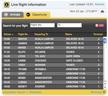
Both airport websites and airport screens often organise and show flight information chronologically using time-lists. This method seems to facilitate finding a flight in a short time. As an example, when travellers arrive to the airport slightly late, they tend to search for their flight according to its schedule time. Both Ezeiza (Buenos Aires airport) and Heathrow airport screens use this method to organise their flights in the airport screens, and Heathrow and Arlanda (Stockholm main airport) websites also use it.
Alphabet
This method appears to be applied to organise flight information in two ways.
By City: Some airports use this method to organise this information according to the origin/destination city. This means that flights should not be searched for their schedule time, but for their origin/destination city name. This is the case of the Toronto airport.
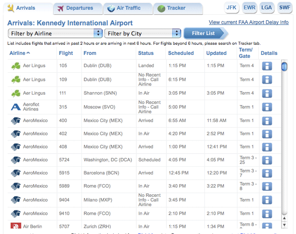
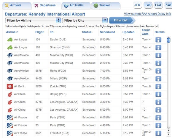
By Company: Other airports organise flight information according to their company names. In this case, flights should not be searched for their schedule time either. For example, this is the case of the Kennedy New York airport website.
Category
To order by Category means to organise and cluster things that share similar properties and attributes together. Flights can be ordered according to this method when flights share a same status, such as departed or delayed.
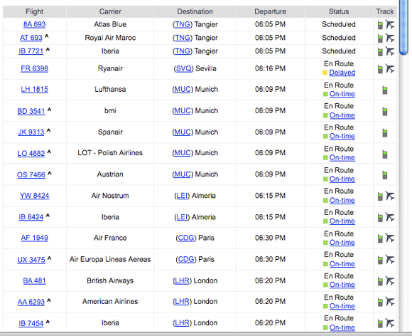
Particularly, the website of the Barcelona airport adds a sub-layer of information to this method, which permits to organise flights into a deeper sub-group. In its website, it is added the variable time, displayed using a chromatic code, to the flight status. As can be seen in the image below, when a flight is on time it is green, but if it is delayed, it is also indicated how much it is delayed.

Number
This method simply organises flight information according to the flight numbers, instead of the flight company names. In this case, flights should not be searched for their schedule time or for their company names. This can be seen in the websites of Barcelona and Frankfurt airports.
Mixed methods
Flight information can also be organised using more than one method. Generally, airport websites and airport screens do not share the same methods of organising information. As an example, Toronto airport uses the Alphabet by City method, while its website uses the Number method.
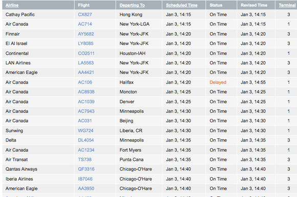
A different subject of analysis is the order in which flight information is shown in airport screens and websites. Not all airport screens and websites show flight information in the same order. As can be seen in the above images, the order is also essential to obtain effective legibility and facilitate travellers to find their flights. Definitely this is a subject for further investigation.
– Shedroff, N., 1994. Information interaction design: a unified field theory of design [Online]. Available at: http://www.nathan.com/thoughts/unified/index.html [Accessed 14 September 2009].
– Wurman, R.S., 1989. Information anxiety. London: Pan books.
Leave a Reply