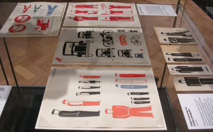
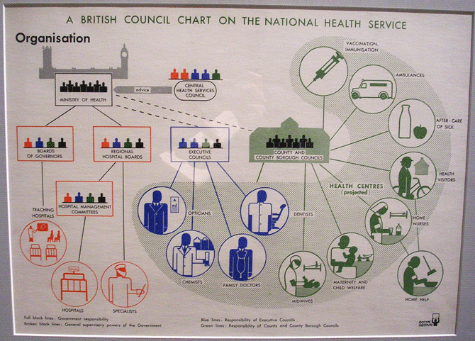
Last week I went to the V&A Museum to see the Isotype International Picture Language exhibition. The exhibition is a collaboration with the Department of Typography & Graphic Communication (University of Reading) and is also part of the research project ‘Isotype revisited’.
To be honest I was prepared to see the very well known Isotype graphics all around, as I have seen before, but I was gladly surprised with the approach of the exhibition. In addition to a less well-known set of posters and publications, I found truly amazing to see from a quite close distance (10 cm!) how each Isotype poster was created by hand. Each icon was drawn, printed, cut, and pasted within a rigid structure. Sketches from both Otto and Marie Neurath can also be seen, as well as Marie Neurath’s collection of children’s books composed with the Isotype language.
Another reason to see the exhibition is to learn a bit more about the history and principles of this graphic language. This is explained in a very comprehensive language addressed to both expert and inexpert audiences. Good to take the time to read the hisroty of Isotype, as sometimes designers seem to be missing some of the Isotype language principles, and are only creating set of icons and vsualising information without any philosophy/purpose/theory behind.
The only ”˜but’ is that the exhibition is a bit small. So, if you are around London, this exhibition is worth seeing. It is free and runs until March 13th. Enjoy it! And don’t forget your camera 🙂


Leave a Reply