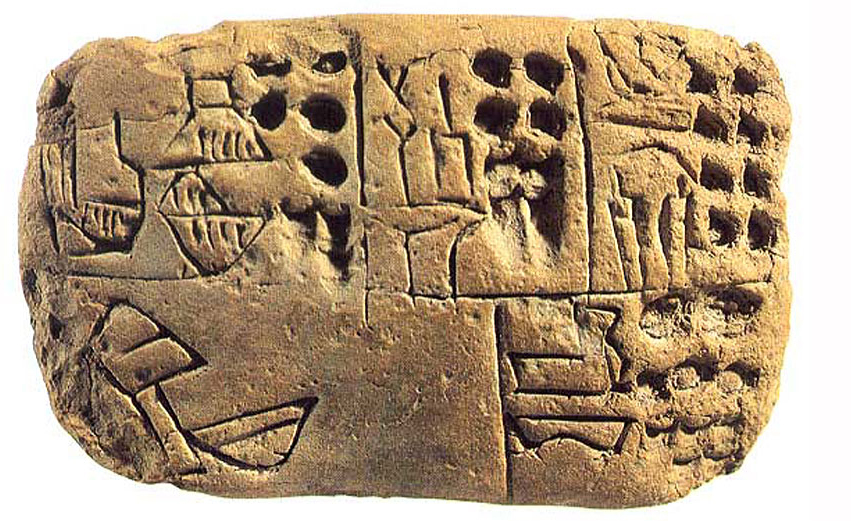
Last week I have been ”˜diving’ into the history of graphic design and I found amazing works dated from long time ago. Particularly the image below caught my attention, as it is one of the first ways of visual communication developed around 3000 bc.

This graphic writing tablet belongs to the Mesopotamian civilization and it is referred as pre-cuneiform writing. At the beginning, the writing system was logographic and ideographic, which means that signs represented a word or an idea. Signs could be grouped into four categories:
– Pictograms that represent all or part of a designated object;
– Realistic or abstract symbols, that transcribed a concept or an idea whose figurative meaning was not immediately recognisable;
– Numerical signs composed of notches or circles impressed in the soft clay with a round stylus;
– Complex signs formed by adding or combining two signs in order to convey elaborate pieces of information
In addition to the writing system, this tablet can be seen as one of the first attempts of information design. Yes! The way pictograms and signs were engraved in these type of tablets had a logic, and followed a rationale to organise information and improve understanding.
Mostly, these tablets were created with a specific purpose, such as store records or inventory lists, document earnings and expenses, entries and exits of merchandise (foodstuffs, fabric, cattle). In addition, some tablets documented how to raise cattle, others showed how to calculate surfaces and how to tend the fields. It is interesting to see how the different types of information have been organised without an alphabetic writing system. For this, the surface of the tablet was divided into columns and cells, each one containing a single piece of information. Finally, a number indicated by a notch, followed by the name of a person, an animal or a commodity designated by a drawing pictogram completed the information. Pre-cuneiform tablets were part of a sophisticated archive system in which each item of information was meant to supplement another. This means that we need to have a ”˜how-to-read-pre-cuneiform-tablets’ manual to have a complete understanding and decipher each tablet. In other words, not a single notch seemed to have been done arbitrary.
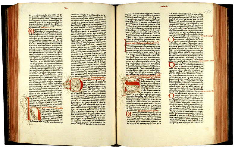
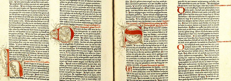
The second image I found fascinating is a double-spread of The Gutenberg Bible (1456). This was the first major book printed with a movable type printing press marking the start of the ”˜Gutenberg Revolution’ and the age of the printed book. It is undeniable the effort and work that this work conveyed. Just imagine that a single complete copy of The Gutenberg Bible has 1,272 pages, from which most of them were lately coloured by hand. However, apart from its high aesthetic and artistic qualities, the book has superb typographic legibility, a sense of organising information and defining a hierarchical structure of the information.


The most valuable factor of these works (and others from similar periods) is that they have been done without advance technologies, but with long hours of dedication and a strong idea. To some extent, I will always think that technology and (even more) digital tools have cheapened our (design) thinking.
Leave a Reply