Throughout the history key movements, people, schools, organisations and publications have contributed to the development, evolution and consolidation of the information design field. Here it is a non-exhaustive personal selection of 20 of them:
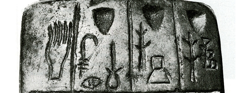
1. Pre-cuneiform tablets (3000 bc). First ways of visual communication developed in Sumer, a region of Mesopotamia. These tablets can be seen as one of the first attempts of information design. The way pictograms and signs were engraved in these types of tablets had a logic, and followed a rationale to organise information and improve understanding.
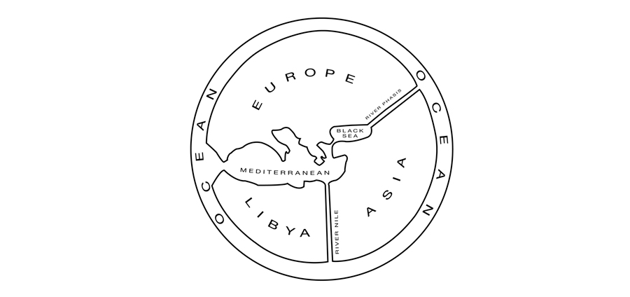
2. Early cartographic examples. The first map of the world was a simple illustration where the world is synthesised in a circle, containing three continents: Asia, Europe and Africa. It was created in Turkey (around 550 BCE) by Anaximander. While, the first route map (366 BCE) represents the road system of the Roman Empire. Much later, in 1375 a world atlas was made, which was a complete visual work of cosmography, along with a perpetual calendar and a thematic representation of the known world. The Atlas was commissioned by Charles the Fifth of France and made by Catalonian Abraham Cresques.

3. The Gutenberg Bible (1456). This was the first major book printed with a movable type printing press marking the start of the ”˜Gutenberg Revolution’ and the age of the printed book. This book has superb typographic legibility, and a sense of visual organisation, defining a hierarchical structure of the information.

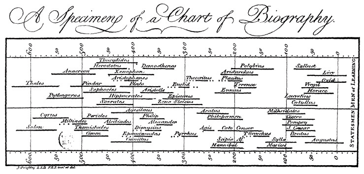
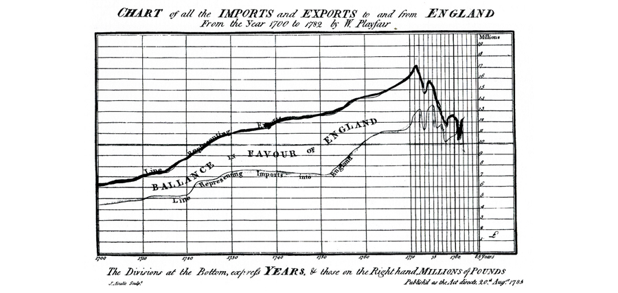
4. Charts and Graphs (1770-80s). Joseph Priestley created the first recorded graph of time depicted as a timeline, which was published in 1765. While in 1786 William Playfair published a great collection of graphics in his Atlas, The Commercial and Political Atlas (London), representing information about economics. The importance of Playfair’s study was the creation of a new graphic language that offered an alternative to the tabular presentation of information used prior to that date. Playfair said that: “Graphics are preferable to tables because graphics show data from a comparative perspective”
5. The Rose Diagram (1858). Diagram created by the nurse Florence Nightingale to show the poor sanitary conditions of hospitals under which the British army was exposed during the Crimean War (1853-1856). Nightingale’s diagram was part of her report about the soldiers’ causes of mortality in hospitals during the war aimed to change UK’s attitude to hospitals care. Nightingale believed that diagrams could be more effective ways of communication than only written words.

6. Cartí© Figurative (1869). Also worthy of mention is the graphic created by the French engineer Charles Joseph Minard, who added statistical diagrams and bar graphs to cartographic maps. His work displays a great amount of information carefully organised and visually coded.

7. Periodic Table (1871). Mendeleev presented a classification of the elements according to their chemical properties, noticing patterns that led him to develop his periodic table. Thanks to the clear organisation of the elements, Mendeleev predicted several new elements that would complete the table. The periodic table was later a piece of inspiration for organisation and classification of complex information for disciplines not related to experimental sciences.

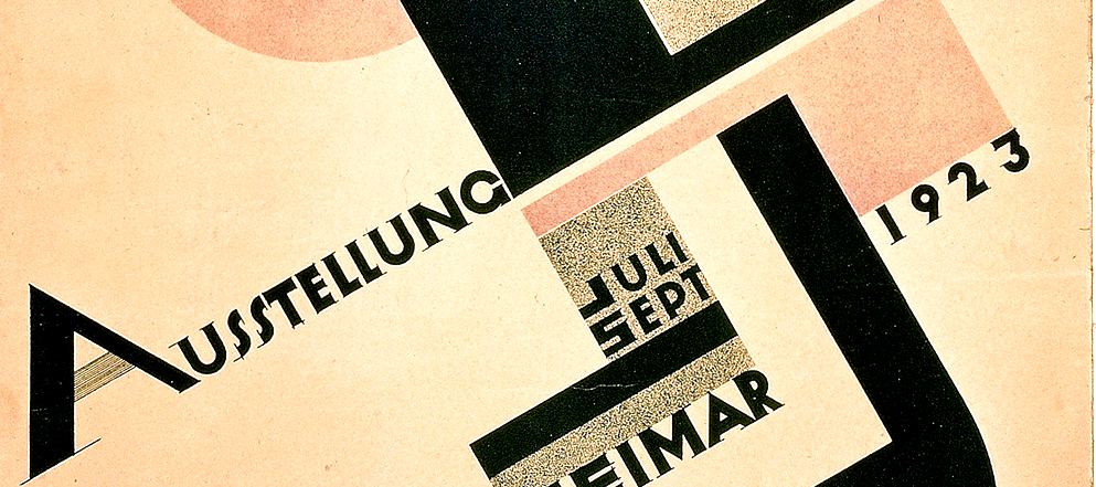
8. The Bauhaus School (1919-1933). Ideas from all advanced art and design movements were explored, combined, and applied to problems of functional design and machine production at the German design school, the Bauhaus, founded in 1919 in Weimar, Germany. The aims of the school were to create a functional and rational idea of design, and bridge the gap between art and industry, becoming the antithesis of the Arts and Crafts movement. Mass production was increasing every day, and the machine aesthetic demanded reduction to essentials, exclusion of the sentimental choices and visual distractions.
9. EL Lissitzky (1920s). Among other works, he designed three books which could be considered a key contribution to information design. In these books, he introduced the concept of visual programme and functional design, working with shapes and colours purposefully organised and creating a visual unity throughout the pages. In addition, he achieved visual clarity and understanding as a consequence of well-structured ways of organising both typographic and visual information.

10. The New typography (Berlin, 1920s). The essence of the new typography was clarity, not simply beauty; its objective was to develop form from the functions of the text. Similarly to the Bauhaus, this movement stressed utilitarian aspects in design, claiming that a thing becomes beautiful only when and because it serves a practical purpose, denying any attempts to artificially ‘adorn’ it.
11. Isotype language (1930s). This important movement towards developing a ”˜world with out words’ began in the 1920s, continued into the 1940s, and still has important influences today. The Isotype concept involves the use of elementary pictographs to convey information. The originator of this language was Otto Neurath, inspired by how the Egyptians and diagrams visualise ideas and factual information. Neurath felt that the social and economic changes following the First World War demanded clear communication to assist public understanding of important social issues relating to housing, health and economics. He developed a system of elementary pictographs to present complex data.

12. London Underground Diagram (1933). The invention of the LUD is another important contribution to the development of the information design discipline in the twentieth century. The difference between Henry Beck’s and other underground diagrammatic maps is that Beck defined and strictly followed a set of fundamental design rules to produce a usable and effective piece of design.

13. Ladislav Sutnar (1940s). He is considered the progenitor of the information design discipline, as he stated the importance of functionality over aesthetics in graphic design projects and the need to control and organise information in order to effectively communicate it.
14. The International Style (1950s). This style was a synthetic graphic language, based on a mathematical grid and the used of sans-serif typefaces. Its main characteristics were unity of design achieved by asymmetrical organisation of design elements on a mathematically constructed grid; objective photography and copy that present visual and verbal information in clear and factual manner, free from the exaggerated claims of propaganda and commercial advertising of the previous decades.

15. Semiology of Graphics (1963). Jacques Bertin published Semiologie Graphique, which became the essential book for organising visual and perceptual elements in accordance with information characteristics and relations. Bertin’s work created the foundations of the principles of graphic semiotics, developing a theory of graphic symbols and representational modes.

16. Visual programme (1964). Karl Gerstner introduced the concept of visual programme to the graphic design discipline, presenting a design method called the ”˜morphological box of the typogram’. Gerstner created a systematic method, merging art and science, that is capable of generating a broad range of design solutions in which results are not fixed and the form should and must take its shape in obedience to an order or formula.
17. Organisations, Publications and Conferences (1980s). An interest forresearching, sharing and learning about information design emerged during the last decades of the xx century. First PhD investigations about design started to appear in the 80s. Associations such as SND (1979), IIID (1986) and IDA (1991), and design publications such as Information Design Journal (1979) and Visible Language (1967) were also ”˜born’ during those years.
18. The Visual Display of Quantitative Information (1983). Edward Tufte’s first book introduced the idea that effectiveness is not related to beauty or technology but to appropriate organisation of information. His books display old-fashioned, but clear diagrams over cluttered, flat modern ones.
19. Understanding is everything (1989). Richard S. Wurman explains that for effective organisation, understanding the problem is essential. Wurman devotes most of his books to explaining the meaning and importance of ”˜understanding’. He points out that it is essential for the graphic designer, information architect or information designer to acknowledge the power of organisation to increase understanding and to have in their repertoire an efficient method of organising.

20. Malofiej (1993-2012). In 1993, the first edition of the annual, international competition for print and online information graphics, named for Argentinean infographer Alejandro Malofiej, was launched. Conferences and workshops have been also part of the programme of this event. In addition, it brings together a great number of specialists, students, professionals and researchers of the field, creating a rich space for discussions, learning and sharing. Undeniable, this event has been an invaluable key contributor and essential reference for the development and consolidation of information graphics, and thus information design.

The above 20-milestone list makes evident the essence of information design: understanding and information organisation. That’s why I would like to conclude with Wurman’s (2004) words:”˜There is only one God that I serve and that is the God of Understanding. If you serve that God, all the others will be taken care of. My quote is: “The only way to communicate is to understand what it is like not to understand.” It is at that moment that you can make something understandable.’
Some references
– 19.20.21 Project
– Bertin, J., 1983. Semiology of graphics, diagrams, networks, maps. Madison: The University of Wisconsin Press.
– Friendly, Michael. Denis, Daniel J. Milestones in the History of Thematic Cartography, Statistical Graphics, and Data Visualization. York University, Canada.
– Funkhouser, H. G. Historical Development of the Graphical Representation of Statistical Data. Osiris, Vol. 3. 1937, P. 272-464
– Garland, K., 1969. The design of the London Underground diagram. The Penrose Annual, 62, pp.68-82.
– Gerstner, K., 2007. Designing programmes: instead of solutions for problems, programmes for solutions. 3rd ed. Baden: Lars Muller Publishers.
– Meggs, P.B., 2006. Meggs’ history of graphic design. Chichester: John Wiley.
– Mijksenaar, P., 1997. Visual function: an introduction to information design. Rotterdam: 010 Publishers.
– Mí¼ller-Brockmann, J., 1996. Grid systems in graphic design: a visual communication manual for graphic designers, typographers and three dimensional designers. Niederteufen: Arthur Niggli.
Leave a Reply