‘We need to starts with the basics’ repeats one of my good friends quite often. Although she says this quote in a complete different context (she is not related to design at all), I found that these words summarise the approach of my practice and my research work. Many times I have the feeling that we, designers, are always in a hurry, we want to have the latest technology devices, create the most fashionable outcome, learn all about the newest digital tools, etc. However, great percentage of current design outcomes and in particular that of information design presents basic mistakes, such as forget to include the title, not use colour wisely, code data inconsistently…
Information design and information graphics are not synonymous. As I explained in my talk at Malofiej 20 (M20) and in previous papers, information graphics is a tiny part of what information designers do. Roughly, information graphics are visual representations, which combine textual and graphic elements created to supplement or enhance communication. The term ‘information graphics’ is commonly used in visual journalism and editorial design contexts. Nevertheless, information graphics can be created beyond that context as a tool to enhance understanding of complex information.
In short, information design principles and rationale can be applied to the development of information graphics, and the analysis of information graphics problems can improve the information design discipline.
Ill-defined information graphics

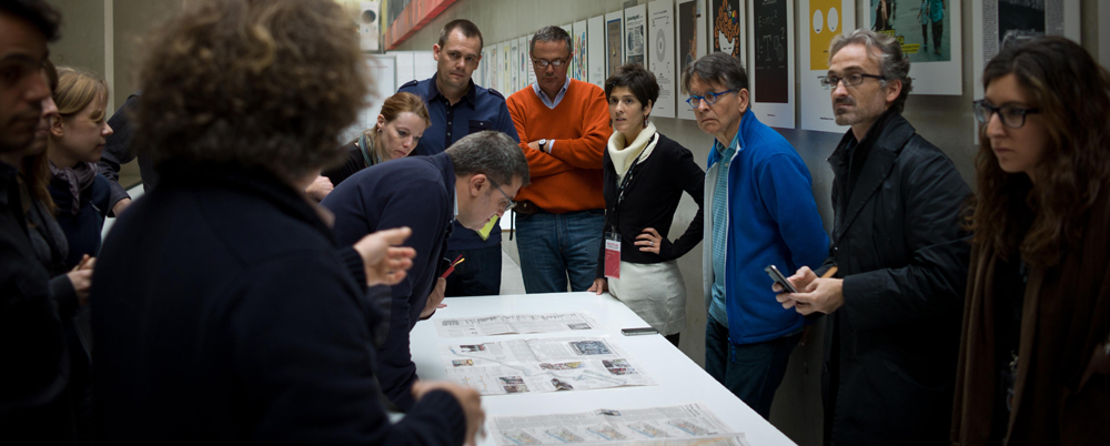
In this post I will analyse the entries I had the chance to judge during Malofiej20. Many of the entries were impressive works, showing deep research and high quality design skills. However, many others can be described as ill-defined information graphics. Usually ill-defined information graphics are a consequence of ineffective conceptual design development which results in inappropriate coding decisions. I divided common indicators of this phenomenon into two group following Bertin‘s and Baer’s terminologies:
Content
Clarity: Information graphics are representations purposefully developed to inform, describe, explain and instruct. They are a specific typology of complex diagrams which aims at enhancing understanding by communicating information with clarity. Information graphics which fail to do this, result in unclear or excessively complex visualisations.
Credibility information: Tufte explains that for complex diagrams to be considered reliable they must include information about their quality and integrity; i.e. information about authors, data sources, date of creation and origin. He adds that complex diagrams that include credibility information are clearer to comprehend, as they give their audience their ”˜personal information’, facilitating in advance understanding of what their content is about.
Main subject areas: Data is perceived and understood in organised information fragments, called chunks (Dorst and Lawson, 2009). Designers are able to chunk or group a great amount of information together under the heading of a category, i.e. type of information and subjects areas. Chunking groups of information fragments into single types of information is a key stage for the development of effective information graphics.
Hierarchy and information flow: To visually communicate complexity designers classify types of information following an organisation rationale. A correct organisation of chunks is based on their levels of importance (Baer, 2008) and is the result of a deep content analysis and understanding.

Form
Weighting, grouping, rhythm of elements: Clustering information helps readers locate the information they are looking for. Many authors (e.g. Engelhardt, Mijksenaar, Bertin) have conducted studies about the application of visual variables (using Bertin’s terminology again) to code information. Moreover, we, designers, have been taught the meaning of coding information since the very first day at university (Every time I see two shapes, words, or icons of the same colour I cannot help but thinking that they should be related somehow). However, information graphics with weak graphic coding abound. Colour is often applied arbitrary and shapes are designed randomly. Too many colours or palettes of pretty similar hues to code information are often used, creating a real challenge for the reader, and decreasing legibility and understanding.
Typography and type styling: Similar to graphic coding, typography can be used to code information. A basic way would be to attach a different size or typographic variable to denote each type of information. Often bold, uppercase and bigger sizes are used to indicate the most important information. Another basic lesson would be: not to use more than two typographic families at the same time, as it could result in a typographic catalogue. Typographic coding demands high sensitivity and great clarity.
Composition and structure: Lack of meaningful space, unnecessary graphic elements and clumsy composition decisions are recurrent problems in information graphics. If load of information is visualised but there is no story behind, the result is disconnected elements ”˜dropped’ in the space. A visual, conceptual or structural connection should exist between visual and textual elements.
There is one more category that I haven’t included here: Imagery, because I will discuss it in my next post.
As a mental note: Deep content understanding is needed to communicate great clarity. Consistency and purpose are also steps towards effective visual communication.
– Baer, K., 2008. Information design workbook: graphic approaches, solutions, and inspiration + 30 case studies. Beverly (Mass): Rockport.
– Bertin, J., 1983. Semiology of graphics, diagrams, networks, maps. Madison: The University of Wisconsin Press.
– Dorst, K. And Lawson, B. (2009) Design expertise. Oxford: Architectural Press
– Costa, J. & Moles, A., 1992.Imagen didáctica. 2nd ed.Barcelona: Ed. CEAC.
– Erlhoff, M. & Marshall, T., 2008. Design dictionary: perspectives on design terminology. Basel: Birkhí¤user.
– Tufte, E., 1983. The visual display of quantitative information. Cheshire (Connecticut): Graphic Press.
– Tufte, E., 1990. Enviosing information. Cheshire (Connecticut): Graphic Press.
– Tufte, E., 1998. Visual explanations. Cheshire (Connecticut): Graphic Press.
– Tufte, E., 2006. Beautiful evidence. Cheshire (Connecticut): Graphic Press.
Leave a Reply