Among information (visual) fields there seems to be great confusion on the appropriate use of core terms. Particularly, the terms: information design, information visualisation and data visualisation are the ones that are daily used and, at the same time, arise more uncertainties among practitioners, academics, students and teachers from diverse disciplines. Other terms, which are also related to information analysis, sensemaking and visual reasoning seem to be less frequently used, such as scientific visualisation and the emerging field: visual analytics. Some of the those terms are also often used interchangeably (e.g. information design and information visualisation), even though they referred to different fields of study, and therefore have dissimilar goals, objectives and applications. Although, visual analytics and scientific visualisation are less popular terms within the (visual) design community, there is a lack of clarity clarity around them, as well as between information visualisation and visual analytics, between the former and data visualisation. This post aims to shed light on the design community and other relevant disciplines by defining each of the above fields related to assisting the sensemaking process of complex information and large datasets.
Information design (ID)
The main goal of information design is clear, transparent and unambiguous presentation of information to enhance understanding, dialogue and communication. ”˜Elements from a large number of academic disciplines’ enrich this field of study, including graphic design, communication sciences and journalism; interface and user experience design; information and media production technologies; cognition, perception, behavior and applied psychology; information science and management, and sociolinguistics (Pettersson, 2010; Waller, 2011). Each of them has influenced the development of the information design field, which involves a multi and interdisciplinary approach to communication (Baer, 2008).
The main objective of the field is the communication of information from different levels of complexity in more understandable ways accessible to wider audiences. Information designers’ work involves the facilitation of dialogue and interaction at human level, dealing with aesthetic concerns in later stages of the problem-solving process, the primary stages being the thinking ones. The information design process involves different stages, actions and tasks, such as strategic planning, problem analysis, methodology development and visual design, which make a team approach essential for the field.
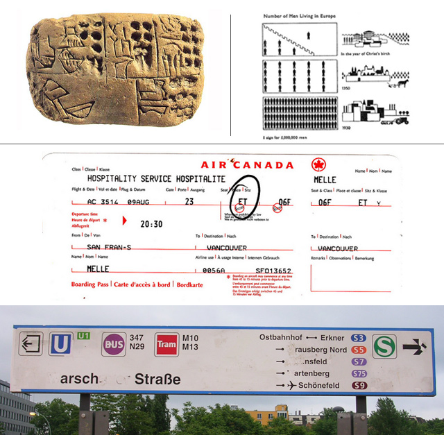
Information design examples date from centuries ago and the range of solutions is broad and diverse, covering more than information graphics. They can include tangible artefacts (e.g. manuals from products or services, forms to fill out and feedback displays, instructions on prescription bottles), visualisation and communication strategies (e.g. toolkits, methodologies, organisational models) and navigation systems (e.g. on roads, airports and train stations, museums and galleries, hospitals, open areas).
Information Visualisation (InfoVis)
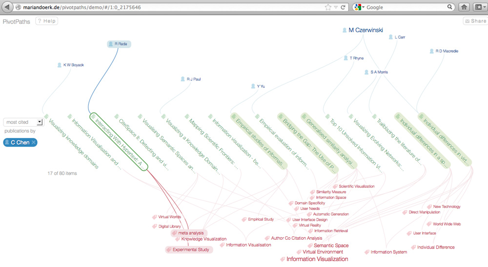
Information visualisation is a relatively new field of study, having less than 20 years of history (Chen, 2004). Although InfoVis does have some commonalities with information design, it does not sit entirely within the information design domain. InfoVis works with ”˜computer-supported, interactive visual representations of abstract data to amply cognition’ (Dí¶rk, 2012) for which computer science, human-computer interaction and software development skills are essential to complement cognitive and perceptual knowledge. Information represented on screens combined with interaction techniques help decrease the necessary efforts to acquire knowledge by allowing users to see, examine and make sense of large amounts of information at once.
InfoVis is also defined as ‘large-scale collections of non-numerical information, such as files and lines of code in software systems’ (Friendly, 2009). Interactivity is the key word for InfoVis. Digital libraries, WWW, human-computer interaction and computer sciences are the domains from which InfoVis has emerged.
Originally, the term visualisation has been used to refer to ”˜a graphic representation of data or concepts’ (Ware, 1999), but nowadays, this term is increasing related to visualisations which are produced by computers and specialised software. Information visualisations are created to communicate ”˜abstract data relevant in terms of action through the use of interactive interfaces’ (Keim et al., 2008a), aimed at:
- Presentation: Information visualisations can be used to communicate the results of an analysis, in which data to be displayed are determined in advance and the way they are presented is based on the user’s needs.
- Confirmatory analysis: Information visualisations can be used to help support or reject initial hypotheses by displaying a ”˜goal-examination process’ of one or more hypotheses.
- Exploratory analysis: Information visualisations can be used for searching and analysing large amount of data to help find patterns and unravel hidden connections by presenting a different angle of datasets.
In short, InfoVis is concerned with the creation of approaches for conveying abstract information in intuitive ways. Nevertheless, ”˜information visualisation does not necessarily deal with the analysis tasks nor does it always also use advanced data analysis algorithms’ (Keim et al., 2008b). The field that involves analysis tasks, decision-making and data processing is Visual Analytics, which is discussed below.
Data visualisation (DV)
Before defining Visual Analytics, it is worth explaining another term which also seems to arise confusion among the information communities: Data visualisation. Particularly, the term DV is used to refer to the graphic representations of data used to visualise the information in the data in exploratory data analysis, including graphics displaying statistical data, structures, networks, graphical models and trees (Unwin et al., 2006). DV helps ”˜identify trends and clusters, for spotting local patterns, for evaluating modelling output and for presenting results’ (Unwin et al., 2006).
While InfoVis is interested in the visualisation of information of all kinds, DV is often used in the context of and as a complement of statistical analysis to explore, uncover and present information (Unwin, et al., 2006). DV does aim to present any information in the data, but ”˜another goal is to display the raw data themselves, revealing the inherent variability and uncertainty’ by creating statistical graphics.
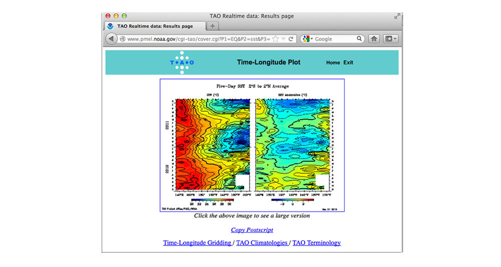
Scientific visualization (SV)
Scientific visualisation works with ‘3D+ phenomena (architectural, meterological, medical, biological, etc.), where the emphasis is on realistic renderings of volumes, surfaces, illumination sources, and so forth, perhaps with a dynamic (time) component’ (Friendly, 2009). This field of study ”˜examines potentially huge amounts of scientific data obtained from sensors, simulations or laboratory tests’ (Keim et al., 2008a). SV is based on scientific theories; therefore the meaning of each pixel could be quantified, minimizing the risk of ambiguity or misconception (Chen, 2004). Often, SV does not work with raw data but with ‘data that are either readily presentable in visual forms or readily computable to a presentable level’ (Chen, 2004).
Outcomes ranged from ”˜superbly realistic 3D graphics’ (Unwin et al., 2006) to quantitative and 3D geometric models with explicit references to time and space that derived from scalar, vectorial, or sensorial fields.
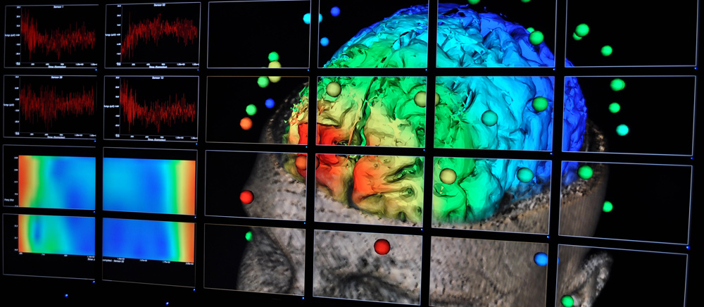
Visual Analytics (VA)
Visual analytics is an emerging field that has evolved from information visualisation and scientific visualisation. ”˜Visual analytics combines automated analysis techniques with interactive visualisations for an effective understanding, reasoning and decision making on the basis of very large and complex datasets’ (Keim et al., 2008b:157). VA combines the ”˜strengths of machines with those of humans’, in other words human factors and computational data analysis. Similar to information design, the visualising component is only one side of this field as it integrates aspects and ”˜methodologies from information analytics, geospatial analytics and scientific analytics’. Its main goal is to ”˜gain insight’ of a problem described by large amounts of ”˜scientific, forensic or business data from heterogeneous sources’. However, it is important to highlight that if a large dataset analysis does not require the use of algorithms, then it cannot be considered a visual analytics problem.
Reflections
The above five definitions belong to five different information fields and practices. As mentioned at the beginning of the post, some of those fields have well-defined domains and applications, but that of others are blurred and still unclear. Initially when I started writing this post I was determined to clearly demonstrate that information design and information visualisation were two different fields. Now, at the end, I realised that that differentiation is no longer necessary as, based on the above explanations, each of those two fields have clear defined domains. However, now a new challenge has arisen: how information visualisation and data visualisation can be clearly defined? Both of them are beyond my area of expertise, which means that it may take me a while to find the answer to that question.
Another aspect that deserves further discussion is the aesthetic side of each of the above fields, and the contrast between information design outcomes and that of the other four. Visualisations created by non-info designers often lack of aesthetic sensibility because they belong to a different domain than that of (graphic) design. Analysts, computer scientists and human-computer interaction designers (the frequent creators of those types of visualisations) do not have visual design skills; instead their toolkit is composed of codes, software, algorithms and mathematical formulas. On the contrary, information designers do have a vast set of aesthetic skills (I won’t discuss now whether these skills are always properly used) but do not tend to work with complex software codes or understanding algorithms.
This is why I am looking forward to exploring projects in which sets of skills from both the information design field and other information visual fields (i.e. InfoVis, DA, SV and VA) are combined and work together.
– Baer, K., 2008. Information design workbook: graphic approaches, solutions, and inspiration + 30 case studies. Beverly (Mass): Rockport.
– Chen, C. (2004) Information visualisation. Beyond the horizon. London: Springer.
– Dí¶rk, M. (2012) Visualisation for search: Strolling through information landscapes (Lecture) UCLIC, December 2012.
– Friendly, M. (2009). Milestones in the history of thematic cartography, statistical graphics, and data visualization (Digital) [Accessed online 13 June 2010]
– Keim, D., Mansmann, F., Schneidewind, J., Thomas, J., & Ziegler, H. (2008b). Visual analytics: Scope and challenges. In: S. e. al. (Ed.), Visual Data Mining (pp. 76-90). Heidelberg: Springer-Verlag.
– Keim, D., Andrienko, G., Fekete, J. D., Gí¶rg, C., Kohlhammer, J., & Melaní§on, G. (2008a). Visual analytics: Definition, Process, and Challenges. In: Information Visualization: Human-Centered Issues and Perspectives , 4950 , 154-175.
– Pettersson, R. 2010. Information design: Principles and guidelines. Journal of Visual Literacy, 29(2), 167-82.
– Unwin, A., Theus, M abd Hofmann, H. (2006) Graphics of large datasets. Visualising a million. Series: Statistics and Computing. Springer: Singapore
– Ware., C. (1999) Information visualisation. Perception for design. US: Morgan Kaufmann Publishers
– Waller, R. (2011) Information design: how the disciplines work together. Technical paper 14. Simplification Centre: London.
Leave a Reply