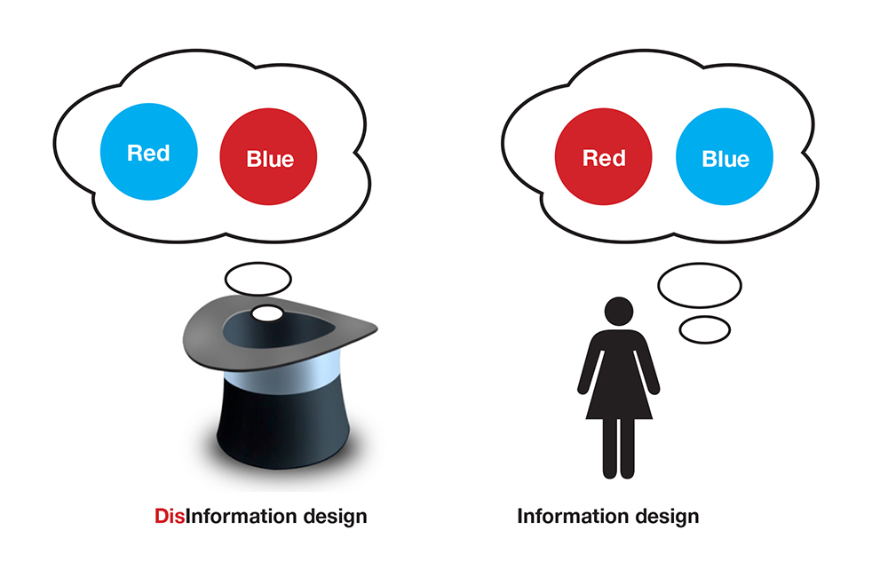
Much has been written about the recurrent creation of visualisations which fail to enhance communication and understanding, and prioritise the process of creation and visual languages over the presentation of accurate and informative content. A while ago, I was reading (again) the book Visual Explanations (Tufte, 1998) and came across a concept I didn’t remember from my previous readings: Disinformation design.
In the book, Tufte uses the term in the context of Magic to describe visualisations which purposely deceive the audience (here referred to as magic visualisations). However, the term can also be used to refer to ineffective information design. A clear example would be visualisations which succeed in hiding relevant information, creating misleading communication, and corrupt messages. Tufte explains that these type of visualisations emphasise the method of display (e.g. visual language, technique, software) instead of the data. Others describe ill-conceived visualisations as ‘data-thin’ visualisations in which the information density displayed is not robust or rich enough to construct valuable meaning (McFedries, 2012).
Information designers, not magicians
On the one hand, there are some commonalities between magic visualisations (i.e. disinformation design) and effective visualisations (i.e. information design), in the sense that both try to present a ‘seamless and convincing alternative reality’ (Marchak, 2000). For that, both filter information (choosing what to show and what to hide), and use similar techniques and tools, metaphors and user evaluations to ‘make the ordinary [raw data/content], look extraordinary [visual]’ (Marchak, 2000).
However, both type of visualisations have opposite aims: magic visualisations (e.g illusions and magic tricks) are concerned with creating misleading or misdirecting situations, while the goal of effective visualisations is to make sense of distorted or misdirected situations by creating transparent and accurate communication. In line with this idea, some authors suggest that ‘the reverse of [magicians] techniques hold true for the visualisation creators’ (Juell & Shanmugasundaram, 2004). Therefore, the mere visualisation of information is not the practice of information design. Making sense of a situation and improving understanding are the essence of information design.
From above, it could be argued that both types of visualisations hide information, as in both cases creators filter information when deciding what to convey. Nevertheless, the difference relies on why and in response to what decisions are made. Magicians make decisions based on their own interests and show the audience what they want them to see, information designers place the audience over their own interests, always seeking audience’s sensemaking.
From a cognitive perspective, disinformation design operates at a different level from information design too. Information designers reduce unnecessary content to minimise cognitive work and facilitate the process of learning and processing. Disinformation design plays with people’s perceptions and cognitive processes by shaping reality and creating illusions that may challenge understanding.
Misused disinformation design
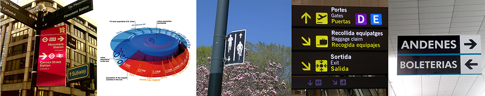
Examples of ineffective information design which results in misused disinformation design are created every day (e.g. images above). One frequent problem arises when information is visualised following arbitrary decisions instead of informed decisions made on design principles, or when the principles followed are not information design ones. As a consequence, some visualisations are hard to read, use and understand, have misleading and not informative enough messages.
Sadly, misused disinformation design seems to be unnoticed by clients, general public and information visualisation consumers. This becomes evident when bad or ineffective information design decisions are not questioned, but accepted. A major Re-educating them is a major current challenge, which should begin by re-educating us (information design practitioners), rethinking our decisions, our design processes and our creations.
Once again: Information and Disinformation design do work with similar tools and techniques, but have opposite goals. The former aims to create clarity and unambiguous communication, the latter is concerned with the creation of confusing and misleading situations. Nevertheless, both practices are equally valuable and useful, and this post does not intend to discredit disinformation design, but to stress the importance of understanding what we are trying to do and not to do. Otherwise we could end up achieving the latter when we were aiming for the former, and vice versa.
—
– Marchak, F. (2000) The magic of visual interaction design. Newsletter ACM SIGCHI Bulletin, 32(2): 13-14
– McFedries, P. (2012) Tufte-isms. The proponents of information design, present””and talk about””data efficiently. Spectrum, IEEE – ieeexplore.ieee.org.
Leave a Reply