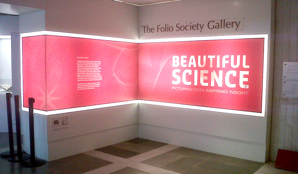
Today I visited the “Beautiful Science: Picturing Data, Inspiring Insight” exhibition at the British Library. The small exhibition explores how scientific information from different areas, including health, weather forecast and human evolution, has been visualised throughout the years. It also “explores how our understanding of ourselves and our planet has evolved alongside our ability to represent, graph and map the mass data of the time.”
The journey begins with a series of book annotations and mathematical expressions of raw information before being translated into visual form. Interestingly, both old, iconic information design objects (e.g. John Snow’s cholera map and Florence Nightingale’s Rose diagram), and new interactive visualisations (e.g. Tree of Life Branches) are displayed. Older visualisations are presented in their original formats (i.e. books) protected by glass boxes, and computers allow the public to interact with the newer ones through touch-screens.
From an information designers’ point of view, I missed some statistical graphics by William Playfair or Joseph Priestley both also key contributors to the evolution of the field, and some projects bridging older and more current visualisations, such us the work by Otto and Marie Neurath. But, the exhibition does present a rich variety of visual forms and gives a sense of how information design has been gaining scientific value. The diagrams, maps and charts displayed are examples of well-conceived and effective visualisations, letting the viewer reveal meaning, identify trends, and associations among data. Iconic projects reveal the importance of conceptual design over software and technical languages, and interactive projects provide a playful and pedagogic element to the exhibition, encouraging the public to learn by interacting.
In short, the exhibition provides the rare opportunity to get closer to (and even analyse!) foundational information design work, and also appreciate how it has influenced the creation of new information design projects.
So, if you are in London, it is worth paying a visit to the British Library before the end of May.
—
Beautiful Science: Picturing Data, Inspiring Insight. The Folio Society Gallery (British Library) – 20th February – 26th May, 2014 – Free. Other related events and talks are also part of the exhibition.
Leave a Reply