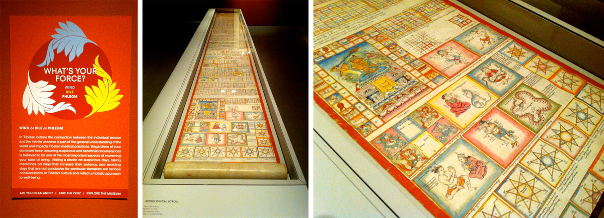
A few weeks ago, I visited the Rubin Museum of Art in New York City to check Bodies in Balance. The exhibition presents an information design journey through “the origins, history and practice” of Tibetan medicine. Tibetan science principles of healing are visually represented in “paintings, manuscripts, and medical instruments.”
The journey begins with a questionnaire for visitors based on the foundation of Tibetan medicine: the three forces or energies (Nyes-pa-gsum) composing the human body. When Wind (Loong), Bile (mKhris-pa) and Phlegm (Bad -Kan) energy systems are in balance, the body is in good health, and when one of those systems is low in energy, we are sick. The questionnaire helps visitors determine whether their bodies are in balance.
The exhibition is built on those three energies too. To explore the exhibition, visitors can choose their own route or follow one of the three routes indicated with blue, yellow and white; each colour responding respectively to the three energies. Based on the initial questionnaire, visitors can follow the route of their lower energy system to learn how to correct it.
The journey continues with “approximately 140 objects dating from the 9th century to the present day” distributed in two floors. Most of those objects are diagrams, schematic representations and timelines which unravel the thinking and healing processes behind Tibetan medicine. Both the older and the newer objects follow key foundational information design principles: constructive synthesis of information, clear organisation, and content-driven design.
Learning, Understanding, Dissecting, Reconstructing
The information design objects of the exhibition display large amounts of complex information. Tibetan medicine is a complex system based on “four medical tantras and two concluding chapters which condense all the preceding information” (e.g. Buddhistic and Ayurveda philosophies). In total, this adds up “156 chapters with 5900 verses,” involving “causes, symptoms and treatment of many different kinds of diseases,” descriptions of the human body (embryology anatomy and physiology), and diagnosis and pharmacology. In addition, this medical system takes into account “the qualities of five universal elements to form the many different aspects of the physical body”: Earth, Water, Fire, Wind and Space. The learning of Tibetan medicine demands a minimum of seven years in which the four tantras are studied and an average of forty chapters are memorized.
To gain better understanding of the content of those tantras and philosophies, Tibetan doctors synthesize that information and visualise explanations, different processes, main aspects and steps involved in the complex medical system. Medical illustrations and diagrams support understanding and provide guidance to doctors, and are also tools for learning and communicating with peers. Some diagrams are instructional and explain anatomic processes, while others display ways in which a disease could be spread.
Organising, Coding, Presenting
To be effective, a constructive synthesis of information needs to be supported by a clear information organisation. In the exhibited visualisations, information hierarchies are purposely determined and organised in clearly-defined structures. Some of the visualisations are based on tree structures, others in circular structures, and others in more squared structures. In all cases, information is organised following a strong structure which facilitates the understanding of the visual narrative flows, and the steps and phases involved in the processes are clearly distinguished.
In addition to structure, exhibited visualisations display a complex (but clear) colour and iconic coding system. Colours and icons are consistently used in each diagram combining aspects of the five universal elements (Earth, Water, Fire, Wind and Space) and medical principles to construct meaning. The Astrological Scroll, which is included in the exhibition, is an example of both principles being effectively used to convey large amounts of complex information: it combines a strong squared structure which permits information to be thematically grouped and hierarchies visually distinguished, and a rich visual coding system which helps identify connections and related information.
As most visitors are unlikely to be Tibetan doctors or speak Tibetan, small reproductions are situated next to the most complex visualisations translating Tibetan textual elements into English or presenting a key for coding systems used. These aids help non-experts bridge their own background knowledge and medical-related knowledge, and also get more familiar with the Tibetan medical system.
Visualising complex systems
The visualisation of a complex system, like a medical system, demands a thoughtful process of learning, understanding, dissecting, synthesizing, and reconstructing information to convey patterns, steps and connections to support and deepen the initial understanding. The exhibition diagrams and other visual objects evidence the important role of following information design principles to achieve clarity and effectively communicate complexity.
——
The Exhibition:
– Bodies in Balance – March 15, 2014 – September 8, 2014 [Friday Evenings Free]
Expanding knowledge:
– Tibetan Medicine – The Science of Healing
– Balancing Health – Tibetan Medicine
Principles described in this post are based on:
Pontis, S. & Babwahsingh, M. 2013. Communicating complexity and simplicity: Rediscovering the fundamentals of information design. 2CO COmmunicating COmplexity. Alghero, Sardinia, Italy, 25-26 October 2013
Leave a Reply