Information designers create visualisations at various instances of their problem-solving process. Working or process visualisations are often created during conceptual stages, and represent information designers’ thoughts, ideas, tests, research, and learning phases. While making sense of content, they draw, sketch, and diagram to externalise and, in some cases, share their thinking. In some cases, information designers create visualisations as the solution of a problem. These latter visualisations have been widely analysed and discussed.
Both types of visualisations are originated from quantitative content (e.g. displayed as pie charts, tables and graphs, or more complex visualisations combining those structures), qualitative content (e.g. timelines, infographics) or a combination of both types of contents. This post unpacks the terms qualitative and quantitative when visualising content, and discusses the differences between data and information.
Content: Data and Information
The terms information and data are sometimes used in a quantitative sense, referring to (numeric) content, while in other cases they are used in a more generic way, denoting any piece of content or collection of facts. However, technically speaking, each term has its own definition.
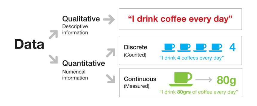
Data. Data is defined as “facts (such as values or measurements) and statistics collected together for reference or analysis.” This collection of facts can be qualitative or quantitative:
- Qualitative data is descriptive content (it describes something)
- Quantitative data is numerical content (numbers)
At the same time, quantitative data can be Discrete (counted) or Continuous (measured). Data is Discrete when it only takes certain values (e.g. whole numbers), and data is Continuous when it takes any value (e.g. within a range). Both qualitative and quantitative data is also raw material, which means that data needs some sort of processing and be put into context to be useful or usable.
Information. Information often denotes a qualitative meaning and is defined as “facts provided or learned about something or someone.” Information is also described as “data that has been processed in such a way as to be meaningful to the person who receives it.” In other words, information is structured (or processed) data or data in context.
Working with & visualising content
Information designers make sense of content by findings patterns, identifying habits and trends, and visualising their thinking process. These actions help gain understanding of hidden or unsaid stories in the content, and eventually find a solution to the problem. To some extent, making sense of quantitative content may seem as a more straightforward process as information designers can rely on percentages and statistics to interpret the data, and construct and visualise an understanding. Quantitative sensemaking is frequently related to measurement by “statistical, mathematical or numerical data or computational techniques” in order to find trends and unravel stories.
Making sense of qualitative content may be seen as a more uncertain process because it can be harder to know from where to start finding trends, what working visualisations to create, or how to do it objectively and unbiased. As with quantitative content, qualitative sensemaking also involves the search of trends (emerging themes) from the data and the discovery of a story, but it does not involve mathematical analysis or measurement. Stories and themes are considered valuable when credibility and replicability can be demonstrated, for which following a systematic and rigorous process is essential. Working visualisations are very much part of the process too. In a previous post, I discussed ways to make qualitative sensemaking more rigorous but also more transparent.
Both quantitative and qualitative content, and visualisations are intrinsic components to information design. Information designers conduct quantitative and qualitative sensemaking to gain a better understanding of and solve problems. They also create visualisations to assist that process, but sometimes they create them as final solutions too.
Some types of content may require more thinking and work than others to make sense of depending on the information designer’s expertise and background knowledge. But, a visualisation is an abstraction of any type of content.
Leave a Reply