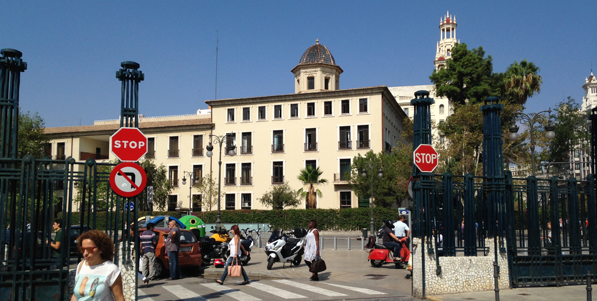
Earlier today I was walking around the old town in Valencia, where I’m teaching a course, and found a very interesting situation captured in the above photo. I walked out from the train station and something caught my attention, something was off. I had the same feeling as when reading an ill-conceived infographic or paying attention to an unclear: there was a lack of rigour and consistency in the middle of a street. Please check the above photo if you haven’t done already.
Have you spotted the inconsistency?
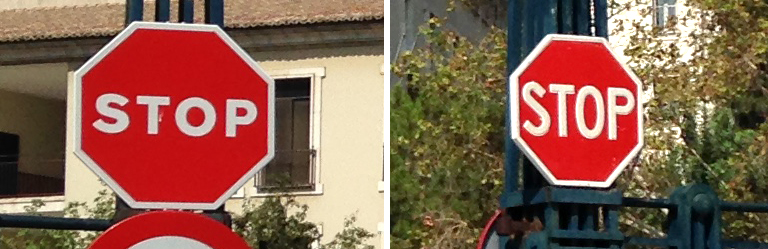
There are two types of STOP signs in the photo. I know the difference between them is only on the size font and family font, but made me think, why not using two identical STOP signs? If we were talking about an editorial project, every design would (or should!) make sure that the use of typography is consistent throughout all pages. If we were working on a PPT presentation, we would double checked fifty times that the position of the elements on each slide is in the same place. And if we were creating a visualisation, we would pay attention that the colour to code the same type of information is being used consistently. So why not put the same amount of care when designing for/in/to a city or any other open urban space?
Why can’t we apply to urban spaces (such as town, neighbourhoods, streets, cities, roads, etc.) the same level of rigour and consistency in the application of information design principles that we use for other projects, if those principles facilitate understanding? A city is a much bigger ‘canvas’ than a book or a PPT presentation or a visualisation, but sadly lack of consistency can often be found in much smaller urban spaces too (e.g. a street, museums, supermarkets).
What about wayfinding? Wayfinding design solutions greatly facilitate navigation in museums, airports and, in some cases, in some parts of a city but only when those solutions have been effectively conceived and developed. I haven’t visited every city in the world yet, but so far, I haven’t seen information design principles applied broadly and consistently throughout all problems of a same city.
The overproduction of information that characterised the information age does also involve urban information: e.g. transit signs, Wifi signs, road work signs, sale signs, store signs, adds, crossing lights, road markers, street names, house numbers, shop names, etc. It is without saying that each of these sign systems has their own language and sets of rules, and within each system there are more than one sub-set of rules and languages, and so one. Somehow, we have already learnt (either by intuition or by studying) how to deal with all those different sign systems in a city.
Finding a way to make all those systems consistent or at least a way to reduce or minimise the level of visual clutter of a city would also help reduce levels of stress and feelings of getting lost (both introduced as feelings experienced when dealing with information anxiety).
Leave a Reply