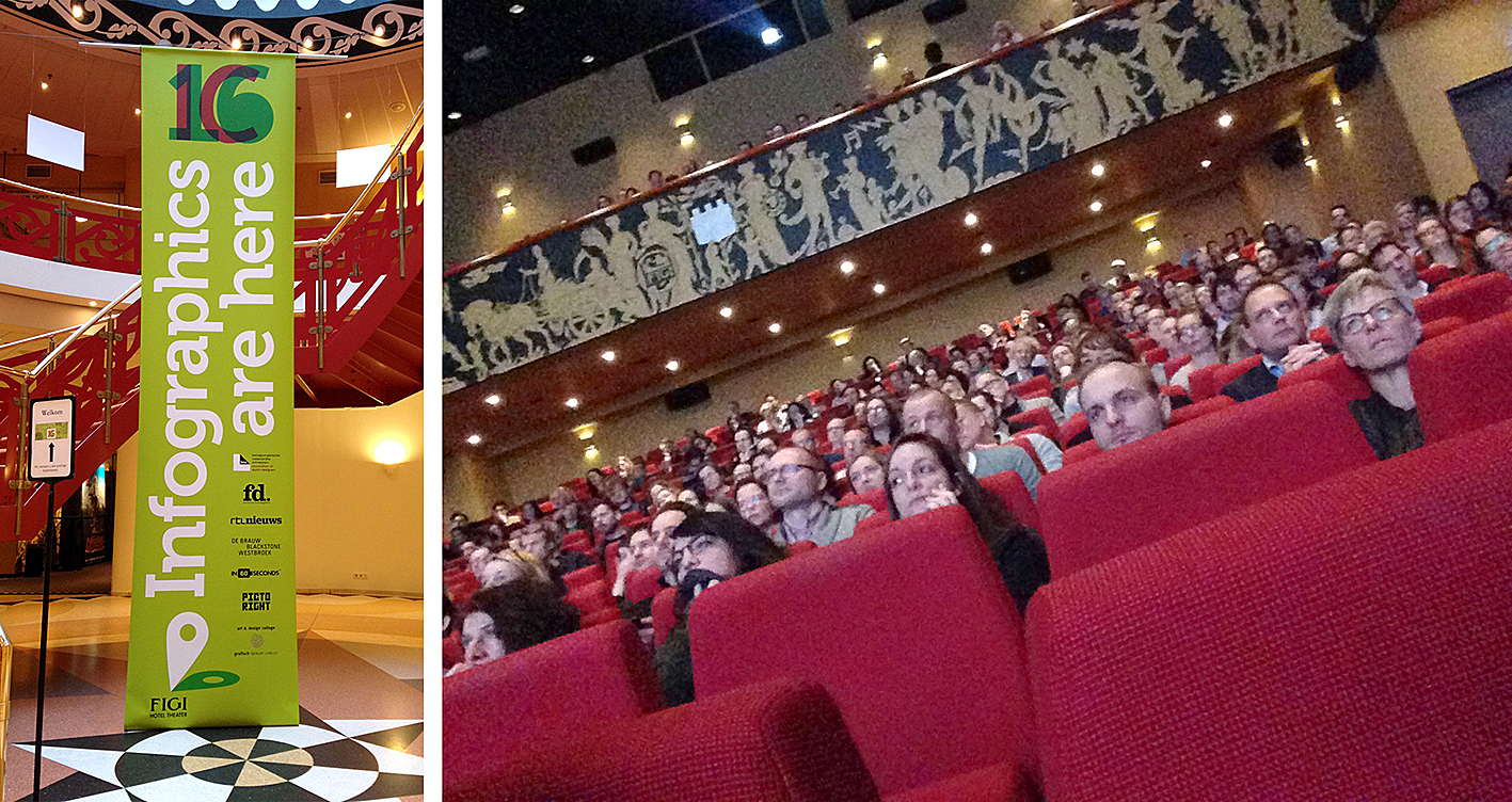
Last week, I flew all the way to The Netherlands to speak at Infographic Conference’16, which, like every year for the last nine editions, took place in Zeist, a town very near Amsterdam. Similar to Malofiej, this conference is mostly focused on information graphics, and between 250 to 300 professionals and students with various backgrounds–and ranging from senior data analysts and information designers to those not related to design but interest in learning how to visualise information–attend to learn new insights about this realm of information design. The eleven speakers of this year provided a rich variety of information design challenges, from more framed and well defined infographics (e.g. Adolfo Arranz, David McCandless), and botanic and scientific illustrations (e.g. Sven Bellanger, Rogier Trompert) to broader and less defined projects like visualising human rights (Shayne Smart), promoting infographics (Max Gorbachevskiy) and interactive ways of presenting information (e.g. Nadieh Bremer, the Drawing Room, Refugee Republic, Hans Aarsman). My talk closed the conference focussing on how information designers design, and presenting the information design processes building on an analysis of the speakers’ processes.
What follows is a summary of my key takeaways from the conference:
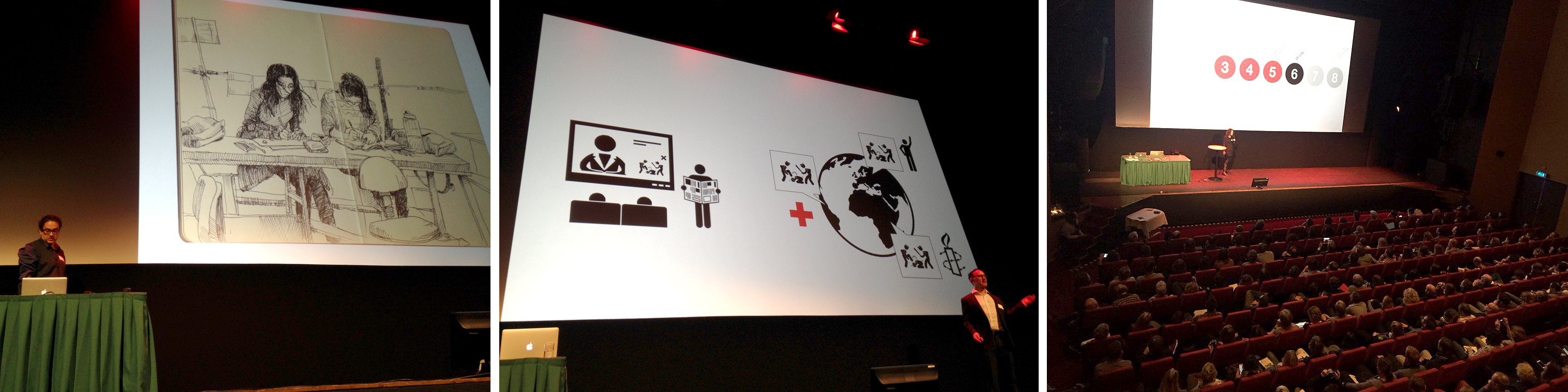
Stimulating & Engaging. Frequently, when you attend a conference with ten talks or so, not all of them are at the same level. This wasn’t the case at all. Each talk presented a unique journey to information graphics, and was stimulating and engaging in a different way; some were extremely visual, showcasing the key role of sketching and drawing in the creation of information graphics. Other talks touched on the need to start working with content as accurate as possible to the real ‘thing’ in order to convey appropriate meaning. A few of the talks were more technical showing part of the behind-the-scenes of some projects.
Diverse. Information graphics is just one type of solution that information designers can create to clarify complexity. The talks made explicit that this type of solution can take many different forms from line drawing and abstract shapes to the use of photographic language. Altogether, the talks also showed that any topic could be used as the starting point for creating an infographic, but most importantly, all speakers stressed the relevance to first understand and get familiar with the topic at hand.
The Process. I’m always fascinated to learn and look closer into how designers work. This is why for this conference I decided to build on my research, and bridge theory and practice: I asked all the speakers to create a rough drawing or sketch of their design process. By no means intending to be a rigorous analysis, I focused on commonalities among all processes (steps) and the structure of the processes (the relationship between the steps), and also if there was a connection between what theoretical models describe and what practitioners were actually doing. Although I only collected a sample of five process drawings, some interesting findings emerge the analysis. All five were emphasizing the conceptual part of the process and the cyclic nature of the process. Steps were not performed in any rigid sequence, but designers went through various loops as the result of moving forward and then going back in the process to a previous step as more information was available. To some extent these findings go in line with the goal of information design: define and understand the problem first, and make sense of disorganised content coming from different sources before start thinking about translating content into visual language.
Impeccable Organisation. Last but not least, also to highlight, the conference started promptly at 10 am with a short introduction by John Grimwade, the moderator of the event. And all presentations flowed smoothly one after the other, with very few technical problems (only my microphone!) to the point that the conference finished at 5pm, as planned (and this is a point to strongly remark as conferences often don’t follow the scheduled times!).
Next year will be the 10th anniversary of this conference. It will be the must-event to attend in 2017. Looking forward to it!
—
NB: Once again, many thanks to the organisers for the invitation to be part of the conference.
Leave a Reply