Why some visualisations are more effective than others?
Why some visualisations are still not universally understood if I have tested them with a big sample?
How can designers improve the effectiveness of visualisations?
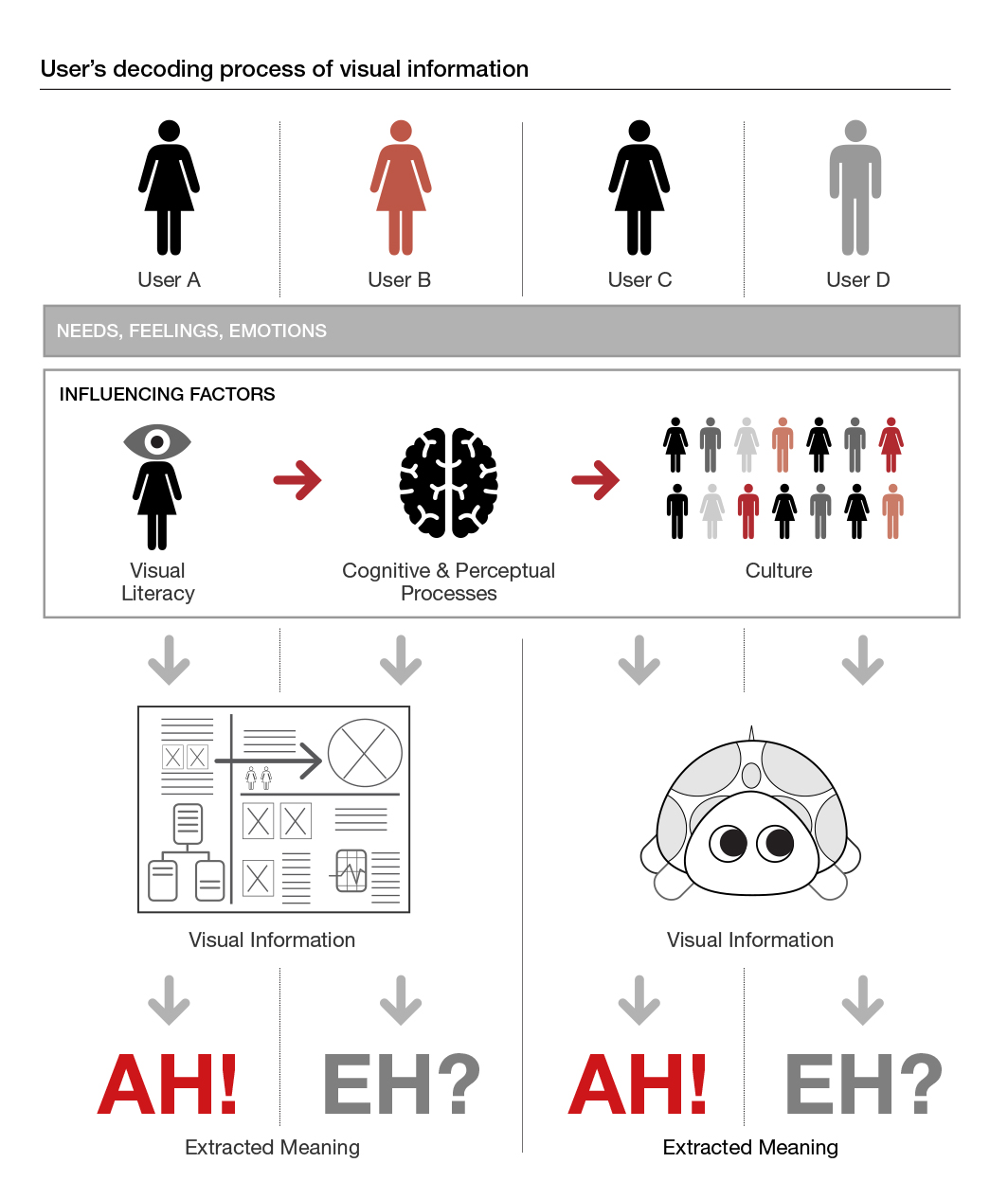
Each person interprets visual information in a different way. We know that understanding the intended users’ needs (maybe through observation or interviews) is key for information designers to create effective solutions. But there is another essential part to effectively visualise information which involves understanding users’ visual, cognitive and cultural processes when interacting with information.
Understanding image meanings
Semiotics is the study of the interpretation and meaning of signs and communication. To some extent, Pierce brought semiotics into the design world by introducing the classification of images as signs, symbols or icons, and describing images as polysemic; i.e. having multiple meanings. More explicitly, Jacques Bertin and Abraham Moles discussed the role of visual literacy in the visualisation of information, and Bertin, in particular, the role of visual variables to communicate specific types of information (e.g. qualitative differences: shape; quantitative differences: size). Gribbons’s work (1991) focuses on understanding types of filters that intervene in users’ processes of interpreting visual language. More recently, with A Unified Theory of Information Design, Amare and Manning (2013) analysed Pierce’s theory in the context of information design. Their work explains common problems in the field, and provides indicators to distinguish effective from ineffective design decisions and choices.
Unfortunately, not many of these studies, frameworks, or criteria are frequently applied in professional practice, or even known.
Artistic vs. Functional visualisations
Artists create visualisations to represent reality; they visualise what they see through their eyes, in any way they want. Information designers create visualisations to communicate meaning by making visible the invisible structural and logical relations (of a situation, of a process, etc.). This type of visualisations focus on representing structural characteristics of meaning, objects, or concepts, instead of mere or immediate likeness. When creating visualisations, designers require logic in the determination of relevant features, in the selection of those that should be excluded, and on the arrangement of visual elements. This logic should respond to needs of the intended users, but also to three key factors that affect how they process visual information:
- Visual literacy
- Cognitive and perceptual processes
- Culture
Developing Visual literacy. Historically, the way information has been translated into visual language has responded to aesthetic waves and designers’ styles (e.g. from chunky bold icons in the 80s to more stylized shapes in the 2000s). Today new skills are necessary to be a clear visual communicator, but also new skills are needed to be an effective visual reader. People (our users!) need to develop specific skills to make sense of visual information in any form: infographics, visual storytelling, PPT presentations, etc.
More and more, literacy is going beyond reading and writing; and involving visual literacy to understand visual information and extract meaning. Reynolds (2008) stresseed that
”˜today we need a higher degree of visual literacy and an understanding of the great power that imagery has for conveying important messages’.
Similarly, Shneiderman asserted that to fully understand the message that a visualisation is trying to convey, we have to train our eyes and mind to read and understand the various visual languages frequently used (interfaces, visual analytics, etc.).
Cognitive and perceptual processes. New generations of designers seem to lack the necessary formal training needed to understand people’s visual literacy levels and to design in response to those levels. For Gribbons (1991), designers are ”˜ill-prepared for the task of information design’ because they struggle to deal with the wide range of decisions involved in the visual translation of information”
”˜including problem and audience analysis, design and cultural conventions, ergonomic issues, and the limitations imposed by the [user]’s cognitive and perceptual processing systems’.
Cognitive and perceptual processing capabilities vary from one person to another. However, understanding or having a deeper sense of how intended users process information and interact with visual displays can provide a key baseline for information designers to determine what language or graphics would be more appropriate to use (i.e. better understood). And, hence, increase the possibilities of creating efficient and effective visualisations.
Cultural differences. Today, we can have accessed to practically anything that is being created in any country. This has opened the door to access a much diverse range of visual languages and forms. However, this doesn’t necessarily mean that we fully understand the graphic conventions used in visualisations created in every country. Visual languages and graphic conventions are culturally determined, as well as aesthetic preferences. To some extent, familiarity to those conventions determines a positive or negative response. A classic example is the use of the colour red, which in China is used to communicate happiness, joy and celebration, but in Western countries denotes danger.
Designing in response to these factors
In the present time, information designers should be better equipped than ever to create highly effective visualisations. They have advanced technology and specialised tools easily available, they can have access to the latest developments in cognitive and perceptual sciences, and they have a wide range of courses to learn the skills. But, paradoxically, this is not the case, and many visualisations are not achieving the expected positive responses.
Two possible causes contributing to this situation could be the disconnection between theory and practice: research findings are published in textbooks and presented at conferences, but rarely applied in design practice. And the fact that designers do not spend the necessary time getting to know their users or the factors that have an impact in their interactions with visual information.
These are three ways to start reverting this situation:
- Exposure to a rich variety of visual information and languages from other cultures. This will help designers diversify their skills and better understand cultural conventions. And will train people to widen their visual literacy repertoire.
- Education focused on visual literacy. In the same way that we are thought how to read and write, education should also focus on teaching visual literacy. Encouragement of exploration and experimentation with visual means (beyond arts and design education) will help develop an open-minded aesthetic culture and visual creativity.
- Bridging theory and practice. Allocating studio time to read (preferably books and papers, not only google), and get familiar with latest discoveries in cognitive and perceptual sciences, data visualisation, technology, etc.
‘Content without form is invisible and inaccessible’ said Kazmierczak. Content needs a visual structure to enhance its meaning.
”˜It is the responsibility of information designers to shape wisely the access to that [content], by making it intelligible’ (Kazmierczak, 2001).
Information designers are the ones prepared to understand invisible structures, appreciate the grammar of visual forms, be able to give form to information visually, identify the various factors that influence their interpretation, and design taking into account those factors (Gribbons, 1991). Visualising information without much reflection generates confusion.
—
– Amare, N. & Manning, A. (2013) A Unified Theory of Information Design: Visuals, Text & Ethics. Baywood Publishing Company, Inc.
– Reynolds, G. (2008) Presentation Zen: Simple Ideas on Presentation Design and Delivery. New Riders.
– Gribbons, W. M. (1991). Visual literacy in corporate communication: some implications for information design. Professional Communication, IEEE Transactions on, 34(1), 42-50.
– Kazmierczak, E. T. (2001). A semiotic perspective on aesthetic preferences, visual literacy, and information design. Information Design Journal, 10(2), 176-187.
Leave a Reply