Information design solutions can look really attractive, but quite a few fail to achieve their intended goal: audience cannot understand them. Why is that? Frequently this occurs when design decisions do not support cognitive activities. Often, this is the consequence of designers using visual variables inconsistently or with no intention, but designing information with no structure or visual organisation can also be a damaging factor for understanding.
This phenomenon emerged quite strongly among my information design students this year. I teach this class in a liberal arts university where students are majoring in computer science, psychology, history or politics among others, and therefore have no design or art background or visual sensibility. Even the most basic principles and concepts are foreign to them. This is why during the first weeks of the course, the focus is on learning the basics, and gaining familiarity with translating words into pictures and thinking more visually. Initially, during class assignments, students just drop elements on the paper without intention as they have no sense of composition, and colours and sizes are arbitrarily used (the feature image of this post is an example).
It isn’t until Week 3 that the breakthrough happens. This week students are introduced to basic principles of composition, and why and how order and structure help the brain better process and understand information. Learning the science behind the design principles helps students understand the consequences that their decisions could have in their projects. Furthermore, as students get more and more familiar with people’s cognitive activities and processes, they realised the value of working with grid systems and visually organising information to indicate entry points and navigation to increase legibility and understandability. They move from blindly designing and making arbitrarily decisions about colors and shapes to consciously designing and making decisions to support those cognitive principles.
Regardless of how we are communicating (visually, verbally or in writing), why is there such a difference when structure and order are added to the way information is presented?
Seeking order for a chaotic world
The world is messy, disorganised and can be seen as chaotic. By building cities, houses and roads, societies try to give it some structure and order. Broadly speaking, to make sense of the world, we, people, first try to see if the situation in front of us is new or we have seen it before. For that, we seek order, patterns and balance. These qualities help the brain distinguish elements and connections, and determine if the situation is new or not. If the situation is new to us, we would have to use our cognitive energy to create new frames (knowledge blocks), but if the situation is the same or similar to something we have experienced before, we would have stored frames in the brain that we would use to make sense of what we are seeing so the use of cognitive energy to understand this situation would be lower.
Order produces calm: we can see what it is in front of us and make sense of it. The opposite is true for chaos. Chaos produces anxiety: it is hard to distinguish individual parts or see patterns, so we need to invest larger amounts of cognitive energy to make sense of it.
We deal with both types of situations and experience these feelings almost everyday. For example, think about the last time you baked cookies:
- Order: First, you search for all necessary ingredients and utensils in kitchen drawers and fridge, and put them on table or counter to have them handy: 2 eggs, flour, butter, bowls, etc. You feel calm, you can see all you need to move forward in the process and you know what to do (you may have a recipe or rely on your memory). So, you start the process by mixing ingredients. Maybe you need a few bowls (dry ingredients bowl, eggs bowl, etc.), maybe you mix pastry on counter until finally the cake is in the oven.
- Chaos: In that moment, you look around and realise that the kitchen looks like a chimpanzee has been playing there for the last 30 minutes (at least this is my experience!): flour is on counters, dirty bowls and utensils are in the sink and others on the counter, egg shells are on a side waiting to be tossed, etc. In that precise moment, you feel anxious: The initial order is gone. Now a new “plan” is needed to restore order: for example, clean up kitchen.
- Order: A simple way the brain approaches a situation like this is by using stored frames: create categories, for example dirty stuff and clean stuff. You start piling the dirty stuff in the sink. Just by doing this, the brain starts recovering its balance because there is a new order in place: dirty stuff in sink, clean stuff in drawers.
Minimising visual chaos
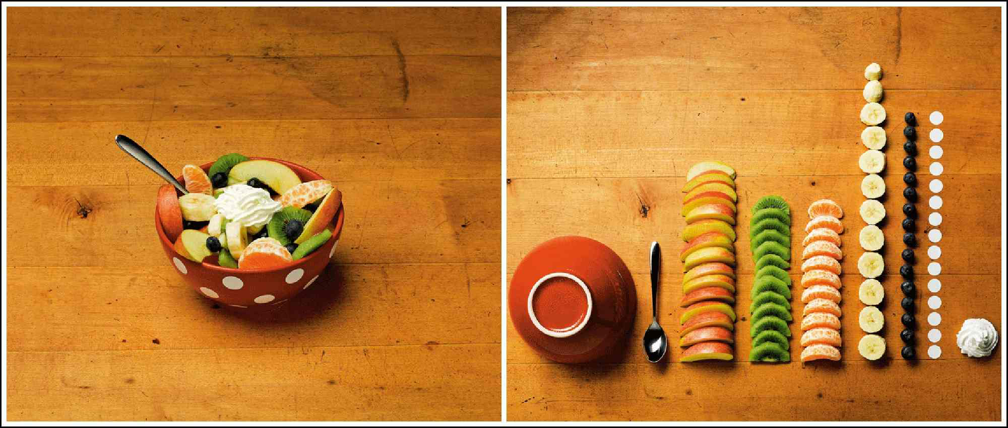
The same brain response occurs when we see visual chaos: something that lacks structure or has weak organisation. The book The Art of Clean Up: Life Made Neat and Tidy by Ursus Wehrli beautifully illustrates this phenomenon. The Swiss artist presents a series of images of disorganised and organised situations to show the contrast between chaos and order, and their respective associated feelings. By organising the elements of each situation following some sort of logic (colours, shapes, etc.), Wehrli demonstrates that order facilitates the understanding of a situation through the identification of individual elements which allows to see patterns, connections, etc.
Since the first time I came across Wehrli’s book, the grid system comes to mind. Perhaps a mere coincidence, the grid system also comes from Switzerland where it was originated in the 1940/50s becoming the essence of the Swiss design movement. During this design movement, structure and organisation were taken to an extreme through the use of grid systems as a way to bring legibility, simplicity and objectivity. With time the strict use of grid systems has relaxed but achieving those values through visual order is still considered a key component of good design.
People seem to be more aware of the value of structures when presenting information verbally (e.g. talks, lectures) or in writing (e.g. papers, books, theses). But the same applies when designing information: it is essential to give our audience some sort of organisation and structure. Explanations of any format need to follow a structure (e.g. general, specific general), otherwise information is perceived as disconnected and the message is hard to piece together. Order, patterns and attributes help the brain quantify elements, distinguish meanings, identify connections, and discover patterns. In simple words: understand.
This knowledge is essential for information designers (with any level of expertise). We, information designers, should always be aware of the connection between design and understanding, and that information design is effective when it mirrors the way the brain processes information.
Leave a Reply