This summer I have been exploring the world of quantitative analysis, statistics and data visualisation (here by data vis I’m specifically referring to visualisations purely created with large quantities of numeric data). As part of this journey, one of my aims was to gain familiarity with Tableau, as it is one of the most frequently used software to create this type of visualisations, and, technically, as their site says, to ‘make analysing data fast and easy, beautiful and useful’. While I learnt many things, the overall experience made me even more aware of the role that users, and particularly novices, should play at different steps in the development of design solutions: from conception to communication.
Tableau through the eyes of a novice
Just for context, I describe my self as relatively new to the quantitative and statistical analysis worlds. While I know the basics, I’m far from being an expert. On the other hand, I do consider myself highly experienced in the qualitative and information design worlds. Having worked in the intersection of these two for over 15 years, gives me confidence and familiarity with data terms and tasks, and particularly with key concepts involved in the visualisation of data. To me, this knowledge was enough to start learning Tableau, a tool described as ‘design[ed] for people’.
How tough could it be to learn such software? I thought… well, this is just a summary of some unexpected moments in that journey:
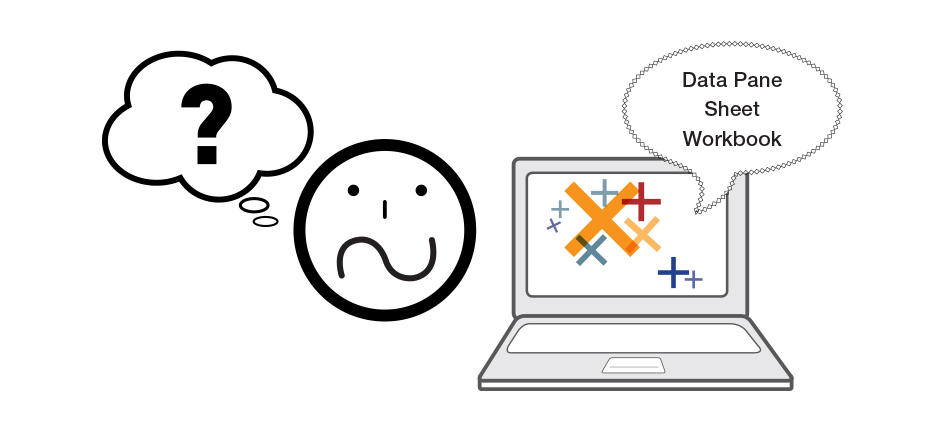
I got my license and after installing Tableau, I decided to follow the steps for beginners and do the official tutorials. I started with the one called ‘Getting Started’. As I’m old school, I had my pen and notebook ready to take notes, and the software open to follow instructions. However, two minutes into the 23-minute long tutorial, I felt as if the lady from the video was literally speaking a different language. I couldn’t even understand the basics (e.g. what was the goal of the software?, what should I do first?, why I should do that?) or some of the specific terms (e.g. what is a ‘sheet’? or a ‘workbook’?). After two failed attempts to try to go beyond the fifth minute of the tutorial, I decided to ask another experienced information designer to join me in my learning experience (hey, maybe, it was just me!). However, the same occurred: after two minutes of watching the same tutorial neither of us could really understand what we were supposed to do.
At this point, every time the lady from the tutorial said: ‘this is how you can easily do this’, or ‘in Tableau is so easy to visualise’ this or that, my frustration increased and my confidence on my quantitative knowledge decreased.
Eventually, we found a much clearer tutorial that helped us learn the basics about the software. Then, I used this baseline knowledge to understand the official tutorials.
Now, I’m still not a Tableau expert, but at least have a general sense about the software and how to visualise data sets. However, why a learning experience has to take so long or be unnecessarily so frustrating?
Starting from the basics: Pedagogy 101
To me, Tableau official tutorials are an example of not fully designing for the user. While the design of an interface is important and we should based design decisions on users’ needs; the way we explain how to use something should be equally user-centred (otherwise, how would users know how to use a solution?). Tutorials should follow instructional design principles and be developed following pedagogy 101 basics. Just to name a few:
- Clearly State the Goal: Two common pedagogical techniques used to introduce a complex topic are GSG (general-specific-general) or SGS (specific-general-specific). The ‘Getting Started’ tutorial uses none of them. For a first time user, it is really hard to get a sense of what the overall goal of the software is or what the tutorial will be covering. This is technically the first time a user is interacting with the software.
- Use Adequate Pace: The instructor should speak in such a pace that the learner is able to understand and take notes or follow the instructions given. I had to pause the tutorial quite regularly because instructions and new terms were given too fast.
- Clearly Explained Terminology: Technical terms and concepts, like Data Pane, should be explained the first time they are introduced. Otherwise, it makes it harder for the learner to fully understand anything that builds on those concepts. I had to go to another Tableau tutorial (‘Tableau Interface’) to actually get a better sense of the interface key terms, tools and menus.
- Use Enough Granularity: While it is important to thoroughly explain levels of complexity of the thing being taught, baby steps are key. Jumping into complex stuff without having explained the basics can be more confusing than not explaining anything. Going into too many levels of granularity too soon may confuse rather than clarify. To me, the tutorial starts at an already too granular level, skipping essential introductory steps.
The need for a user-centred approach
Tableau is the result of putting ‘together an Academy Award-winning professor, a brilliant computer scientist at the world’s most prestigious university, and a savvy business leader with a passion for data’, which has indeed resulted in a highly efficient visualisation tool. And I’m not questioning this premise at all or the quality of Tableau as software. My point is that for a tool that is advertised as ‘for anyone and everyone’, the user seems to have been left out from that equation””or at least the first-time user. The way tutorials deliver content to novice users doesn’t reflect a user-centred approach.
From the start, the software tutorials assume that users’ baseline knowledge is higher than it really is, at least, in a novice user. As an example, the tutorial assumes that a first-time user knows that to accomplish what they want they have to drag and drop elements in different parts of the interface or that each new sheet is by default structured as a table, with x and y axes.
Thinking about the user should always be a priority, and this becomes even more important when explaining a new product or introducing a complex solution. When a user-centred approach isn’t fully considered and the implicit isn’t explicitly communicated, there is a higher chance that the brain cognitive activities may block and learners may think that a solution (in this case, the software) is harder or more complex than it really is; eventually, resulting in not wanting to use it.
To avoid this outcome, information designers (and any other parties involved in a project) should put people first at each step of the process. Or as it is often said, they should empathize with the users: what is obvious to us, it may not be for someone else.
Leave a Reply