Skype. To me, this has been one of the most helpful tools ever created. It has allowed me to connect with friends and family (and clients, and students, and others) who aren’t in the same location as I am. Since early days, I have used it, first, to communicate between Skype user to Skype user. Later on, since Skype allowed more flexible ways of communication, I quite often use my monthly paid plan to call almost any number anywhere. Bottom line: I’m a highly frequent Skype user.
So far so good.
As time went by, Skype evolved from the initially designed desktop computer software to being used in other devices such as smartphones and tablets. It also merged with instant messaging software with similar features (do you remember MSN and ICQ?). Not surprisingly, these functional changes demanded the need of a new interface design to effectively accommodate uses in various platforms and devices. Since then some challenges started to emerge and, with each new interface update, the learning curve to use Skype started to become more steep…
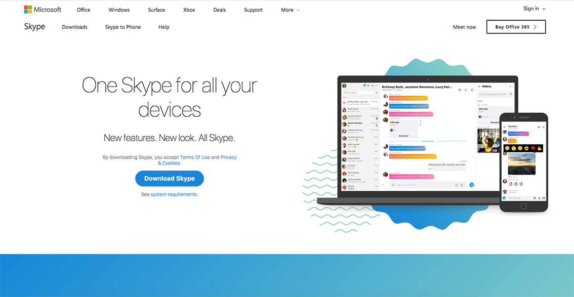
“One Skype for all your devices”?
When a new design is launched, users often need some time to get familiar with the interface and find where the usual features are. However, the very last Skype interface re-design (version 8.13.0.2) demands a little too much time than the expected to (re)learn how to use it. This version certainly has a “new look” and “new features”, but personally, I find it highly confusing. As an example, the last times I have used Skype, I have totally struggled to complete the following two simple tasks:
- Find the pad to dial a phone number
- Add a new contact
These are major problems I have identified with the latest interface:
- Unclear icons: One of the most important skills for information designers when creating icons is finding a visual balance to communicate the essence of a concept without losing key details. This balance is what distinguishes simple from simplistic design. The new Skype icons are too simplistic. Unless you know what they mean, if you are a new user, their meaning is hard to parse.
- Unclear information architecture: Information doesn’t seem to be organised following a specific, clear logic. For example, how are contacts organised: Is it by status? By frequency of use? By time? (also, “Time” indicates the last time you spoke to one of your contacts, right? or the last time a contact was seen online?). In older versions, the largest part of the windows showed your contacts, and the chat box was only activated when you were chatting with someone. Now the proportions have shifted. When you open Skype the first thing you see in the window is a chat box (from your last chat?) and a list of contacts on the left.
- Unclear functions: Simple functions like adding a new contact, deleting contacts, or dialing a number, are unnecessarily hard to do. How do you delete a contact? Is deleting a chat the same as deleting a contact?
- Lack of visibility: There is no communication between the system and the user. One basic usability principle is “visibility of system status” so that the user can know what the system is doing. In the new Skype interface, this can be much clearer: for example, after you send (what I think is the old) “new contact invite”, there is no response from the system that informs you whether you have actually sent one or not.
To add to the list: Having the above structural problems unresolved, the use of gradients and accessory information confuses rather than helps the user.
The first thing a user reads after you have launched Skype with this new version is: “We have redesigned Skype for you”. But I wonder what do they mean by “for you” as the user doesn’t seem to have been taken into account in the design process. I would also love to know what was the rationale behind design decisions and whether there has been any type of user evaluations to determine if the decisions were actually achieving what was intended to.
Interestingly, one of the sites from where you can download Skype has this disclaimer:
“CONS:
- New wider interface takes some getting used to
- Many users may not like the redesign”
Luckily, I may not be the only one struggling with the new interface.
Leave a Reply