What is the story told by the above objects? What do these objects have in common?
At a glance these objects look like just a bunch of office supplies with not apparent connection or story to be told. However, after closer inspection supported by sketching and rough visualisations, you could start identifying some interesting connections and findings. This is what my students worked on during a short in-class exercise (explained below) to practice visual reasoning. Visual reasoning is the process of analysing and understanding visual content, and is essential to understand the hidden logic in a raw data set.
Types of visual reasoning
In his Data Visualization: a successful design process book, Andy Kirk discusses two types of visual reasoning involved in the visualisation of data. We can connect each type to a main data visualisation challenge:
- How to translate data into visual form to tell a story. In this case, data clearly shows the story and we have to visualise it into graphic forms to make key parts and findings more accessible and easy to understand. This is referred to as deductive reasoning.
- How to identify and understand the story hidden in the data. In this case, the story is unclear at the beginning, and it only emerges after data is analysed and visualised. In other words, you don’t really know what the main message or findings to visualise are until you start getting familiar and translating data into visual forms. This is referred to as inductive reasoning.
In either scenario, a basic to moderate understanding of quantitative reasoning is needed to read and understand raw data, and create and interpret graphic forms. Although the emphasis when teaching data visualisation is often placed on learning software, design principles or computer science skills, the lack of quantitative reasoning skills is sometimes the Achilles’ heel amongst information designers. We learn how to use design principles to support cognitive activities, and develop visual literacy to understand visual languages, but we don’t have robust training on making sense of statistical graphics, or identifying trends and correlations from raw data. This extra set of skills, which is often learnt from statistical analysis courses or other relevant ones, has become essential when working on a project that involves inductive visual reasoning.
Practicing inductive visual reasoning
While my class is not a data visualisation class, one key component of the syllabus is helping students develop visual reasoning. This is one of the exercises we do to achieve that:
- Goal: Identify at least 2 insights that aren’t obvious
- Logistics: Small groups (3 or 4 students), 40-60 minutes.
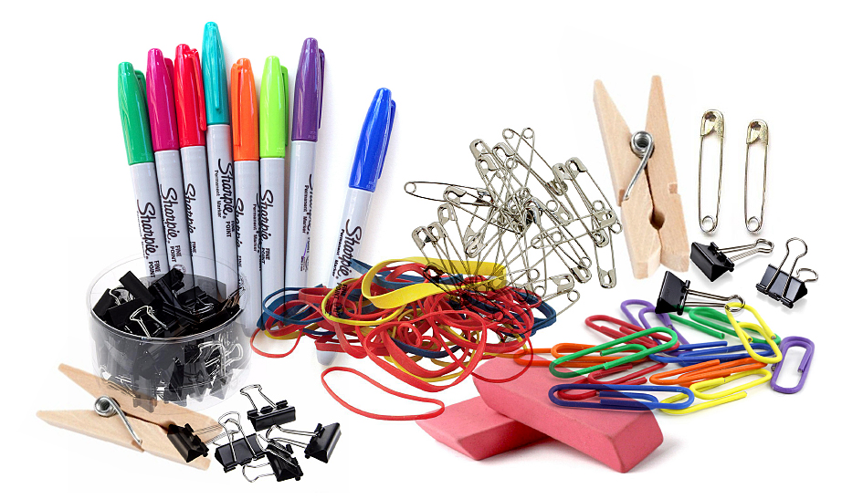
- Materials: Assortment of objects. I work with office supplies such as markers, binder clips, rubbers, paper clips, safety pins, erasers, but any objects could work. Drawing materials such as colour markers, pencils, gridded paper, rulers, etc.
- Level: Medium (I wouldn’t do this exercise on the first or second week of class)
Instructions:
- Give each team a bunch of apparently unrelated objects (more than 15)
- Each team gets familiar with the objects and analyses them to identify unexpected connections, correlations, trends and other insights that aren’t obvious at first glance.
- Each team organises objects using different variables (quantity, color, size, etc.) and organising frameworks (previously, we have worked with LATCH and 5Ws+1H). This allows rich exploration and the identification of less obvious connections.
- Each team creates graphic forms to capture the different explorations and visualise findings and insights
- Each team presents emerging insights using created visualisations
Findings from some of the teams
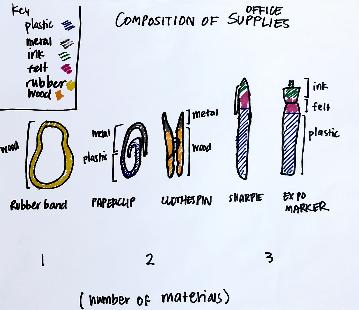
Team 1: Students first identified the “composition of” the objects and list key materials: plastic, metal, ink, felt, rubber, wood. Then, they organised the given objects based on number of materials included in each object. Finally, they grouped objects into three clusters based on increased number of materials. Rubber bands are only made of one material while sharpies have three materials.
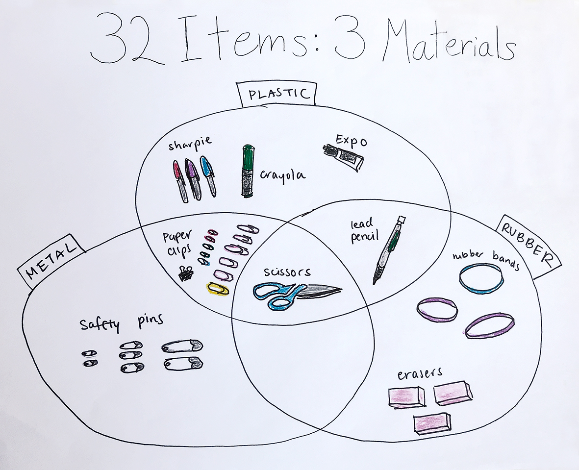
Team 2: Similarly, this team also organised objects based on materiality, but these students realised that actually all objects shared three materials. By organising objects based on these three shared materials, they emphasized this finding and determined that scissors are the object that needs more materials to be created.
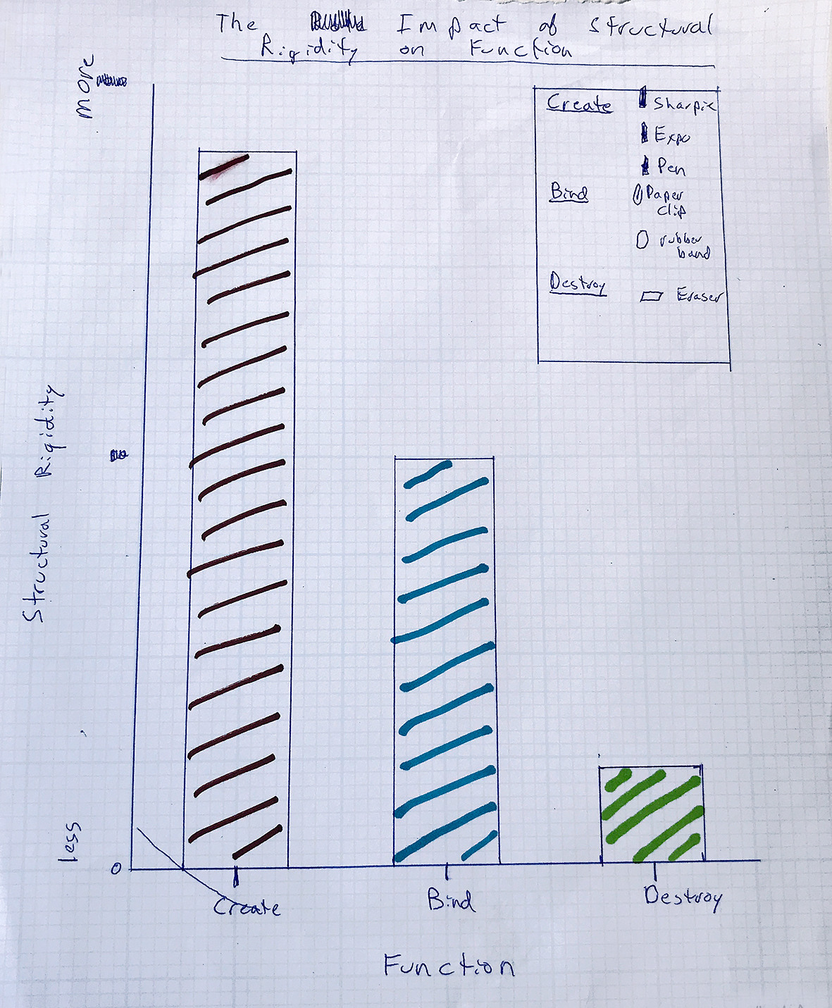
Team 3: Rather than materiality, these students focused on functionality of each object based on their structural rigidity. By grouping objects based on three activities or functions: create, bind, destroy, and compare them based on the impact of their structural rigidity, they learnt that most objects could be used to create (sharpies, expos, pen) and only a few to destroy (eraser).
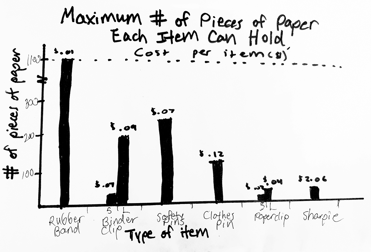
Team 4: These students conducted a deeper analysis, looking at functionality, uses and costs for the objects. They realised that all objects could be used to hold sheets of papers (yes! even a sharpie) and they could be organised based on the number of sheets each object could hold. Then, they looked into the cost of each item to determine which object would be more cost-effective to hold the larger number of sheets of paper. Based on the resulting visualisation, rubber bands, costing as little as $0.01 per unit, seem to be the object to go with!
While this was just a quick exercise, it succeeded in showing students that, when you look at things from different perspectives, there could be a story to tell even amongst apparently unrelated data. These were a bunch of random objects, but the same reasoning applies when analysing raw data sets.
To make sense of data, understand the hidden logic, and effectively visualise a story, both complementary sets of skills are needed: reasoning + visual principles. When one of these sets is missing, the resulting visualisations could be either cryptic or highly scientific looking graphics that are hard to read (e.g. created by computer scientists or statistician, or software), or aesthetic-looking graphics that do not accurately communicate the story (e.g. created by information designers).
—
- Kirk, A. (2012) Data Visualization: a successful design process. Packt Publishing
Leave a Reply