Many people new to design believe that technology occupies a big role and working with professional software is essential to create effective results. Moreover, many think that not knowing how to work with the appropriate software is the main difference between designers and them, and what gets in the way of creating high quality designs.
Similarly, at Sense, we get questions about software almost at the end of in each workshop: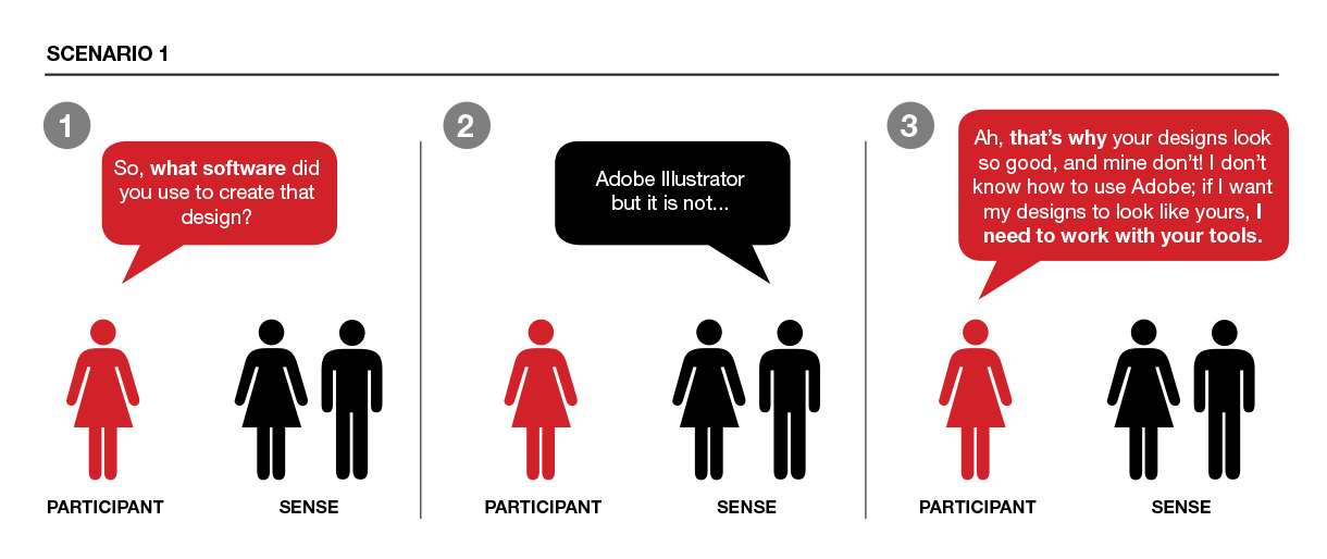
And not surprisingly, this is also a common conversation I have with some of my students: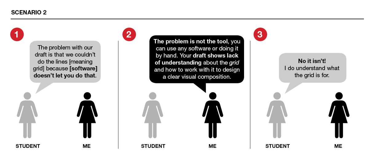
Having technology skills and working with professional software can certainly help, but understanding the basics comes first. There are many examples of ineffective information design that has been created with the right software. On the other hand, there are also examples created by computer scientists that don’t look aesthetically pleasing but are conceptually strong and clearly structured.
The role of technology in the info design process
The following are three core information design steps and recommended tools that can be used at each of them: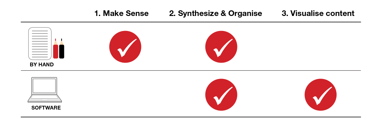 Yes, I argue that you don’t need to work with software at each step. At the beginning of a project, most of the work occurs in my head or on paper. While I’m not a really organise person with a dedicated notebook for sketches, I do use paper to make sense of the project at hand.
Now, let’s review key basic information design principles and tasks within each step:
- Make sense. Roughly, this step involves understanding the problem, data or content: One way to do this is creating an inventory of what you have. This could be a simple list or table describing all parts of a problem.
- Synthesize & Organise. Here the goal is to delineate the story or main argument (what is the message you want to tell?), and put together the pieces in a way that help communicate that story. This can involve the use of organising frameworks and manifest as a storyline, general structure, information hierarchies or set of categories.
- Visualise content. The goal is to visually support the story and structure defined in the previous steps. Design decisions should be in line with content decisions and focus on creating a clear visual composition, and working with design and psychological principles to support cognitive activities (which facilitates understanding). Also key is to work with visual variables (e.g. color, shape, size) in a deliberate way. This helps support the message, emphasize content decisions and address intended audience’s needs.
At this point in the process, working with digital tools can increase the number of drafts and explorations you can create. However, if you are unfamiliar with design or psychological principles, the resulting design could be hard to read, confusing, misleading, or not communicate the intended message with clarity.
Details matter!
Paying attention to small details is equally important, but too often overlooked. The following are three common examples where knowing how to work with professional tools won’t make a big difference:
- Use high-quality photographs. They have a huge impact on the overall design. You don’t have to be a professional designer to find pictures that are sharp, have balanced light and exposure, and are well composed and engaging. But if you only spend 5 minutes looking for this type of images or use the first one you find, the results won’t be as impactful as if you take the time to search and try many images until you find the one that best illustrates the intended message.
- Keep it simple. The more visual variables you add to a design, the hardest it is to create a visually harmonic and balanced outcome. Working with a small color palette (e.g. black, white and one color) and using color in a functional way (e.g. connect, distinguish, emphasize), rather than solely for decoration, can be a good way to start.
- Use the appropriate wording. The wording used in titles and subtitles, and throughout a design can also make or break clarity and understanding. Taking the time to find the appropriate words is also essential.
If you are interested in learning information design, first focus on learning the mindset and the process. This will take time: like with everything else, there will be a learning curve. No one would expect to run a marathon after two hours of training or to master the laws of physics in a week; so why learning information design should be any different? With time and practice anyone can learn how to work with more professional tools, but having a solid foundation is what helps create solutions that not only look good, but that also are effective.
Leave a Reply