Last month, I went to check out the Changing Signs, Changing Times: A History Of Wayfinding In Transit exhibit at Grand Central Station in New York City. Although, the exhibit was tiny, it was both visually and informationally rich. Overall, it provided an overview of how information design in the subway system has evolved since its origins until the present time. Coincidentally, many years ago, I visited the Museum Depot at Acton Town in London (UK), which is a huge space where you can see and experience the history and evolution of London underground trains, signs, maps and other wayfinding components.
This is why what first came to mind, after visiting the recent exhibit, was the parallels between the Metropolitan Transportation Authority (MTA), organization responsible for public transportation in New York, and Transport for London (TfL), its counterpart in London. While today only one company manages each respective system, they both were built by independent companies:
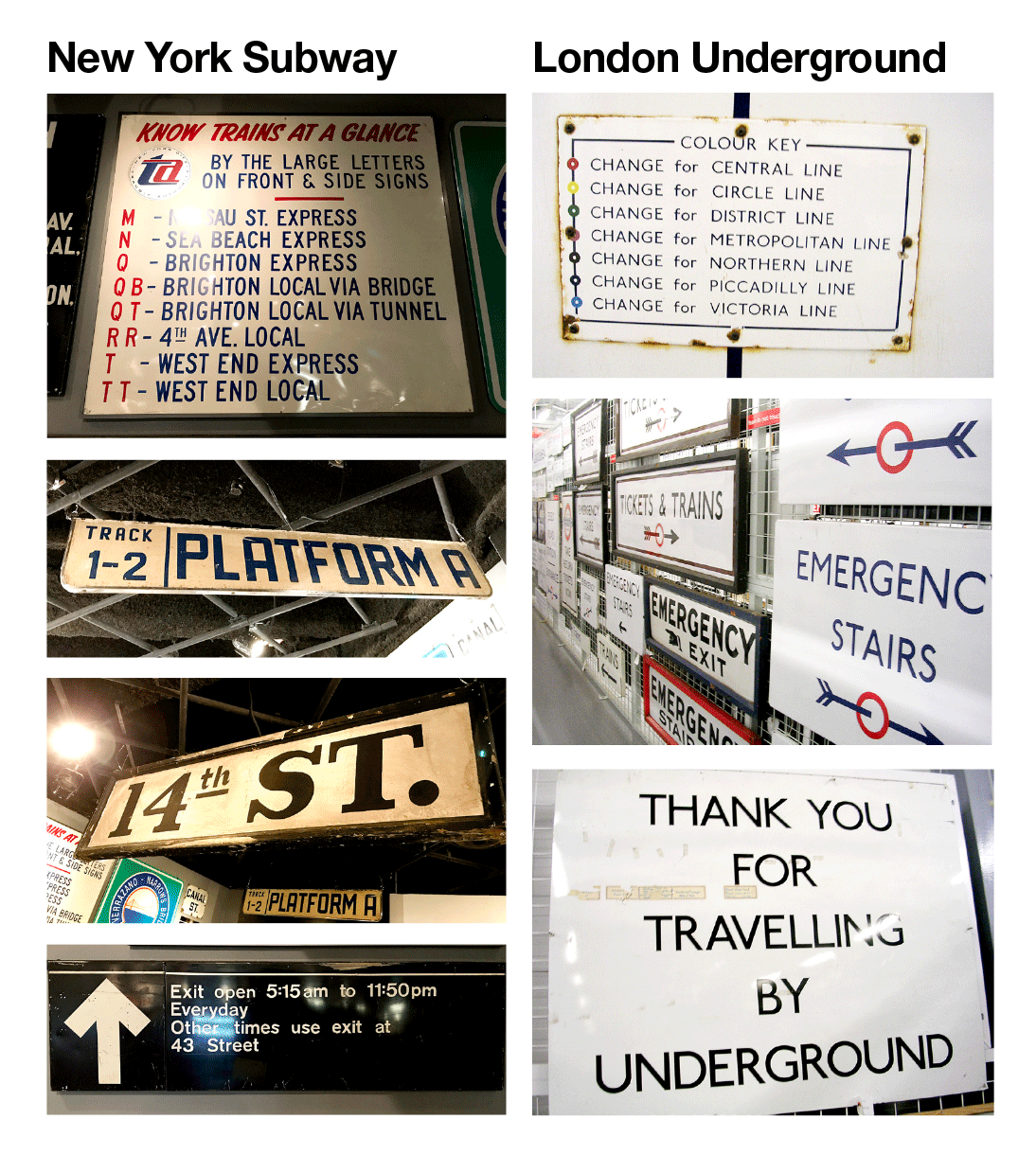
- NYC Subway: When the first line opened in 1904, it didn’t cause much disruption among commuters because they quickly learned how to use it. What did cause confusion was the creation of more lines, but no standardized language to distinguish one line from the other. Until its unification in 1976, the Subway system comprised three different companies: the IRT (Interborough Rapid Transit), BRT/BMT (Brooklyn Rapid Transit/Brooklyn Manhattan Transit), and the City-owned IND (Independent). Lines and other modes of transportation competed with each other to attract customers; and each station had its own personality, communicated through ornamental signs and distinctive colors.
- London Underground: The first journey of the London Underground (LU)–also called the Tube–was completed in 1863 by the Metropolitan Railway (today Metropolitan line), and most of the system built in the next 50 years. At the beginning, the transport system was owned and managed by several independent organizations. From 1933 to 2000, different organizations took responsibility for the public transport network in and around London until Transport for London (TfL) took control of most modes of transportation. In 2003, TfL also started managing London Underground.
Due to this fragmented beginning, both transportation systems showed a lack of standardized visual language across all underground lines and stations until the systems expansions made the creation of a solid wayfinding system a necessity.
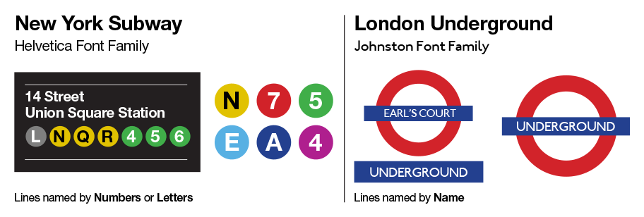
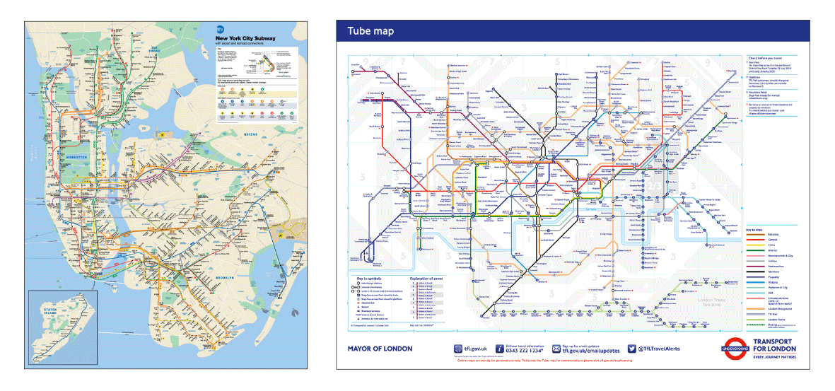
- NYC Subway: There was an evolution in the way messages (called service notices) were communicated to the public from highly wordy to more visual and engaging. But a uniform visual language wasn’t created until 1967 when the decision to code each line with a different color was made. In 1972, Massimo Vignelli designed the core of MTA’s wayfinding system including the iconic subway diagrammatic map, which later was replaced with the current one.
- London Underground: After most lines opened, in 1913, Edward Johnston was commissioned to design a typeface to unify all underground lines, and redesign the Roundel (red disc with the blue horizontal bar), which since 1919 was used to help passengers find stations at street level. In 1933, Henry Beck created the first map of the London Underground as an attempt to make the network easier to navigate. Beck’s map constitutes the origin of the current diagrammatic map.
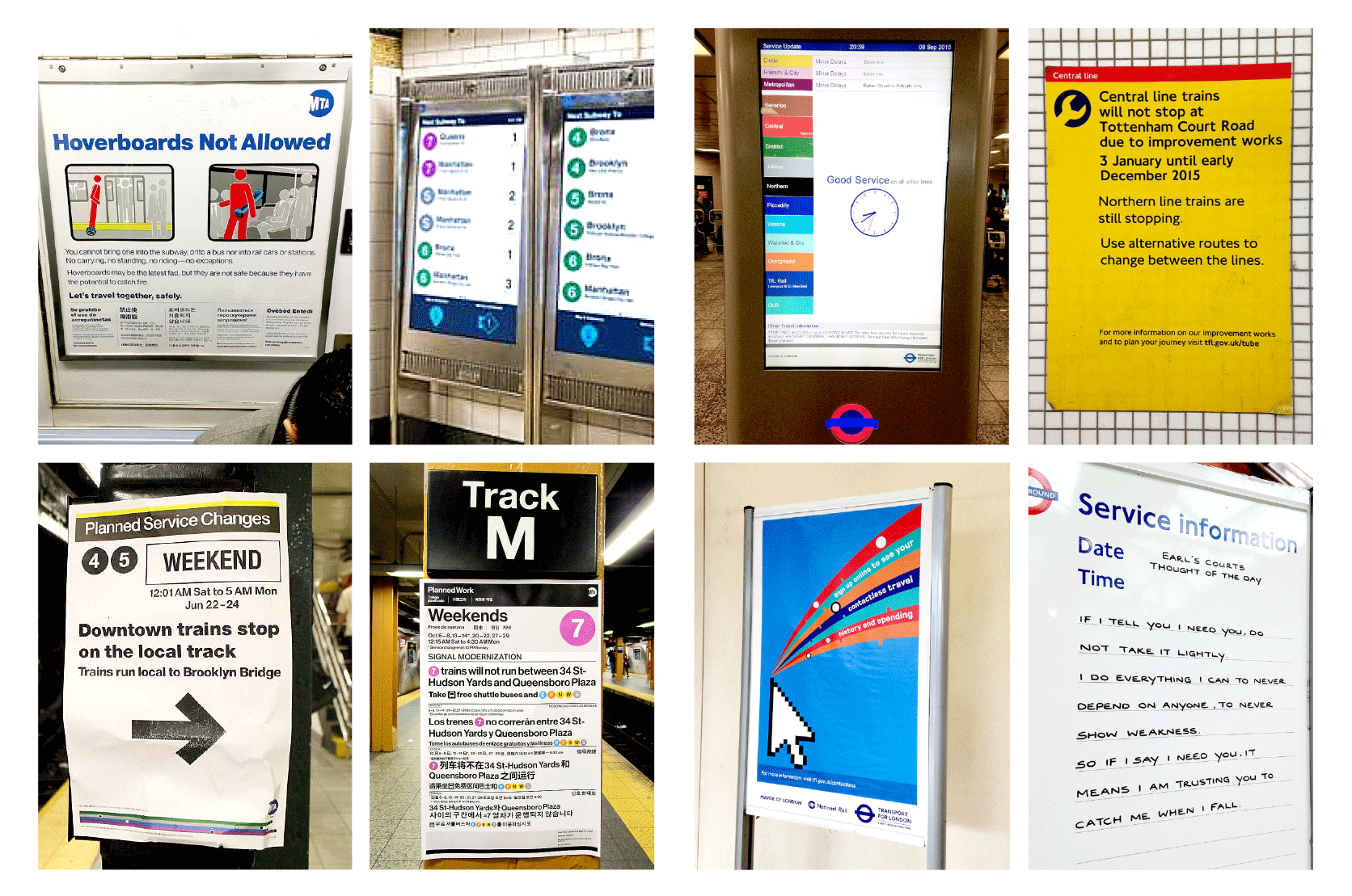
Both wayfinding systems evolved and expanded becoming examples of effective information design. Today they include a wide range of components: system maps, service information/update posters, clear visual identity for lines and stations, digital tools (websites, apps, station touch screens), vending machine interfaces, and many others.
Information Design Evolution
On paper, these two systems may look pretty much the same. However from an information design lens, both systems differ greatly because each reflects the culture, characteristics of their respective cities, and needs of their population. Just a quick visit to each organization’s website shows these small but key differences:
- “Plan a Journey” (London Underground)
- “Plan a Trip” (NYC Subway)
Below the information design evolution for each system.
Leave a Reply