Have you ever wondered how information designers explain “invisible phenomena” that are “too big, too small, too slow or too abstract for normal sensory comprehension”? I borrowed the term invisible phenomena from Eric Siegel to describe experiences, concepts, things or processes that are hard to understand because we cannot see them or interact with them. Making sense of these types of phenomena is at the root of information design work.
From explaining quantum computing to biological processes, my second book, Communication Knowledge Visually, provides step-by-step guidance and visual strategies to help information designers create interventions to help the general audience understand complex subjects. The analysis of Will Burtin’s process discussed in the book helps understand how he overcame three core understanding barriers, that many information designers deal with every day:
- How to explain something that is too small, that is hard to see
- How to explain something that is too abstract, that is hard to imagine
- How to explain something that has multiple component parts, that is also hard to imagine
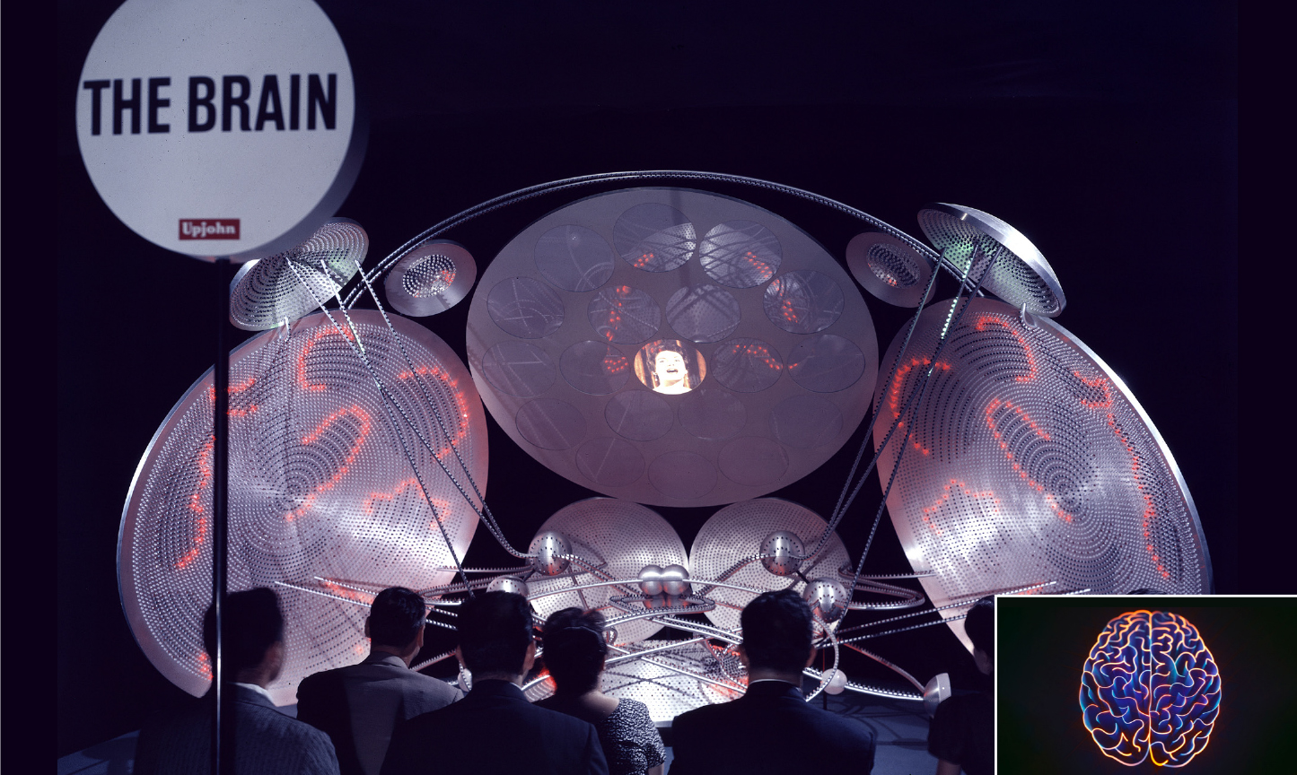
The Brain Exhibition for the Upjohn Company, 1960. With moving lights and flashing images, the large-scale interactive model represented mental functions; specifically, the role of time in consciousness and the evolution of thoughts. People in the audience could observe three sessions of 12 minutes each illustrating mental processes that normally occur in one second (1:720 time scale). 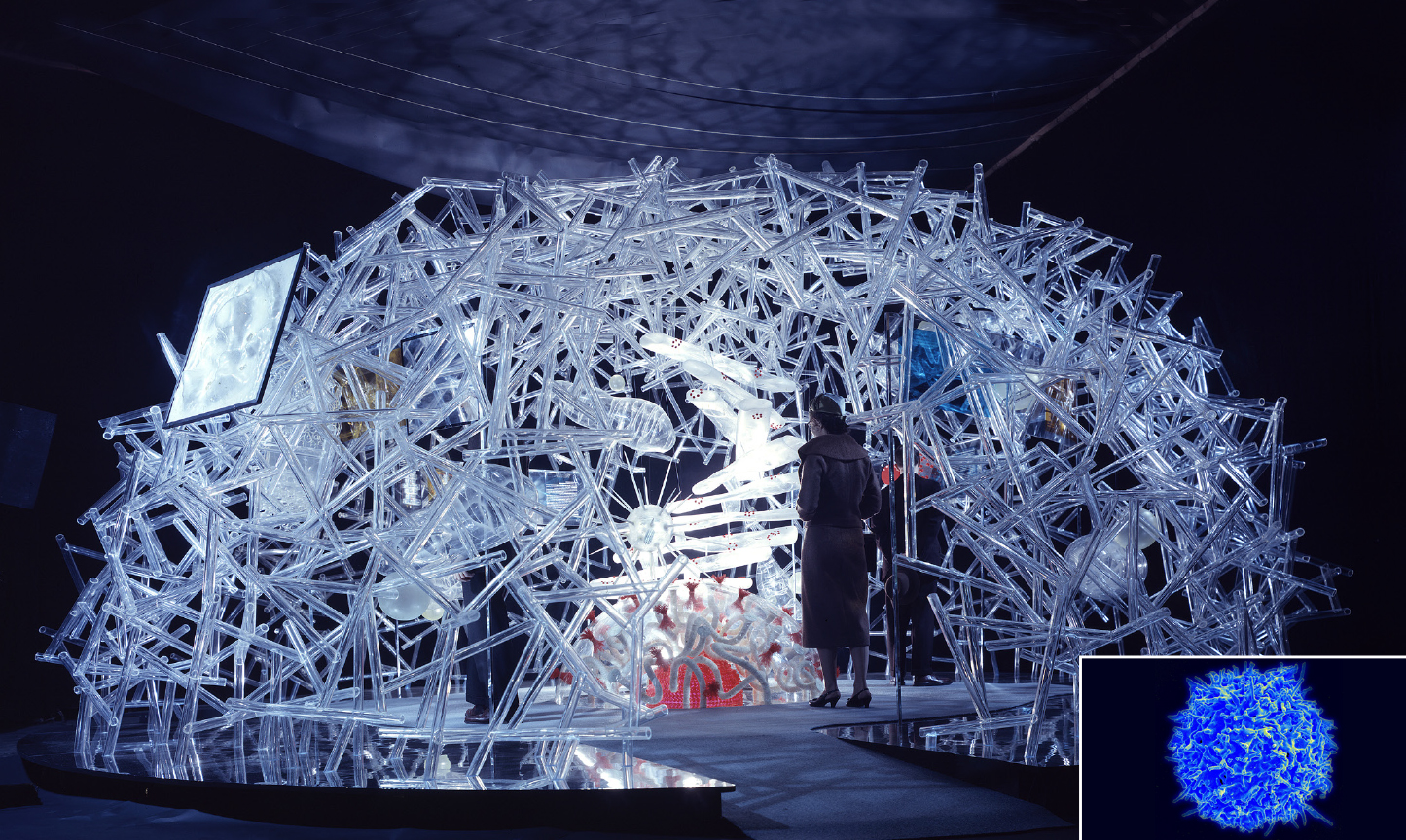
The Cell Exhibition for the Upjohn Company, 1958. The large-scale, walk-through model represented the inner structure of one cell””information that had been revealed recently thanks to an electron microscope. One human cell was magnified one million times (1:1.000.000) to create a 24 x 12 feet, transparent plastic model. This helped viewers understand the cell’s interrelated functions and individual parts.
Some of Burtin’s strategies included the creation of large-scale, walk-through 3D models, an ingenious solution that many information designers, despite having more resources and technology available today, rarely think of doing to explain complexity. By dramatically increasing scale and building interactive models, Burtin’s interventions helped people experience first-hand what something is and see how something works, and this way understand what it means.
To learn more about information design strategies to support sensemaking and create effective design interventions, pre-order your copy of the book from RIT Press: $49.99 (regular price $60). The book is available on November 1st!
What will you learn from this book?
- Information design strategies to communicate complex, abstract, invisible processes and concepts
- Step-by-step information design process and key activities
- Wide variety of techniques to communicate information visually beyond digital approaches
- Recommendations for developing information design curricula
Reviews
With their new book, Roger Remington and Sheila Pontis take a fresh look at why Burtin’s work””making sense out of complexity””is so important today. Using a clear, methodical, and well-organized format (Burtin would have loved it!), the authors describe in detail a number of his graphic projects, and also his three-dimensional, walk-in explanations of various functions in the human body.
Nigel Holmes, Graphic Designer
Remington and Pontis unapologetically present Burtin’s mid-century modernist ideals of information design as a progressive force, committed to scientific objectivity and rigor. At the same time, they also make it clear that design is not a science but a holistic discipline in which the designer acts as an intermediary ”” a mediator, visualizer, business partner, teacher, and storyteller.
Dietmar Offenhuber, Program Head MFA Information Design and Visualization, Northeastern University
—
Siegel, E. (2008) Too Big, Too Small, Too Slow, Too Abstract: Exhibiting Modern Science, Exhibitionist 27, no. 2: 22.
Leave a Reply