Spring semester classes at the Information Design and Data Visualization Graduate programs started a few weeks ago. Being able to articulate what makes information design different from related fields is essential to anyone new coming into the practice, but this can be tricky because boundaries are blurring and practices, methods, and outputs often defy categorization. The use of some terms, such as “information architecture” and “data visualization,” interchangeably with “information design” also adds to the confusion. This is why in the first class of my Information Design Theory and Critical Thinking course, I dove into defining the landscape of information design to help MS and MFA students get a better understanding about each field. The first exercise challenged students to define, connect, and map six practices that focus on visual communication: Information Architecture, Data Visualization, User Experience Design, Information Design, Graphic Design, and Instructional Design.
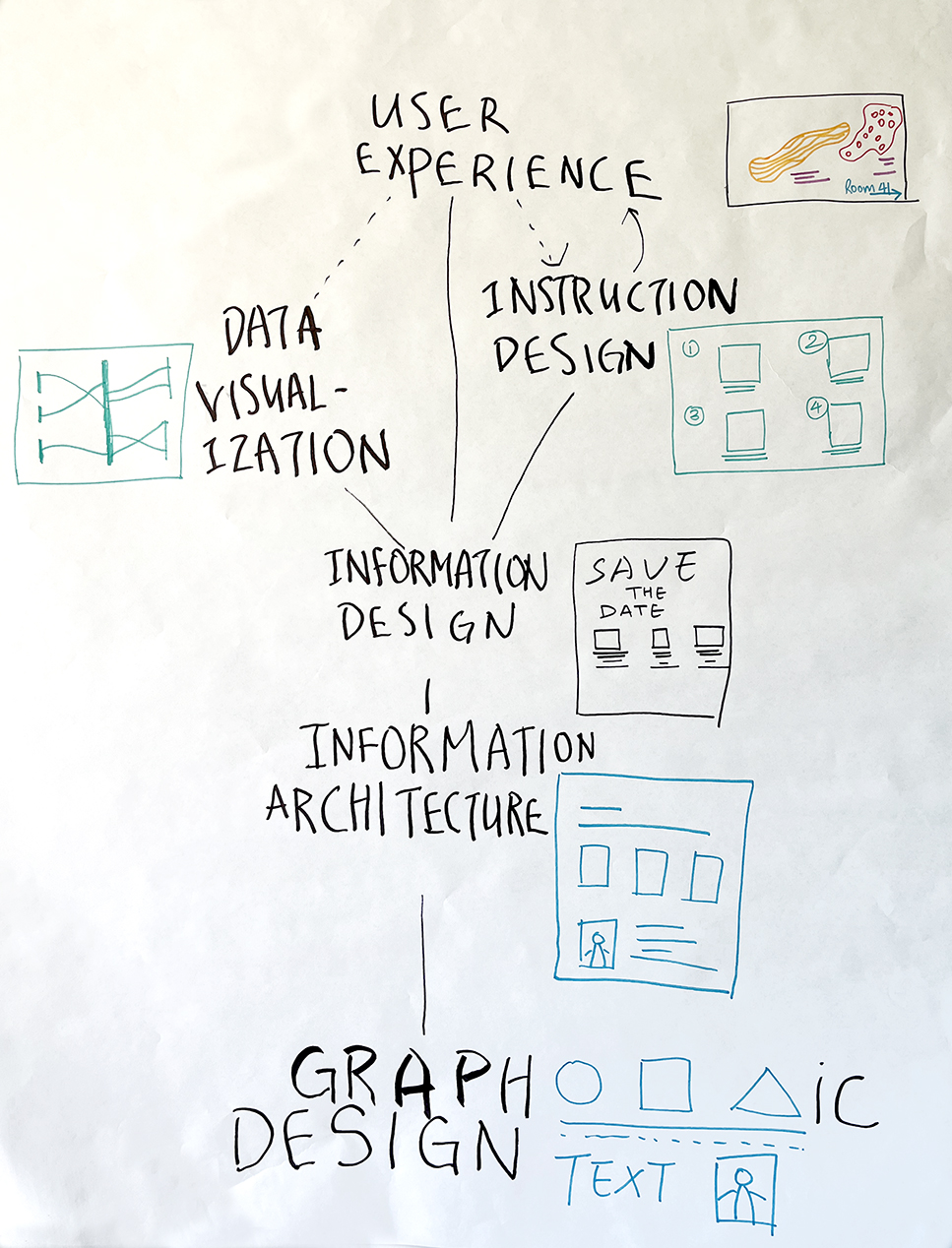
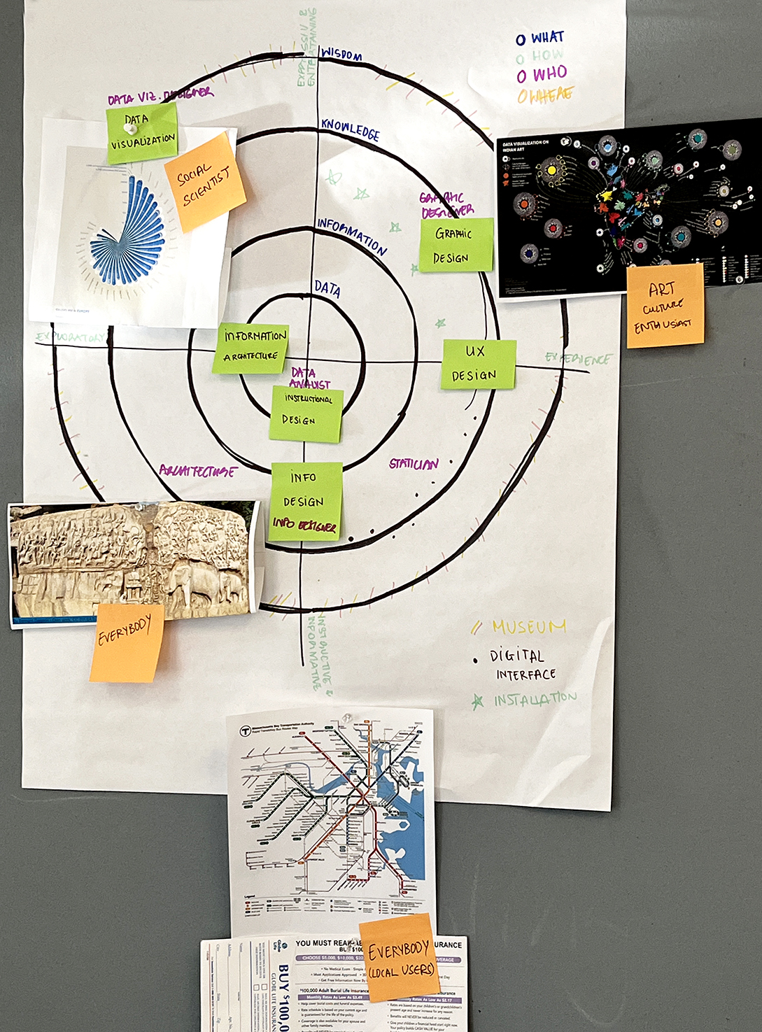
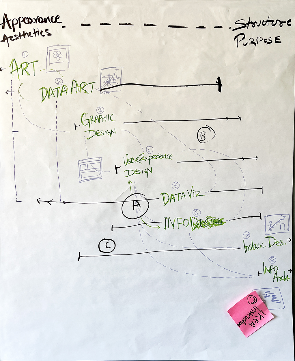
After much dialogue and discussion, each team came up with very different ways of visualizing the landscape of related fields. While Team 1 (Image 1) visualized a hierarchical relationship where User Experience is at the top and Data Visualization and Instructional Design are at a same level, Team 2 (Image 2) represented their understanding using concentric circles overlapped on a 2×2 quadrant based on exploratory-experience and entertaining-informative axes. This team included the audience, the artifact, and the modality involved in a project. Interestingly, Team 3 (Image 3) approached the task differently as well. They mapped the fields in a aesthetics-focus to purpose-oriented spectrum placing Art on the far left and Information Architecture in the far right, and indicating the scope of each field within these extremes.
The exercise debrief was the most revealing part of the exercise. It highlighted the difficulty for people from different backgrounds to understand the differences between each field as well as misconceptions (and misunderstanding) about the role of information designers in industry. An important distinction that emerged from the discussion was that of skill vs field. For instance, you may need information architecture skills for a project, but that does not mean you are an information architect.
In our book Information Design Unbound, we also discuss the value and need for clarity – as well as challenge to gain it – in the design community to better define each field. Having alignment on what each concept means helps preserve the integrity of information design and the historical body of knowledge it contains. Most importantly, it also ensures shared understanding in discussions of its various dimensions between professionals, clients, students, and everyone else involved in the conversation.
For me, as an educator, a unified understanding of its goal will help me better nurture it, and my students will be able to identify the types of problems they want to focus on more clearly as well as better explain what they do to others. This is one of the most pressing concerns among students: What types of jobs can I get as an information designer? What is my role in addressing global challenges? Clarity from the community can greatly support them.
—
Pontis & Babwahsingh (2023) Information Design Unbound: Key Concepts and Skills for Making Sense in a Changing World. Bloomsbury Visual Arts, UK.
Leave a Reply