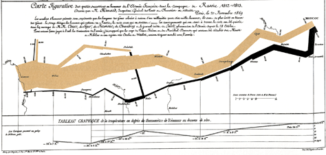
In previous posts I have written about effective diagrams, without mention if they were beautiful of not. It is important to clarify the difference between these terms: beauty and effectiveness.
There are many design books that are govern by the concept of ”˜beauty’, that include unquestionable visual sources of infographics and diagrammatic typologies; where beautiful diagrams are defined as simple and comprehensible ones, where original information can be modified in order to achieve ”˜beauty’.
Nevertheless, beauty and effectiveness are not synonyms at all. Moreover, diagram effectiveness is not related to beauty either. Richard S. Wurman (1989) underlines that ”˜the low premium on clarity is due in part to graphic designers who operate more as cosmeticians –putting mascara instead of meaning in information- instead of functioning as conscientious mapmakers’ and diagrammakers. Similarly, Clive Richards (2000) writes about the increasing quantity of trendy but incomprehensive diagrams created everyday and explains how dangerous can be these kinds of diagrams, for example, for companies’ finances.

Edward Tufte devotes almost all his books to emphasise clear and old-fashion diagrams over clutter, flat and modern ones. He explains how effectiveness is not related to technology but to appropriate information organisation. In relation to this vein, Paul Mijksenaar (1997) also mentions that: this confusion about notions of functionalism and beauty is nothing new. He explains that durability, usefulness and beauty (or reliability, utility, satisfaction) are three interwoven elements in design and that what really matter is their proportion in a design outcome.
Yes, information can be beautiful, but it is not the main purpose of information design. Information design deals with aesthetics in a second stage of the design process. In a previous post, I wrote about The Story of Stuff as a project that effectively displays complex information, without employing beautiful diagrams. The main purpose of information design is to make the complex accessible. That is to say, be understandable, effective, but not beautiful.
– Mijksenaar, P. (1997) Visual function: an introduction to information design. Rotterdam: 010 Publishers
– Richards, C. (2000) Getting the picture: diagram design and the information revolution. Information Design Journal, vol. 9, no. 2\3, pp. 87-110
– Wurman, R.S. (1989) Information anxiety. London: Pan books
Leave a Reply