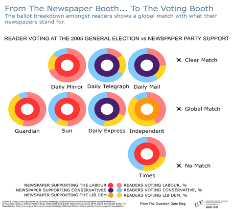
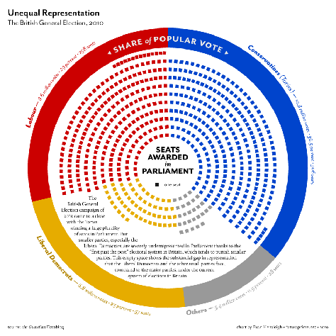
During the recently UK general elections, Information Design made easier to analyse and compare numbers in daily newspapers, and to understand the complex polls results, as can be appreciated in the images below.


In a different country, but also related to politics, Information Design is also showing the importance of visualising complex issues. Last March, US President Obama has announced that the information designer Edward Tufte will be part of the Recovery Independent Advisory Panel of the government. Briefly, Tufte has to investigate and suggest ways in which the $787 billion in recovery stimulus funds can be more effectively managed. Appropriate information design decisions could help obtaining higher levels of transparency, preventing and detecting fraud, waste, and mismanagement.
Even though, those tasks would be seen as beyond an information designer’s work, this is actually the core of this discipline: provide different views of a problem, in order to help making more suitable decisions. When information is clearly visualised, it becomes a powerful tool of communication. Historically, whoever had maps had knowledge; currently, whoever has clear visualised information, increases its knowledge. Diagrammatic representations (such as diagrammatic maps, infographics, diagrams, tables) can make a jumble of issues comprehensible. Diagrammatic representations influence how we see the world, what we see and what we do not see of it. The power of these visual representations relies on their ability to make visible or invisible information.

Diagrammatic representations work as a ”˜purification process’, extracting all irrelevant information and reducing reality to its essential features. However, not all diagrammatic representations clearly communicate complex information. To obtain effective and comprehensible diagrammatic representations, it is fundamental to select and translate the appropriate information. This is referred as the simplification process. In short, the simplification process involves three aspects:
1) Decide what information is better to be included,
2) Decide how to organise it, and
3) Decide the navigation elements (elements that tell readers how to move through a diagram, and indicate what they are looking and what they should be looking for).
Information design departments have already been created in newspapers to improve the communication of complex content, and infographics have also been recognised as having great informational value. However, the fact that an information designer has been required to advise governmental issues means more than recognition. This indicates that diagrammatic representations are being value and acknowledge as serious sources and meaningful pieces of information, and that the discipline, Information Design, has a prominent future in areas beyond art and graphic design.
Related to this, the forthcoming Wednesday19th of May, Edward Tufte is coming to London to give a lecture about his analytical and information design theories. The lecture will take place at the Royal Geographical Society, Ondaatje Theatre.
Looking forward to it!
Leave a Reply