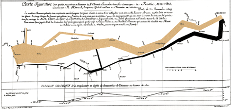
Many times the diagrammatic representation about the Napoleon’s invasion of Russia has been defined as the best graphic ever made. Tufte’s books explore, analyse and develop design principles based on this diagram. I have presented this diagrammatic representation in more than one lecture, article and post to exemplify the concept of ”˜levels of information’, ”˜viewing depth’ and ”˜informational variables’.

However, on the other hand, it is also considered as an unnecessary complex diagrammatic representation. Seth Godin (2006) in a TED’s conference introduces the concept of ”˜broken signs’. Briefly this concept refers to everyday stuff that, to some extent, is not properly working, thus is broken. He adds that we live and are immerse in a broken environment, but we don’t seem to care about it. Godin gives seven reasons of why people do not do anything to change this, which can be applicable to why designers create broken outcomes:
– Not my job
– Selfish jerks
– The world changes
– I didn’t know
– I am not a fish
– Contradiction
– Broken on purpose
Godin exemplifies the last reason showing the Napoleon’s invasion diagrammatic representation. He describes this image as the worst graphic ever made because its 5 different pieces of information distributed in three axes, require a minimum study of 15 minutes to get to know the whole story the graphic is telling. He argues that graphics are not made for being contemplated for 15 minutes.
If Godin’s ”˜theory’ is compared with Tufte’s, it can be seen that they are analysing the same graphic but from different perspectives. While Godin states that graphs should be created for lazy people who do not want to read and who want to understand a message in seconds; for Tufte the creation of a (complex) graph is related to a communication purpose and not with the time needed to be understood, as long it is properly understood.
This difference of judgement about design effectiveness is worth being analysed. Design effectiveness should depend and be based on defined criteria, which at the same time should be followed to create a design outcome. To some extent, to describe a design as the best or the worst can be seen as a subjective opinion, as it is easy for us to project our bias, and our opinion would be supported by personal and subjective reasons. While if the criteria of effectiveness are defined before the creation process of a design outcome, it would be more objectively to determine if a design outcome properly works or not.
Leave a Reply