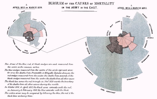
”˜The beauty of diagrams’ at BBC Four is a series of 6 programmes that analyse key diagrams. Particularly, programme 3 explains the history of ”˜The rose diagram’. This diagram was created in 1858 for the nurse Florence Nightingale to show the poor sanitary conditions of hospitals under which the British army was exposed during the Crimean War (1853-1856). Nightingale’s diagram was part of her report about the soldiers’ causes of mortality in hospitals during the war aimed to change UK’s attitude to hospitals care. Nightingale believed that diagrams could be more effective ways of communication than only written words.
The success of this diagram relied on the display of accurate information. For this, she analysed and studied statistical material and reports about the soldiers’ deaths obtained from different sources (i.e. doctors, army’s reports). With the help of the statistician William Farr, Nightingale spent months analysing tables and charts until she reached a complete understanding of all the information.
Then, as she was aware of that not all of the audience members would be able to read statistical tables and data and that not all the information could be visually represented, she translated the most relevant information into diagrammatic language, creating ”˜The rose diagram’.

The above diagram shows mortality in hospitals. Particularly, she coded the three most recurrent causes of death: blue for preventable diseases, red for wounds and black for those due to other causes. Nightingale’s diagram is composed for two circular diagrams: number of deaths in 1854-1855 and number of deaths in 1855-1856. At the same time, each circular diagram is composed of 12 wedges, representing a month.
Years later, in 1869, Charles Joseph Minard created a diagram representing Napoleon’s Russian campaign of 1812. Brasseur (2005) points out the fact that Nightingale and Minard were adopting a diagrammatic language to communicate complex contents in the same ten-year period. Minard employed a more figurative representation: a cartographic model, while Nightingale employed a more abstract representation: circular shapes. Both diagrams are examples of the importance of the organisation and understanding of content to create an effective visualisation. It was not casual that both Nightingale and Minard created effective diagrams. Minard was a civil engineer and Nightingale was a nurse, but also she was a statistician. This demonstrates that to create a complex diagram both are essential: expertise in the field being visualised and a process- and methodological-thinking. Brasseur highlights the period between 1859-1899 as essential for the development of information design.
It is important to notice that even though both diagrams show the progression of the war, the diagrams differed in their purposes. Nightingale’s diagram was created with a ”˜call-to-action’ purpose: change behaviour, while Minard’s diagram was created as a descriptive diagram.
Although, this BBC Four programme is of much interest as it shows the relevance of an effective complex diagram, it is worth mentioning that most of the current complex diagrams created by ”˜artists’ lack of the rigour and methodical view than that of the diagrams analysed in this post. Creating effective complex diagrams is not an easy task.
PS: Apologies to all readers based outside the UK who intended to watch this episode, as I didn’t know that it can only be seen online from the UK.
– Brasseur, L. (2005). Florence Nightingale’s Visual Rhetoric in the Rose Diagrams. Technical Communication Quarterly, 1542-7625, 14(2), pp.161-82.
Leave a Reply