Last week took place Tapestry Conference. Thanks to live-stream, I spent some time watching some of the talks. The discussions around beauty and functionality made me reflect on how we, as information design practitioners, approach the problem-solving process and conceive solutions, but also (and frequently barely discussed) how we, as information design educators, equip future generations with the appropriate skills to successfully deal with the creation of functional solutions and making appropriate visually-coding related decisions.
Exhibitions, debates and conferences are frequently orientated to professional practice: introducing new tools and languages, discussing how to develop new visual languages and techniques. (To be fair: theoretical models and principles are sometimes discussed too but they don’t generate the same degree of interest as more technology-driven themes) Job offers request visually engaging and fancy portfolios, and clients often select a candidate purely based on their technical skills. This scenario feeds designers’ eagerness to impress clients with their repertoire of graphic forms, visual skills and creativity by developing unconventional outcomes, and avoiding to use more traditional (but less trendy) solutions. There is also an increasing myth that functional information design is ugly, and beautiful information design is not functional.
This is the current picture that students, and less experienced designers see and, in some cases, believe. However, this current picture indicates important (basic) gaps in information design practice and education.
Function is important
In previous posts (e.g. here, here, and here), I have written about functional and more conceptual aspects of information design. So, I won’t unpack those concepts here, but just giving an overview. A functional solution addresses the intended problem, in that it responds to intended audience needs letting them expand their understanding, unravel hidden stories, or make connections. Some traditional solutions are often used as examples of functional information design, because when they were created, back in the XIX century, there was no fancy visual languages to embellish information. Their creators needed to rely on their simplification, organisation and communication skills, and visual coding principles. The increasing development of specialised software and tools have modified that approach. By facilitating visual experimentation and exploration, the concept of “beauty” in information design has been redefined, and is, in some cases, misused.
Beauty is important too
Visual exploration and experimentation contribute to the development of the field, and we should spend time and encourage students to perform those activities. But experimentation should follow an initial learning phase in which we get familiar with the basics of the field (e.g. principles, theories, languages, tools, applications), and of each project (e.g. audience, challenge, needs, implications). Only when we have gained foundational knowledge, we can push boundaries. Experimentation is not the problem; the problem is when we neglect conceptual and functional values for prioritizing our willingness to create something original.
In a related note, one of my first learnings as a design student was to first fully understand and follow consolidated rules, to then learn how to break them and create mine. Since then, that has become my motto as a designer. Alberto Cairo pointed out a similar idea in his presentation: First learn how to create and when to use basic graphics, before experimenting with new and unconventional ones.
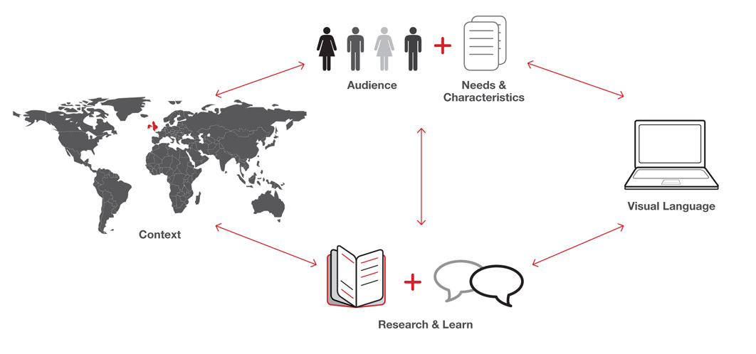
As educators and more experienced practitioners we should explain students and novice practitioners that they should not use subjective values, personal preferences or current trends to guide their design process, such as “This is my favourite colour” or “This is the fanciest language.” When starting a new project, they should construct objective views based on theories, frameworks and principles. They could also adopt a systematic approach and use evidence from user studies or evaluations to help them make decisions.
Function and Beauty are equally important
Effective solutions are those which combine functional and aesthetic values while addressing the challenge. When this is accomplished, beauty is related to the smoothness and clarity transmitted by the solution that allows its audience to understand the message and engage in follow up actions. Each component of the solution has its own place and nothing is arbitrary or irrelevant.
As information designers, we always need to remember that the field is not about our own tastes, but about addressing our intended audience’s needs. The challenge of information designers is finding a balance between function (communication, understanding, clarity) and beauty (aesthetic qualities, form), leaving personal preferences and visual trends aside. Frameworks, theories, and cognitive principles should guide the solving process, and help us develop the appropriate solution for our problem.
This is the message we must pass on to future information design generations, and practice every day to become better information designers.
Leave a Reply