Every time I’m traveling, going to work or just walking around, I can’t help noticing the influence or the need of information design. Airports, roads and museums are some more obvious spaces in which applied information design can be frequently found, but others are less evident and not frequently noticed (e.g. electrical appliance boxes, objects on the street, bus tickets). To some extent, the need for information design can be seen as closely connected to the need for communication and understanding. Well-conceived information design is intrinsically timeless, and, in some cases, is detached from specialised software or fashionable aesthetics; it is functional, clear and useful.
Below a small collection of situations and scenarios of simple, interesting and functional information design:
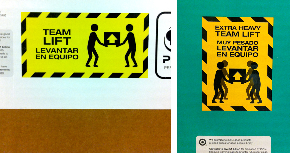
Simplicity. These icons give instructions of how to lift heavy (and extra heavy) boxes to make the activity safer, and, for example, avoid back injuries. The images are labels from two pieces of furniture of different brands. The image on the right indicates the need of extra help when lifting extremely heavy boxes. Either those transporting or those buying the boxes would benefit from this information. Their message is clear and direct, no trendy design or used of sophisticated technology.
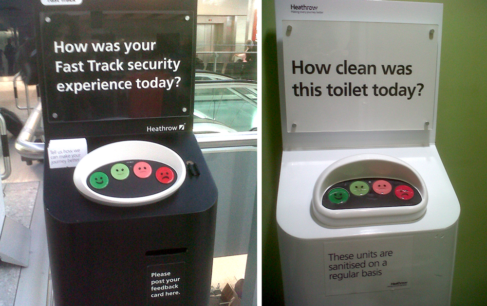
Strategic approach. Interactive devices are located in Heathrow airport (Terminal 5) acting as “surveys” to evaluate the efficiency of different areas in the Departures hall. Devices are strategically located at the end of security queues, end of escalators and toilet entrances. In order to engage travelers to take part in the survey, the devices are straight forward to use, minimising the risk of low participation due to lack of time. Travelers’ opinions are captured by a simple tap based on a four-point Likert scale represented with smileys and colours (red denoting a bad experience and green denoting a very good experience). Results from the survey will help understand the quality of the services provided at the hall, and eventually be used to improve travelers’ experiences. The value of this project is beyond its aesthetic and visual design qualities. It presents a holistic approach taking into account and understanding all parties involved in the problem (the big picture), including the users’ needs (travelers) and characteristics of the context (airport).
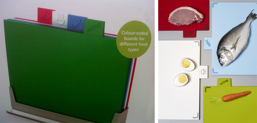
Organising principles. The box of kitchen cutting boards implicitly encourages intended-users to adopt information design principles to aid cooking-related tasks. A colour and icon are attached to each of the four cutting table boards included in the box promoting the use one particular board for each food type. As the right image exemplified, the green cutting board denotes vegetables, the blue denotes fish, the white is for chopping cooked food or ingredients, and the red board is for meat. Somehow, the idea of colour-coding the cutting boards and connecting them to actual food types indicates how the information design principle of organisation can be applied and used to assist a daily activity. As Wurman (1989) pointed out, the ways of organising information can be applied to any situation and facilitate its understanding.
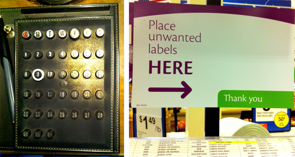
Functionality. At first glance, these last two images seem to be very different. The perpetual desk calendar on the left is probably from around the 60s or 70s, while the sign on the right is a current image. However, both images are examples of highly functional and well-conceived information design.
The perpetual calendar is timeless, it can be used any year, for any month. The day of the week is indicated on the top row by placing a rubberized black circle on the corresponding initial of the day. The current day is indicated in the same way but with a rubberized white circle. (The month of the year can also be indicated but it is out of frame in this photo!) This is just an example of many perpetual calendars that have been built using the same rationale (a calendar that can be used for many years, regardless its design), now these calendars demonstrate all principles of information design: clear information organisation, purposely synthesis of information, strong structure and alignment.
The image on the right is a simple sign to indicate grocery shoppers where to place unwanted labels printed out by the scale after weighting fruits and vegetables. In this store, once shoppers have registered the corresponding amount for their groceries, they used to stick the labels all over the machine, because they did not know what to do with them (as no further use was needed). To address that problem, the store placed a sign just above the scale providing a solution for shoppers in that situation: gives a specific space where they can place the unwanted labels. Interestingly, this sign is very much context focused as it addresses a problem in a particular shopping experience, which may not occur in a different city or country.
The above cases are simple solutions with a very clear purpose and a strong idea of how to address the problem. There are many more simple, functional and well-conceived information design examples from where we can learn basic information design principles that are often overlooked in more complex or heavily technology-related solutions. It’s important to stress that technology and specialised software are not responsible for our decisions or ineffective creations. Almost 25 years ago, Wurman expressed that “we are trapped not by technology but by our inability to understand” the root of a problem.
To conclude, a quote that very much can help understand why we keep encountering ill-conceived information design:
“This defines our society and our age as much as any other set of words: activity without prudence, or, imprudent doing.” – Lee Van Laer
—–
– Inner Wisdom. Lee Van Laer – Parabola Magazine
– Wurman, R.S. (1989) Information Anxiety. Doubleday.
Leave a Reply