Many has been written about the legacy of John Snow, Charles Minard, William Playfair, Jacques Bertin, Otto Neurath, and even Ladislav Sutnar to information design, but comparatively very little has been said about the work of Will Burtin. He was a German-born designer who emigrated to the United States just before the beginning of the second World War. His catalogue and print design, and 3D models and exhibitions are foundational contributions to information design, while his rationale and way of making sense of problems have greatly influenced how information designers think and conceive ideas. This post describes Burtin’s approach to design and work, and stresses his seminal contributions to information design.
Functionality, simplicity and integration
Since a very early age, Burtin conceived his ideas from a functional point of view. As German, he grew up surrounded by Bauhaus rationale and artifacts which communicated synthesis and function. These principles influenced his own problem-solving approach and work in that he conceived and designed catalogues and exhibitions with the same principles in mind that Bauhaus has used for building houses and products.
Functionality and Simplicity were also visible in his font choices (mostly sans serif over serif fonts), the use of white space as an important element of the composition, and the design of big margins. His graphic style was also characterised by asymmetric, multi-layered layouts in which visual components (overlaid colours, photographs, sketches, illustrations, flat graphic elements) and textual components were integrated creating visually simple and organised solutions, where ideas were clearly communicated.
Burtin translated conceptual and visual integration used in paper to his 3D installations and exhibitions. For that, he experimented with and combined various materials from transparent plastics, steel, aluminum and some light-weight new materials. Furthermore, he integrated European design styles to American design. From his connections with European designers and graphic artists, Burtin acquired new insights to address information design challenges. For example, meeting Josef Mí¼ller-Brockmann back in the 50s brought to his repertoire Swiss alignment and visual order, and the Helvetica family of fonts.
Interdisciplinary work and Research
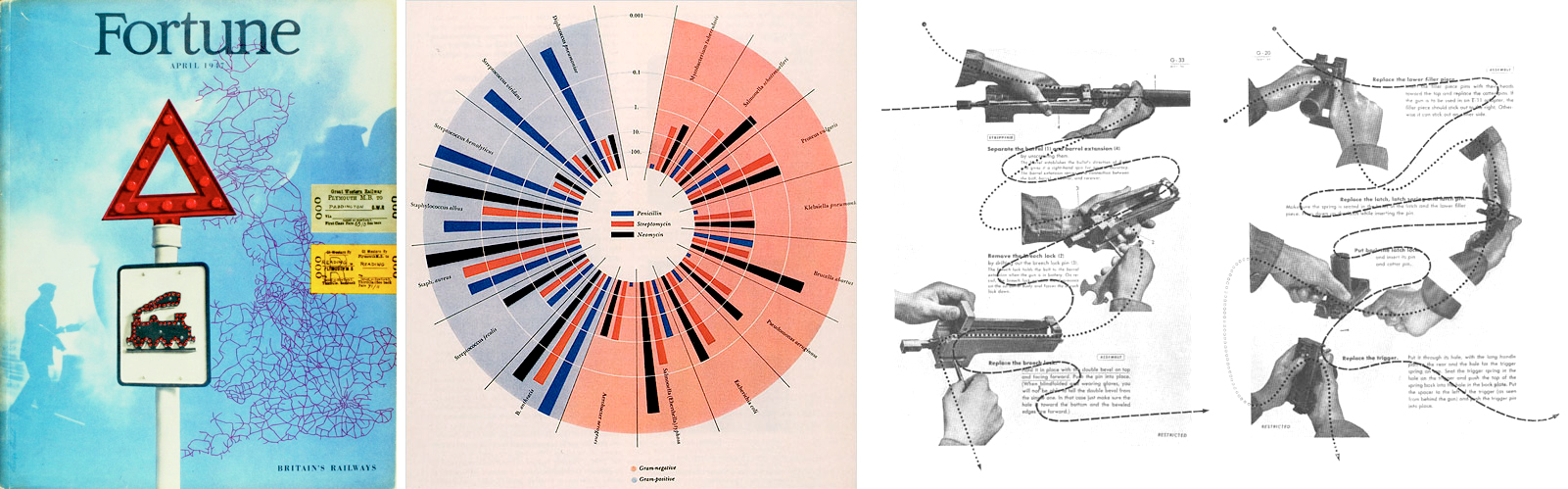
Short after arriving in the United States in 1939, Burtin started working for the US Army designing top priority training manuals for the Air Forces. To gain the necessary knowledge for designing the manuals, Burtin used to get special training in order to get familiar with relevant terminologies and activities that trainees would face. This way he obtained a thorough understanding of what he needed to communicate in the manuals. In addition, he examined training manuals from competitors, and worked with other professionals with background knowledge in the subject domain of the projects (e.g. aerial dynamics). All members of this interdisciplinary team worked together to “explain a complex, interdependent set of variables as clearly and simple as possible.” The resulting manuals conveyed “a complex stream of fast-moving, time-variable data in two static dimensions that users could understand.”
To be able to convey various variables of complex information in a clear way, Burtin synthesized and decomposed the story (e.g. how to use guns) into three steps: first introducing the bigger picture of the problem or situation, and then progressively zooming-in to show the gunner relevant measurements they needed to know. In addition to guns’ manuals, Burtin also designed instructions for other US Army systems.
Bridging design and science
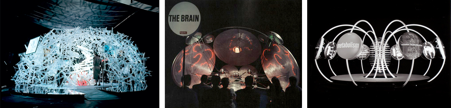
Most of his work was devoted to facilitate understanding of and “explain advances in science, medicine and technology” in a visual way to expert and novice audiences. To achieve this goal he was in constant dialogue with scientists and other professionals of various backgrounds. This allowed him to identify scientists’ needs, e.g. having too much to read in a magazine was not in line with their little time intended for daily reading. To address this and other scientific challenges, Burtin came with the idea of constructing 3D dynamic installations, also described as walk-through, large-scale scientific models. These models enlarged the sizes of and unraveled the meaning of microscopic concepts and components of scientific theories. This way the audience had access to and could learn processes, connections, textures, and components involved in science. His most remarkable models were: the Cell (1958), the Brain (1960), the Atom (1961), and the Metabolism (1963).
To achieve credibility and precision in all of his designs from print to 3D models, Burtin used to go through an initial research period learning and collecting information about the topic he wanted to map and visualised. For the Cell model, Burtin himself and his team gathered information by visiting US and European universities working in that topic, and consulting with experts in cytology and other related scientists. He them compared notes, and cross-referenced images and draft versions of the model with experts in the field to maximise the level of accuracy in the visualisations. However, in more than one occasion, when consensus about shapes and forms was not achieved among scientists, Burtin had to use his research learnings to make final decisions. Particularly, it was
This activity which is so essential and new that Will pioneered, as designer… asking questions: ‘Could this be shown like this? could it have this colour? could it have this shape? should it be like this? would this be possible? would this make it clearer? [p.72]
Burtin conceived initial possible solutions, but both designers and scientists worked together throughout the problem-soving process to “make science visible.” As a result of learning the audience and questioning unclear aspects of the story, his visualisations were well received and considered rigorous by both physicians (the expert audience) and the general public (the novice audience).
Similar to Otto Neurath’s concept to develop the Isotype language, one of Burtin’s achievements was the translation of complex scientific concepts into simple shapes easier to memorise: “scientific abstractions became visual forms,” without the use of advanced technology. His representational skills were more than 25 years ahead of computational science.
5 Contributions to Information Design
Both Will Burtin’s problem-solving approach and rationale, and formal characteristics of his work have a crucial role in information design. I summarised his legacy in five key contributions:
1. Information designers need to have an active role: We should start each new project with a hunger for learning, and actively asking questions to unpack further what we already know (expand knowledge), but also to gather information to construct new knowledge (fill gaps of knowledge).
2. Information designers need to add rigour to their thinking: We should conduct appropriate research as part of our creative process, and have a method of doing to support our decisions and provide guidance to our thinking. This approach will add rigour to our problem-solving process and accuracy to final solutions.
3. Information designers need to engage in interdisciplinary projects: We should be in constant dialogue with our clients, and with other professionals and experts related to the subject domain of each project. This provides new insights that will help identify the unknowns of the project and add credibility to final solutions.
4. Information designers need to work with conceptual and graphic layering: We should unravel the information layers of each problem-situation (e.g. using what, how, when, where, why) to construct an understanding. Then we should reorganise and translate the information obtained from each layer (our learnings) into graphic layers to communicate the complexity of the problem in a clearer and simpler way (concept of multidimensionality).
5. Information designers need to develop theory and a common ground: We should build foundations to consolidate and pass on specialised knowledge and skills to future generations. This will help define principles and frameworks to ensure effective design.
Will Burtin equally cared for function and for form, as a result his work was functional and conceptually strong, and formally accurate and precise. By mapping and visualising science, Burtin made complex accessible. “This unique ability to visually express complex concepts would emerge as a defining characteristic of Burtin’s work.” His legacy brings design closer to science, and value and credibility to information design.
—
This post is inspired by:
– Remington, R.R. and Fripp, R.S.P. (2007) Design and Science: The Life and Work of Will Burtin. US: Lund Humphries
Leave a Reply