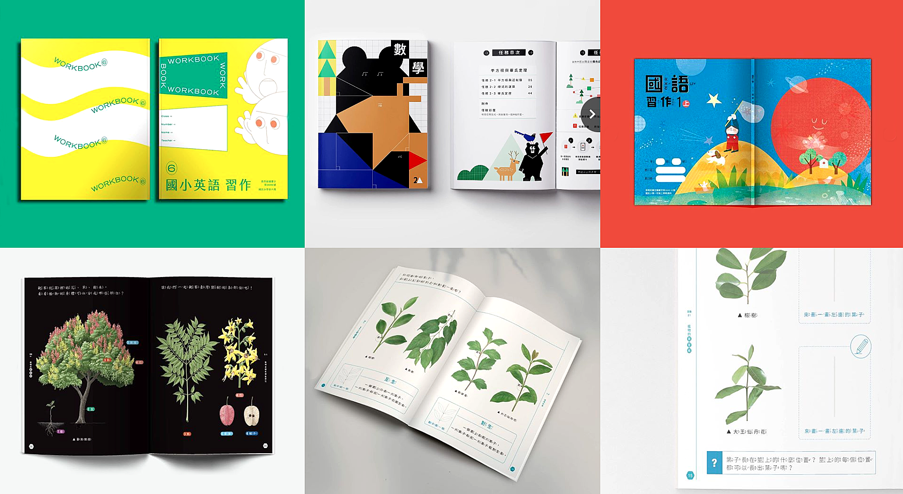
Many people link technology with innovation and new ideas. This is particularly true in the context of education, and even more these days with remote learning, Zoom, Mural and other digital tools. And this is also true for information design as for many people interactive data visualizations are the way to visualize information.
However, an idea doesn’t need to involve technology necessarily to be novel, effective and successful; but it does need to address the intended users’ needs and help them achieve their goals. The Aesthetic Textbook Re-design Project is an excellent example of a user-centered, imaginative and effective information design solution, that does not involve technology. This project took the initiative to rethink textbooks and create a new way to explain primary school key concepts. In contrast to hefty traditional textbooks that present content in a generic, one-size fits all manner, Aesthetic Textbooks are light (more like booklets) and tailor content to the needs of each grade, creating a new learning experience for the students. Content is presented in dynamic and engaging ways reflecting the way primary school students think and act, which makes students connect with and want to read the books. These textbooks also include exercises and visual aids.
To an extent, Aesthetic Textbooks remind me of The Pantheon Story of Mathematics for Young People book written by James Rogers and designed Will Burtin in 1966. In both cases, content is made accessible through visual analogies, and storytelling. Unlike Burtin’s, these textbooks have a more playful approach to learning, almost comics-like which seems to be speaking directly to the audience. This visual style reminds me of the Vendor Power Guide designed by the Center of Urban Pedagogy (NY) and designer Candy Chang in 2009. The guide explains NY street-vending rules using a Chris Ware-inspired style.
Another commonality between these three projects is that all illustrate that information design goes beyond the visualization of quantitative data. Visually explaining qualitative data (like concepts about society, rules and regulations) is also an important part of information design work that not often receives the attention it deserves. This type of work requires strong sensemaking skills to thoroughly analyze and understand what needs to be explained, and then to translate it into a language that the audience can understand. When information design is well-conceived, the resulting design presents the information in a more accessible way and in line with the audience’s needs. These three projects exemplify these characteristics.
But what I like the most about the Aesthetic Textbooks project is that it demonstrates the power of designing with the user in mind and addressing their needs. After watching the 5 min video, there is no question about the students’ enthusiasm and joy about the textbooks, and also for learning! Students’ positive responses to the textbooks indicate the great impact that they will have in their education.
As information designers, we should all aim to elicit this same response from our intended audiences when interacting with all our designs.
Leave a Reply