NYU Wagner hosts a series of talks as part of the 2014 Henry Hart Rice Urban Policy Forum: Neighborhood Inequality and the New Social Transformation of the American City. Back in April, I attended the talk of Robert Sampson, professor of Social Sciences at Harvard University. Sampson presented results from a longitudinal research study he has been working on in Chicago to learn about crime, disorder, neighborhood effects, and the social structure of that city. The combination of a well-structured narrative and appropriate use of supporting visualisations as slides made the lecture highly engaging and educative. The lecture also evidenced the important role of information design in the communication of a complex subject (e.g. research data and findings), and how a well-developed solution broadens understanding.
Presenting research data.The slides of the presentation were mostly visual with textual components added as references, keys or labels. Findings were presented on maps, graphs and charts, and Sampson’s narrative made the audience gain interest in the project (even those unfamiliar with the situation in Chicago and foreign to social sciences), and understand the magnitude of the results.
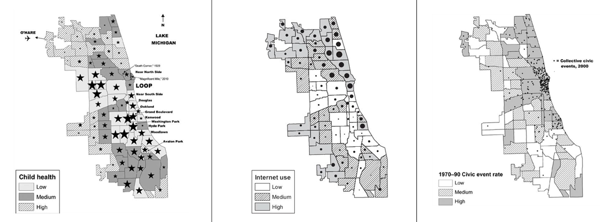
Interestingly, two to three different variables were included in the maps (multidimensionality) displaying the relationship between child well-being and violence in Chicago. For example the above map on the left presents (1) three levels of child health in Chicago (textured and plain colours), (2) homicides per hundred thousand population (starts), and (3) geographic location (map sub-divisions).
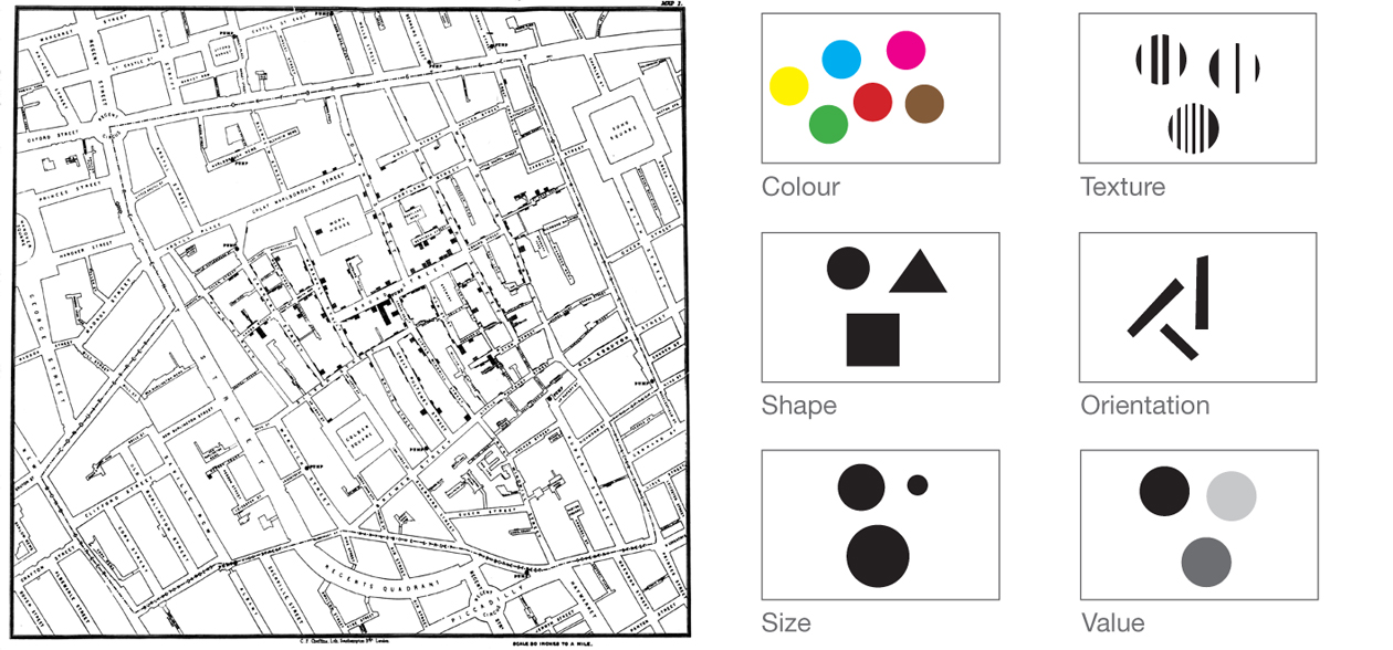
The way Sampson presented research data and findings showed the legacy of two key people of information design history: John Snow and Jacques Bertin.
Understanding data in context. Snow’s main contribution to the field was the presentation of data in context to help the reader to make connections and inferences. In the Great American City maps, data and findings are visualised on a geographic map with a different scale from Snow’s Cholera map but a similar principle. The visualisation of two variables: child health data and homicide data, at the same time helped the experts and non-experts in the audience unravel the relationship between those variables. Therefore, we learnt that “homicide is highly concentrated in the same communities scoring low on infant health” (Sampson, 2014). In addition to a clear visualisation of research data, critical thinking and analysis are necessary to interpret and make sense of the resulting visualisation. Sampson provided these two with his speech by describing the context, rationale for and aims of the study, how the data was collected and how the analysis was conducted.
Coding data with purpose. Bertin suggested that depending on the nature of the research data, it should be displayed with the corresponding visual variables. He introduced six visual variables that he called “the components of the graphic system.” Each variable has its own properties that make them more appropriate to represent one type of data than another. For example, using the value variable is often not as good as using the size variable to represent quantity. Of course, the use of variables is relative to the context of use, the type of research data (quantitative or qualitative), and other graphic components involved in the system (e.g. background, frame, etc). The key is knowing why and when we are using a visual variable instead of another one.
Information design for multidisciplinary projects
The way Sampson presented research data and findings is just one example of many of how information design could be used to help other disciplines communicate complex subjects to various types of audience. Possible stages in which information designers can contribute to projects of diverse disciplines are:
- Pre-data collection: Information designers help with the definition of an action plan and the roles needed for that particular project. They also help with the organisation and analysis of initial thoughts and ideas, which lead to the identification of knowledge gaps. Consequently, this helps determine what further data is needed, and what data collection instruments (research tools!) will be necessary to collect the data to fill those gaps. Information designers are also involved in the design of those instruments.
- Collected data: Information designers visualise the collected data in order to make it more accessible to each member of the team (e.g. researchers, doctors, project managers, audience). These visualisations help make sense of findings, share thoughts, and draw conclusions.
- Post-analysis: Information designers create new visualisations or refine working visualisations from the previous stage to include in reports and presentations, which will later be used to share findings to third parties and various audiences.
The above stages are only a few of the many ways in which information designers collaborate with other disciplines: social sciences, medicine, law, politics, economy. In all cases, the earliest information designers are part of and collaborate in a project, the smoother the whole problem-solving process will be, as information design rationale brings clarity.
—–
– Sampson, R.J. (2014) Great American City. Chicago and the Enduring Neighborhood Effect. The University of Chicago Press.
– Bertin, J. (2011) Semiology of Graphics. California: Esri Press
Leave a Reply