Are information design, data visualisation, and visual analytics the same fields? Do they have similar or different goals? Who practices what? What are their processes? What is the best software to visualise data?
These are very frequent questions which are often the central topic of blog posts, twitter threads, discussions, Q&A, and regular conversation related to information (visual) practices. To me, answers to these questions should come from gaining a better understanding of the goals and processes of each of these specialised fields.
With this in mind, a few weeks ago I went to hear Ben Shneiderman’s talk at the graduate centre of The City University of New York (CUNY). Indirectly, the talk shed light on the on-going attempts to define the boundaries of these information (visual) practices: it provided a very clear explanation of what visual analytics is and its possible applications, and highlighted strong overlaps with information design.
Goal & Approach. Each of these practices has different applications and uses, but their overall goal is to provide a more effective way to look at data so that patterns can be identified and/or hypotheses verified. This results in a better understanding of data, situations, problems, services, etc. Interestingly, using Tukey’s (1977) terminology, Shneiderman defined visual analytics as closer to exploratory data analysis than to confirmatory data analysis. While confirmatory data analysis responds to an initial hypothesis that is verified or refuted through the visualisation of data, exploratory data analysis indicates that the visualisation created from the data summarises their main characteristics and trends. Results from this analysis can be observations, questions, hypothesis and insights, rather than concrete models that could be widely applicable to analyse other data sets (as it is the case of machine learning, for example). In other words, exploratory analysis helps define and better understand a problem or data set. This goal goes very much in line with the goal of information design: provide clarity and enhance understanding.
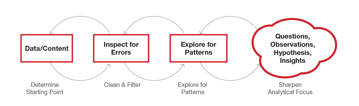
Process. In general, information visual practices translate data and content into visual form following similar steps and principles, although each emphasizes different parts of the process. Shneiderman unpacked four specific steps of the visual analytics process:
- Determine starting point. Tukey calls this initial part of the process as the ‘foundation stone’. Shneiderman stresses the need to first define what the question/s to explore is/are. This question is what the visualization of data should answer. Defining this question early on also helps give direction to the visualisation process. For this, it is key to talk to content experts (e.g. medical staff) and agree on how they want to look at the data or what would be the best way to explore the data. In addition, this question adds constraints and boundaries to the exploratory analysis.
- Clean & Filter. Before start working with the data, Shneiderman points out the need to look at the raw data sets, clean and filter them because they are too often full of errors (e.g. missing dates, chronological gaps, repeated numbers). Some techniques for cleaning data are grouping, determining hierarchies of importance, creating a simplified overview or creating an event category matrix.
- Explore for patterns. After data has been cleaned and filtered, the next step is grouping (no clustering!) data into categories to be able to see patterns clearer. This provides a fresh way to look at the data.
- Sharpen analytical focus. Not all groups should be explored at the same time. Data groups should be explored one at the time, zooming in on a few variables at the time, rather than looking at all at the same time. This approach echoes Tufte’s words: when everything is emphasized, nothing is emphasized.
Some of these steps won’t sound novel to information designers. Probably with different terminology, many of us already follow them when visually communicating information. For example, the third step””Clean & Filter””is similar to the Simplification step that information designers go through when identifying relevant from irrelevant information. However, some of the techniques frequently used in visual analytics can help add rigour and credibility to the information design process.
Data sources. Both visual analytics and information design tools are often used for exploration and discovery because they help find fresh ways to look at the data, rather than merely present results. Although in most cases visual analytics tools work with quantitative data (numbers), they can also be used to make sense of qualitative data sets. For example, one way in which qualitative data can inform visual analytics tools is when using an anthropologic approach, as Shneiderman’s described, where data is gathered from real users through ethnographic methods (e.g. placing a camera in the field to capture users’ behaviours in a hospital). Information design projects have a stronger qualitative than quantitative component, as understanding users’ needs, behaviours and emotions makes gathering rich qualitative data a must.
Visualisations. Shneiderman’s mantra””Overview. Zoom and Filter. Details on demand.””introduced back in 1996 provides a framework to inform the design of data visualisation tools, but it can also be used to effectively structure content in visualisations, infographics and diagrams. For example, when creating an infographic, the first layer of information should provide an entry to the problem or explain the environment in which the problem lives (overview). The next layer of information should include the key areas of the problem, as not everything can be visualised (zoom and filter). A final layer of information provides more details, expanding key aspects of the story to add credibility and increase accuracy (details on demand).
Collaboration. Visual analytics and information design are also different practices; each of them dealing with a specific set of aspects of a problem. However, it is uncommon to see projects in which the best of both practices work together. Three areas in which their strengths can be combined and potentiated are:
- Sensemaking: The use of visual analytics tools in information design projects dealing with large amounts of data can reduce the time spent during the analytical step of the process, and add rigour to the analysis.
- Usability: The use of information design principles could greatly improve the design and usability of visual analytics tools and interfaces, making these tools accessible to a wider population.
- Communication of learnings: The use of information design principles to communicate results obtained through exploratory data analysis using visual analytics tools could enhance their understanding.
There is also another key component that all information visual practices share: the factors affecting users’ processing of visual information; that is their visual literacy and cognitive processing. The next blog post will dive into this topic.
—
– Tukey, J. (1977) Exploratory data analysis. Pearson.
Leave a Reply