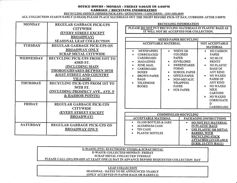
Once again, I challenged my information design students with the task of improving this garbage and recycling schedule:

Working in pairs, students had around an hour to work on this challenge, but couldn’t use colour or digital tools. They followed these steps:
- Understand content: This was the first time students saw the schedule, so they spent time reading the content and understanding the different types of information.
- Define 3-level hierarchy: Then, they analysed the content to distinguish main from secondary information, and determine an information hierarchical structure (critical, important, and nice-to-have information).
- Define user and uses: Some of the teams also thought about who the user was and what ways would be better for them to access this information. This opened up to also rethink the artifact as a simple flyer, and some teams proposed a double sided schedule or an artifact where the user could determine what they wanted to see.
- Define hidden organising logic: Once they have a better understanding of what types of information were included in the original schedule, each pair reorganised the information to find a clearer way of presenting the content and help users make better use of the schedule.
- Define layout: After they have more clarity on what they thought should be displayed or what wasn’t as relevant, they started thinking about structure and grid, and how to visually present the 3-level hierarchy they defined.
- Design: The last step was designing the information in a tabloid size sheet of paper.
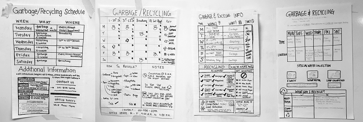
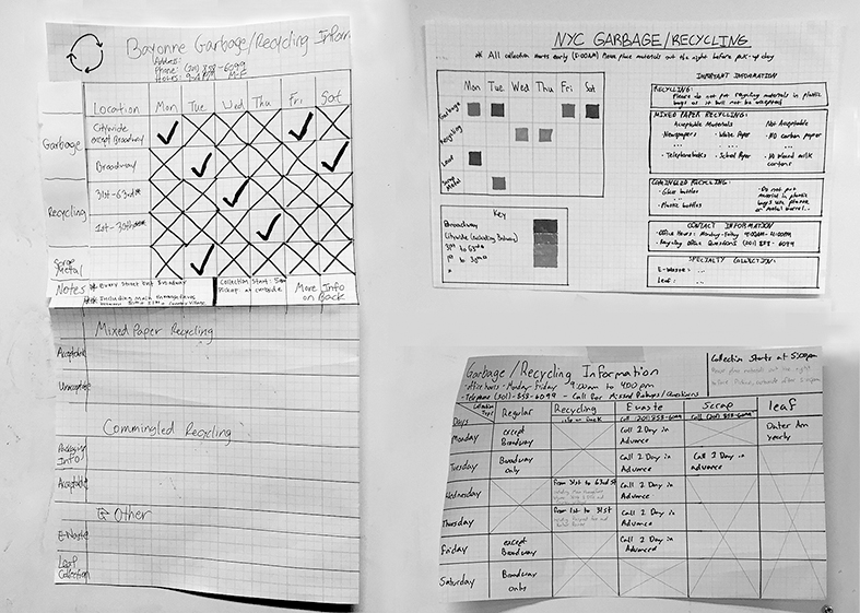
These are some of the results:


Analysing results
Overall, teams defined two types of 3-level hierarchy information:
- Three equal levels: When to put garbage out / What is recyclable garbage / Contact information
- One main level and two equally important subordinate levels: When to put garbage out (main) / What is recyclable garbage and contact information (second level)
Three organising principles emerged:
- Information organised by day of the week (options 4, 5 and 6)
- information organised by type of garbage (options 1, 3 and 7)
- information organised by zone (options 2 and 3)
And three different types of uses were thought for the schedule:
- Flyer to pin up on fridge or wall with all information on the front (options 1, 2, 3, 4, 6 and 7)
- Flyer to pin up on fridge or wall but with information on front and back (options 5 and 7)
- Flyer to pin up on fridge or wall with all information on front but allowing each user to select what information they want to read depending on the zone they live (not here)
These are sketches and work in progress, but all of them show a great improvement from the original:
- information is organised following some logic
- information is more accessible in that the user can easily distinguish different types of content
- there is a clear visual hierarchy and clear intention to present the information
A solid foundation is the basis for well-conceived information design. This is one of the most important principles for information designers, but often forgotten.
Well done class!
Leave a Reply