As information designers, we often create visual representations of meaning to make hard-to-understand information (e.g. scientific information, highly technical, unknown) more accessible to a wider audience. When well-conceived, these visualisations translate complexity into a simpler way to communicate a key message. Visualisations also help understand patterns and trends represented in large and rich datasets.
Broadly, the visualisation process consists of extracting meaning from a data set by filtering relevant from irrelevant data and determining a comprehensive way of telling the story of the data. Then, the identified key pieces of information and narrative structure are translated into a visual form. This process becomes harder when data sets are disorganised, multi-dimensional, or large.
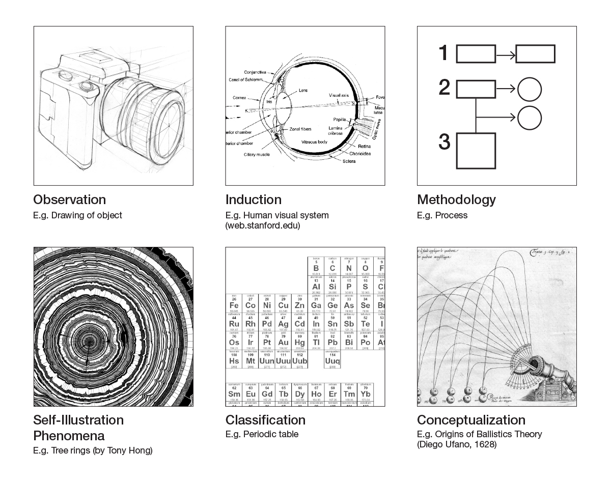
Particularly focusing on scientific visualisations, Harry Robin (1993) discusses six approaches that have been used ‘from preliterate to succeeding cultures’ to convey scientific phenomena (nature, meteorology, astronomy, medicine, biology, anatomy, etc.). To some extent, Robin’s approaches are content agnostic, in that they can be used to guide the translation of any type of complex information into visual form. The approaches are:
1. Observation: ‘I looked an this is what I saw’.
This type of visualisations is created from direct observations with the purpose to describe; they are seen as ‘the simplest and oldest form of scientific illustrations’. These visualisations capture all characteristics and conditions of a particular phenomenon (e.g. plant, animal, object) occurring in a specific moment. Characteristics and conditions can then be explored at any later moment. With the dissemination of books and later technological developments, these visualisations evolved from hand-made drawings to digital drawings representing more sophisticated observations. Visual representations created as the result of direct observations are the first step to understand a natural phenomena. Some examples are descriptions of the moon, descriptions of the components of the brain or of plants.
2. Induction: ‘I looked and this is what I thought’.
This type of visualisations are created to understand the meaning behind phenomena, objects and processes; therefore suggesting answers to ‘why?’ and ‘how’ questions. Similarly to the first type, these visualisations start with the observation of a phenomenon, object or process, but then the initial observation is enriched with information that cannot be observed, but inferred. These visualisations can bring order and clarity, as long as they have been created after thorough understanding of a phenomenon, and revision of any prior explanations of hidden aspects. Some examples are human’s incisions, self-fertilization of flowers, brain and neuronal activity, changes in the positions of celestial bodies in the sky, process of visual perception.
3. Methodology: ‘This is how I think it works’.
These type of visualisations represent cause and effect situations or phenomena, and are the result of experiencing an operation ‘in order to verify or reject a hypothesis’ and understand its workings. They describe a phenomenon but also explain its implications for a broader context by presenting a different explanation or an improved or revised reality of the observed phenomenon built from scientific analysis, evidence and experience. In other words, they are visual representations of how a new conclusion or discovery was found, some of them also depicting any methods, artifacts or devices used to reach those new insights. Some examples are experiments on light and colour, and how sun spots can be observed.
4. Self-illustrating phenomena: ‘A repeated pattern provokes (…) to seek the cause of the phenomenon’.
These visualisations convey repeated patterns or trails created by phenomena that indicate ‘how [something] function[s] and interact[s] with other forces’. Originally, this type of visualisations were created as a result of natural causes, such as volcanic disruptions which could create impressions of fish on vein of lava. More recently, these visualisations capture that same information but often through technical means using photographic devices and including images created with electrical sensors and computer graphic software. Although these visualisations are described as self-ilustrating, they aren’t always self-explanatory. Expert knowledge or deep undertanding of a topic is necessary to decode the visual representation, or the inclusion of an explanatory paragraph next to the visuals to describe the rationale of the patterns. Some examples are comets trajectories, galaxies constellations, fossils, and rings of trees’ lifetime.
5. Classification: ‘Think of it this way’.
This type of visualisations attempt to show some sort of order in nature by categorising phenomena, conditions of phenomena or parts of them, and giving them names. By presenting nature in an organised or structured manner, knowledge can be more directly accessed and stored, data can be more easily compared, and ‘differences can be investigated and clarified’. Visualisations presenting data in a specific order are resources or stepping stones that can enable ‘further observations and experiments’. Some examples are comparative studies of objects, encyclopedias, periodic table, new specimen compared to older ones for similarities and differences.
6. Conceptualization: ‘Concrete expression to purely thought experiments’.
This type of visualisations aims to explain, and make abstract phenomena and the development of theories more comprehensive. To some extent, they can be seen as the most sophisticated type. They convey explanations of phenomena created from personal understanding, observations, inner thoughts (memory) and exploration. Most imagery created for these visual representations is taken from our own experience. ‘The memory of observed phenomena, illustrations, and quantitative and mathematical relationships is subjected to mental scanning, contemplation and meditation that may produce new insights’. Some examples are astronomy illustrations, and technical drawings of predictions (of movements, evolution, etc.).
In all six approaches, when information is translated into visual language, it is presented in a simpler way. Some visual representations can look simple from an aesthetic point of view (e.g. few components, simple shapes, reduce colour palette, etc.), but they should be always communicating great amount of meaning in a clear way. However, when in a visualisation ‘there is nothing to relate to it’, it is because it is simplistic, that is, it has ‘become vague and meaningless’ (Wurman, 1989). On the other hand, successful visualisations do not have to be ‘sterile or uncomplicated’ either. They ‘can be wonderfully sophisticated and rich””even dense, textured, and beautiful””as long as [they are] understandable’.
—
– Robin, H. (1993) The Scientific Image: From Cave to Computer. W H Freeman & Co (Sd)
– Wurman, R. S. (1989). Hats. Design Quarterly, 1-32.
Leave a Reply